
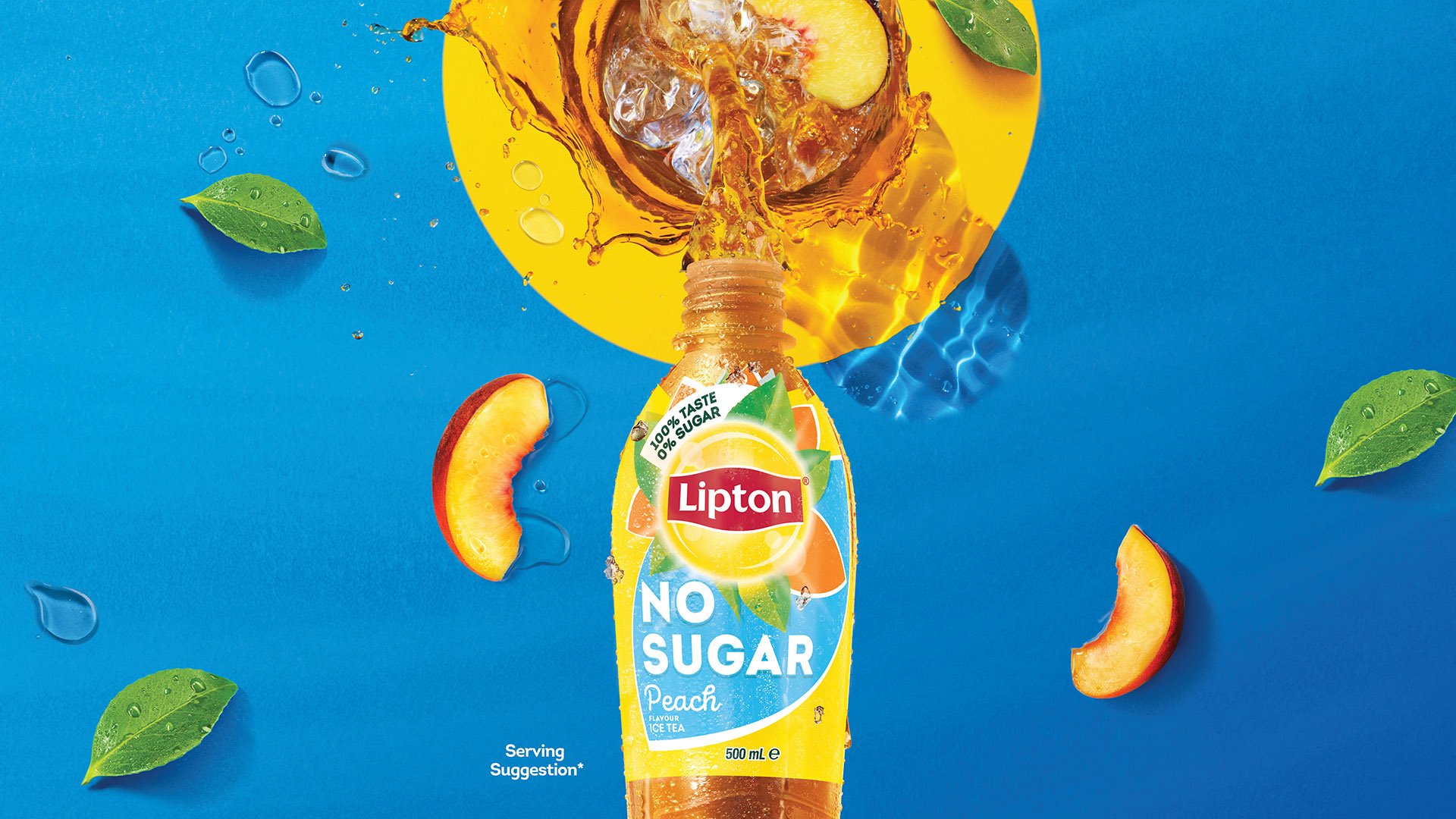
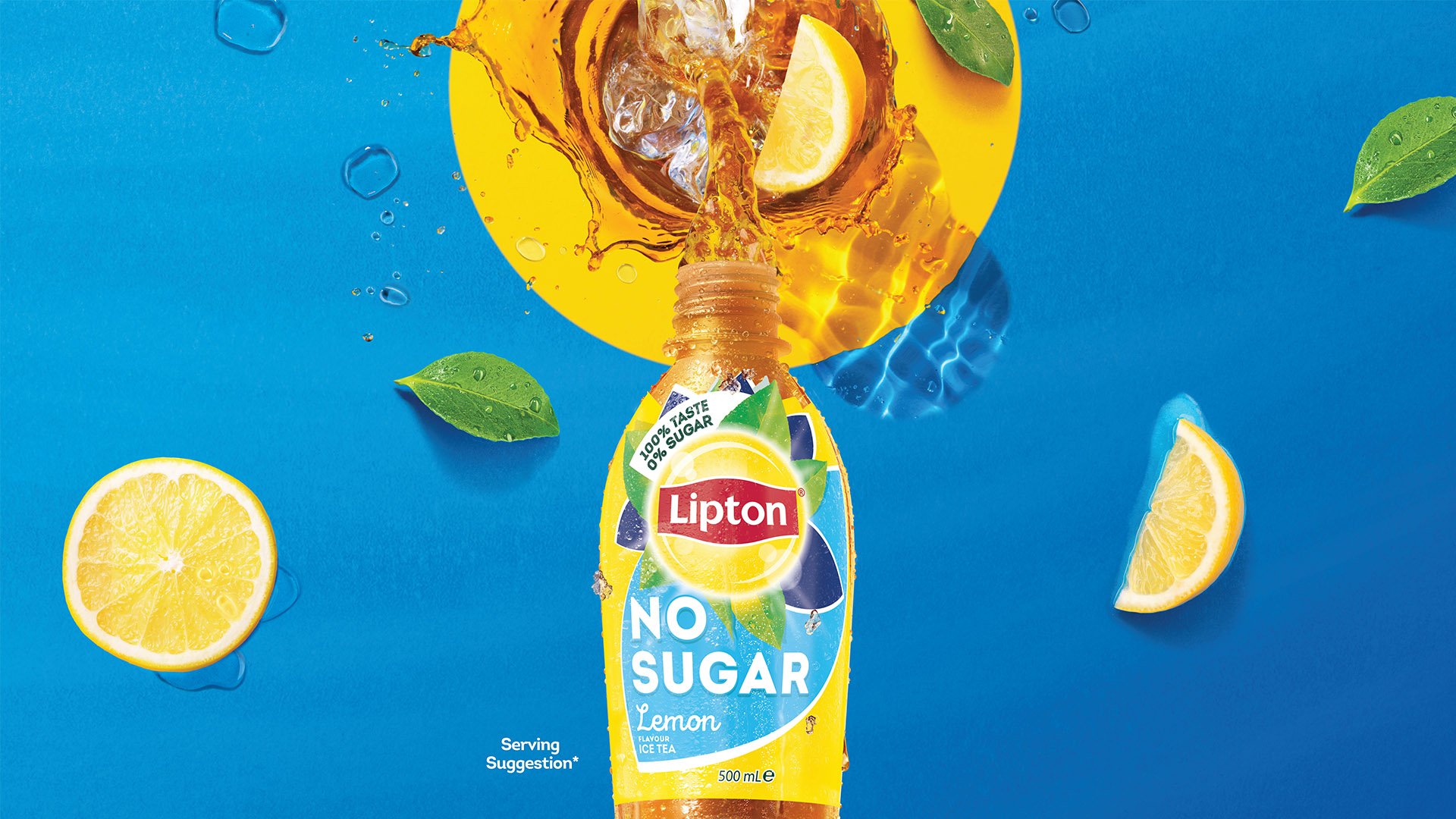
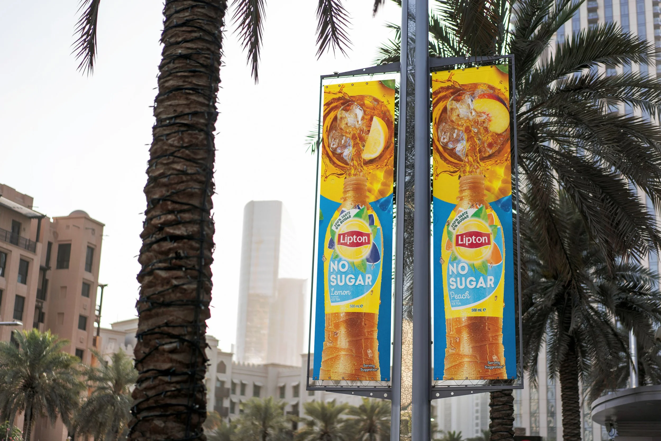
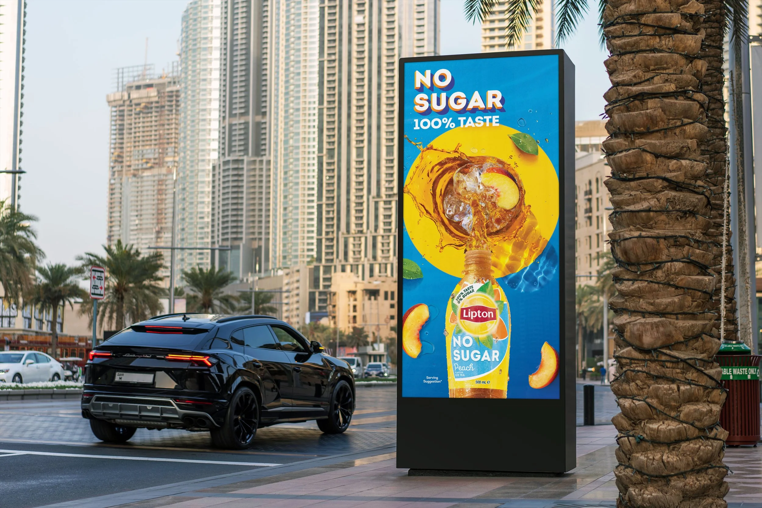
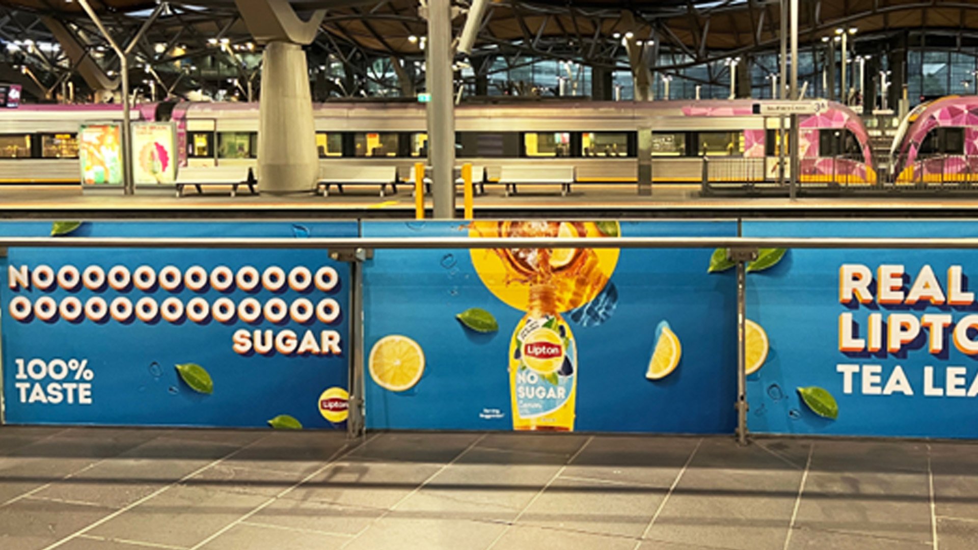
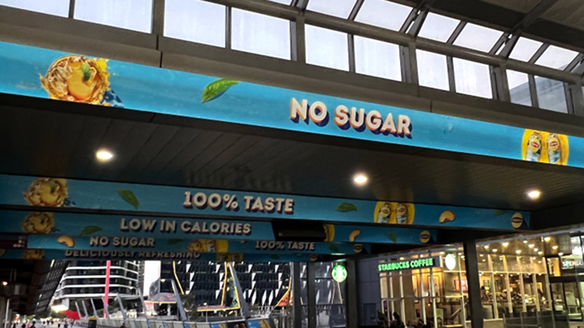
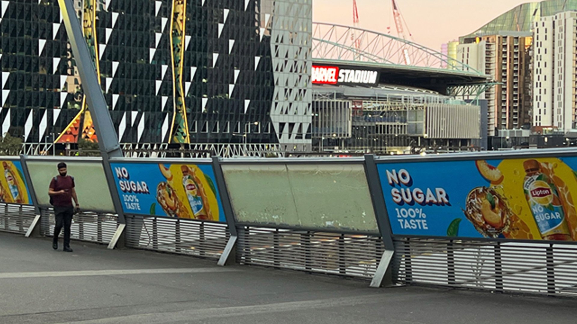
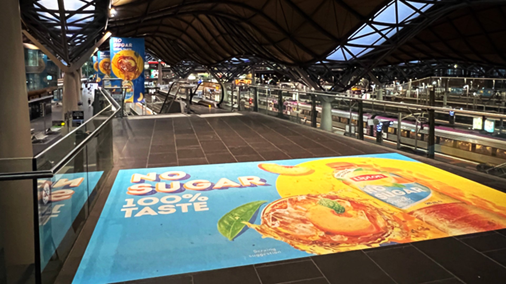
Lipton Ice Tea - No Sugar, Melbourne station takeover
A fabulous Out of Home (OoH) campaign as we let the people of Australia discover the No sugar range of Lipton Ice tea. We took over Melbourne train and Bus station in January 2023 as Australia ramp up their summer campaign.
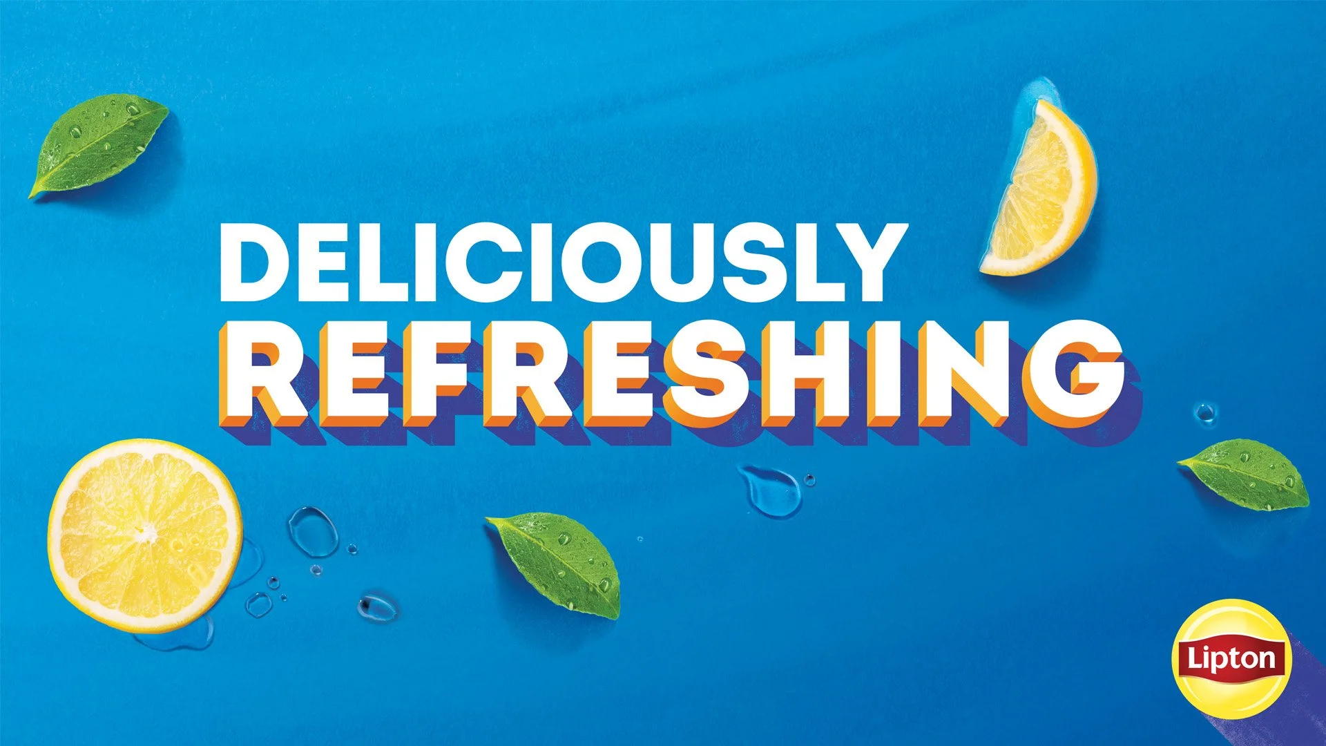
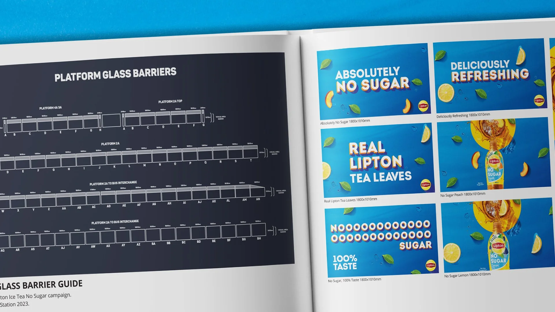
Flavours and Messaging
We started the campaign with only using two core flavours - No Sugar Peach and No Sugar Lemon. We then decided the core messages we wanted to get across to the Australian audience.
1. No Sugar, 2. Real Tea leaves and 3.deliciously refreshing.
One thing that sprung to mind in the process was thinking about commuter. If they were in a rush, would they know what brand was advertising to them. So as a solution we decided to add the Lipton logo on all graphics.


…and now for the Station Take-over


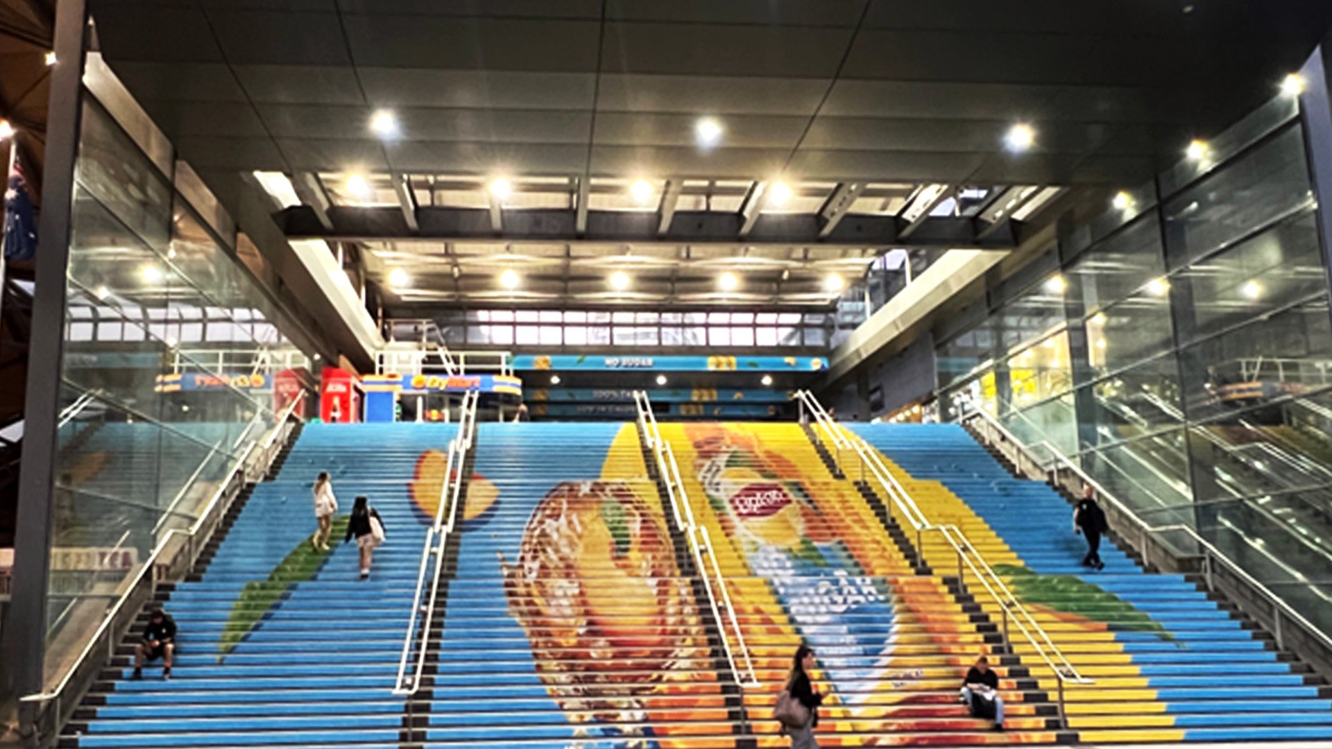
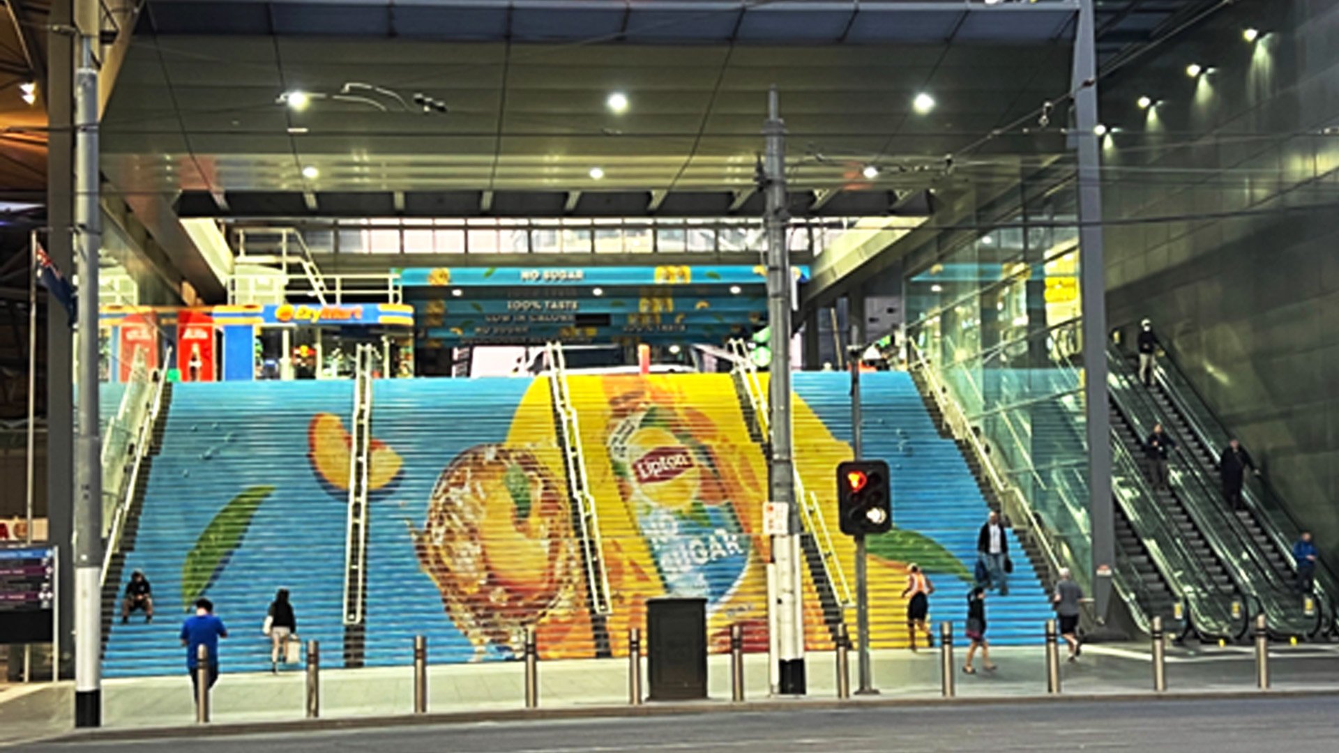
You’ve now arrived
Everywhere you turn there was some form of advertising from Lipton Ice Tea, In the Bus and Train Station and at multiple entrances. We delivered over 100 Print files for multiple placements. As part of this campaign Lipton Ice Tea Australia saw a 30% uplift in sales.
Delivery
Lift well Light box, Shaft Decal, Wall Glass Graphics, Floor Decal, Stair Risers, Double Sided Hanging Banners, Light box, Light Shaft box, Platform Glass Barriers, Main Entrance signage.
Lipton Ice Tea - No Sugar
Client: Lipton Ice Tea / Pepsi Lipton,
Project Scope: Social media, Editing, Motion Graphics, Graphic design,
Out of Home, Digital Out of Home
2023

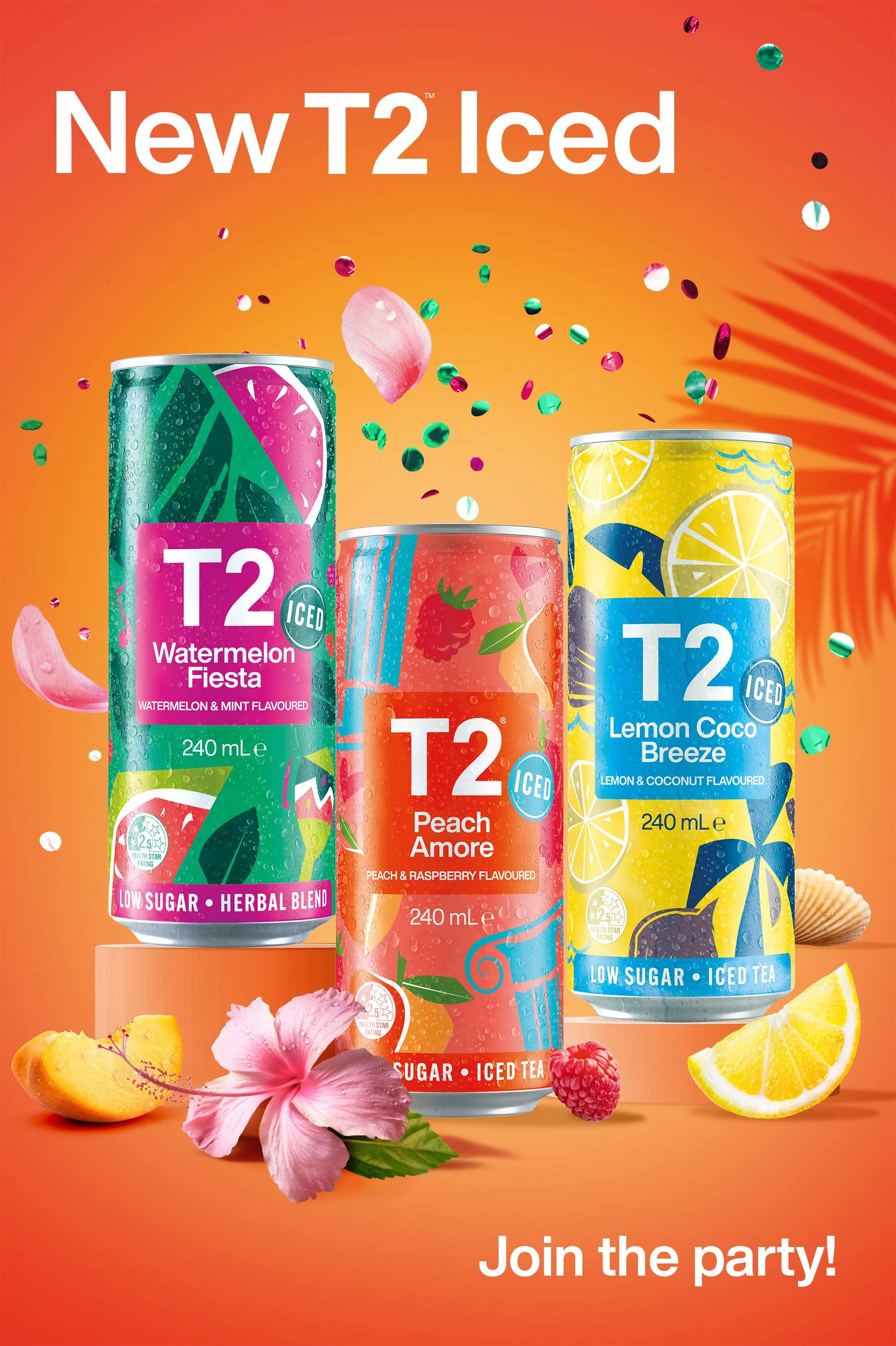
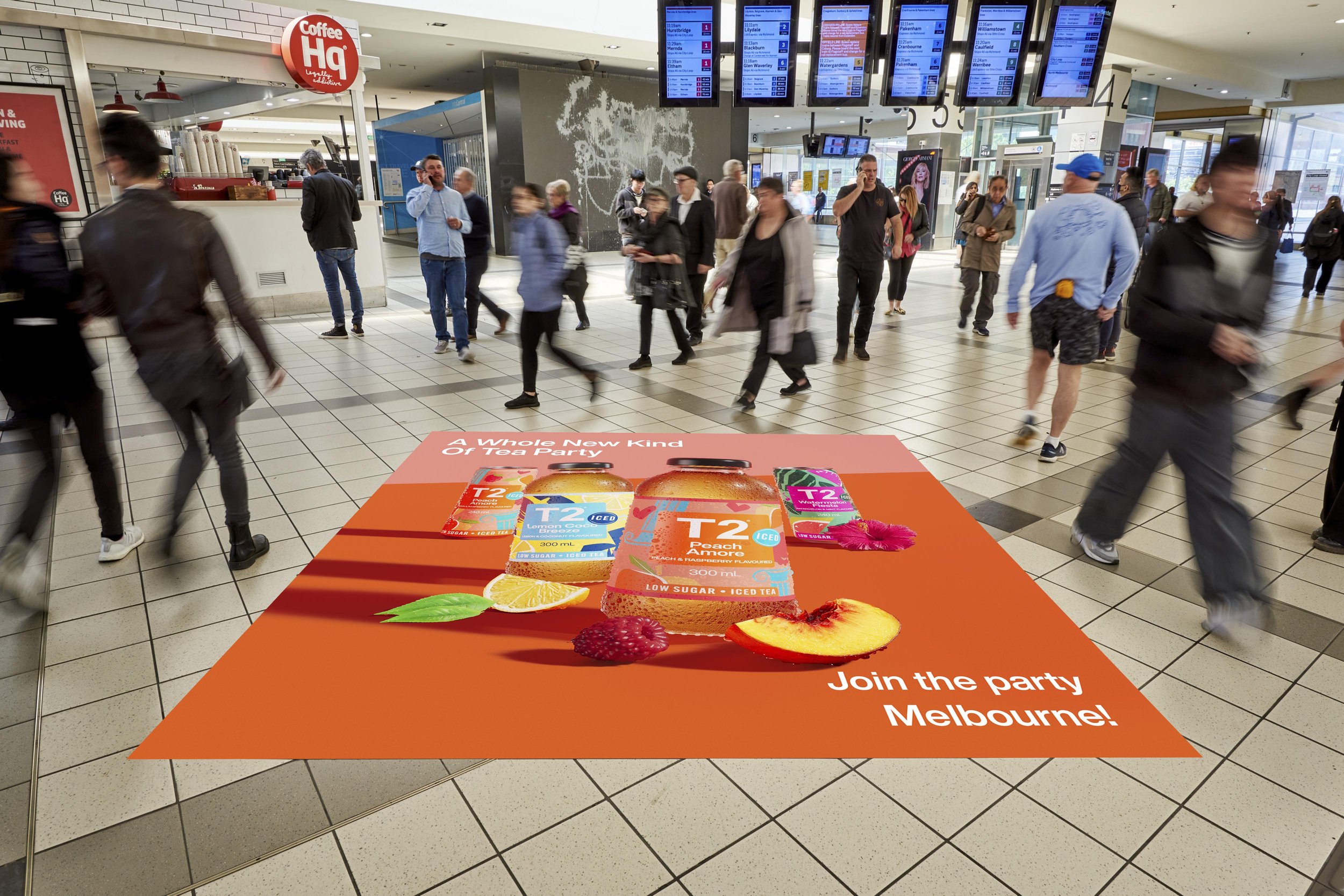
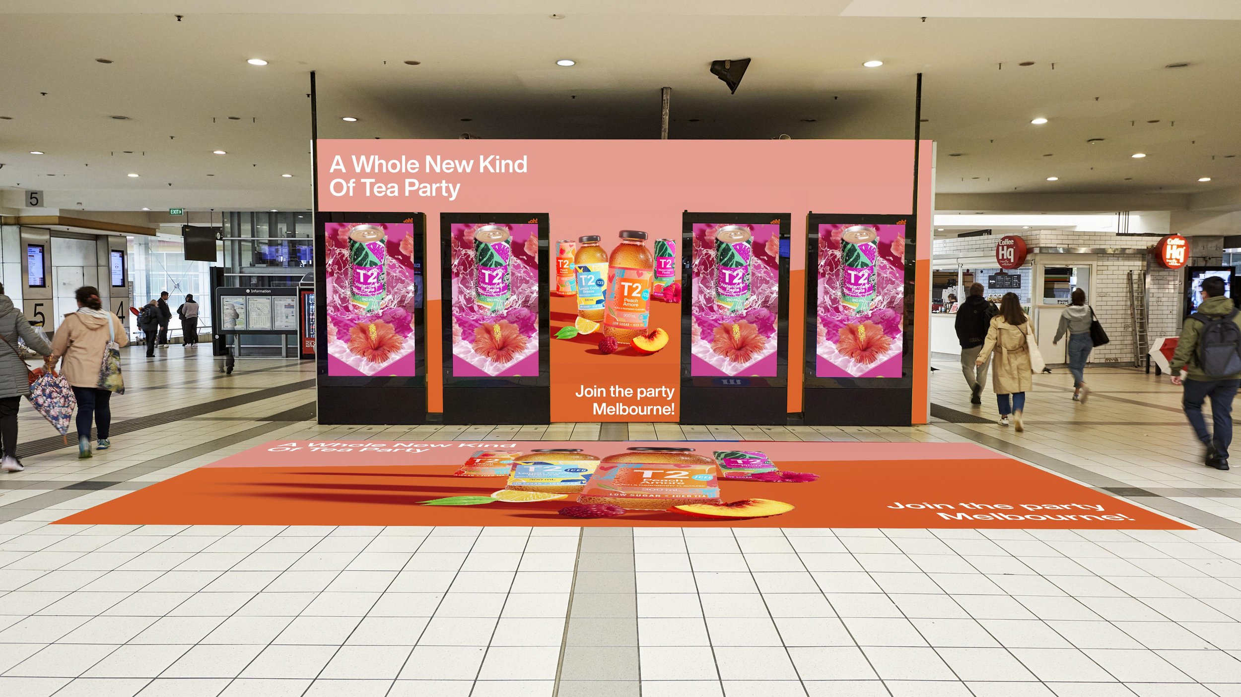
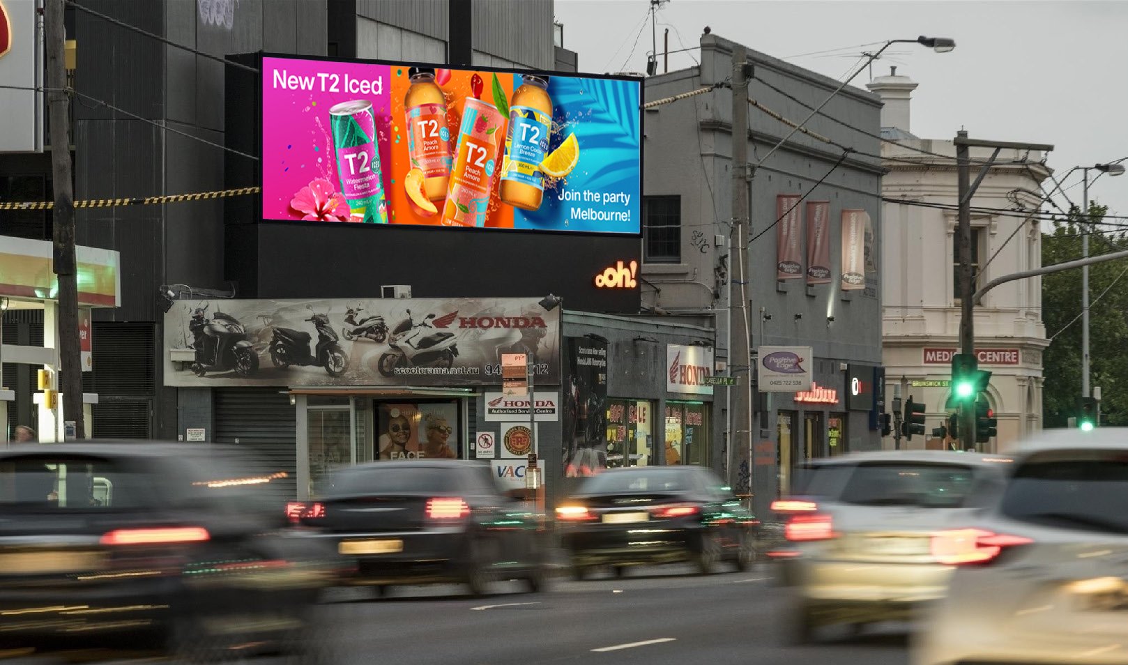
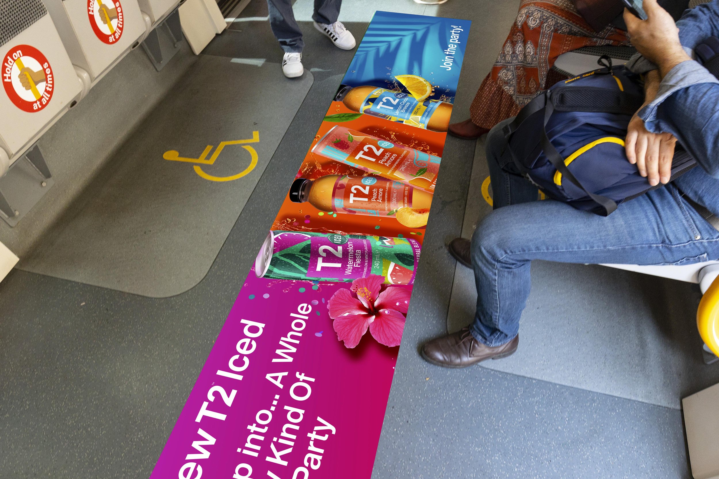
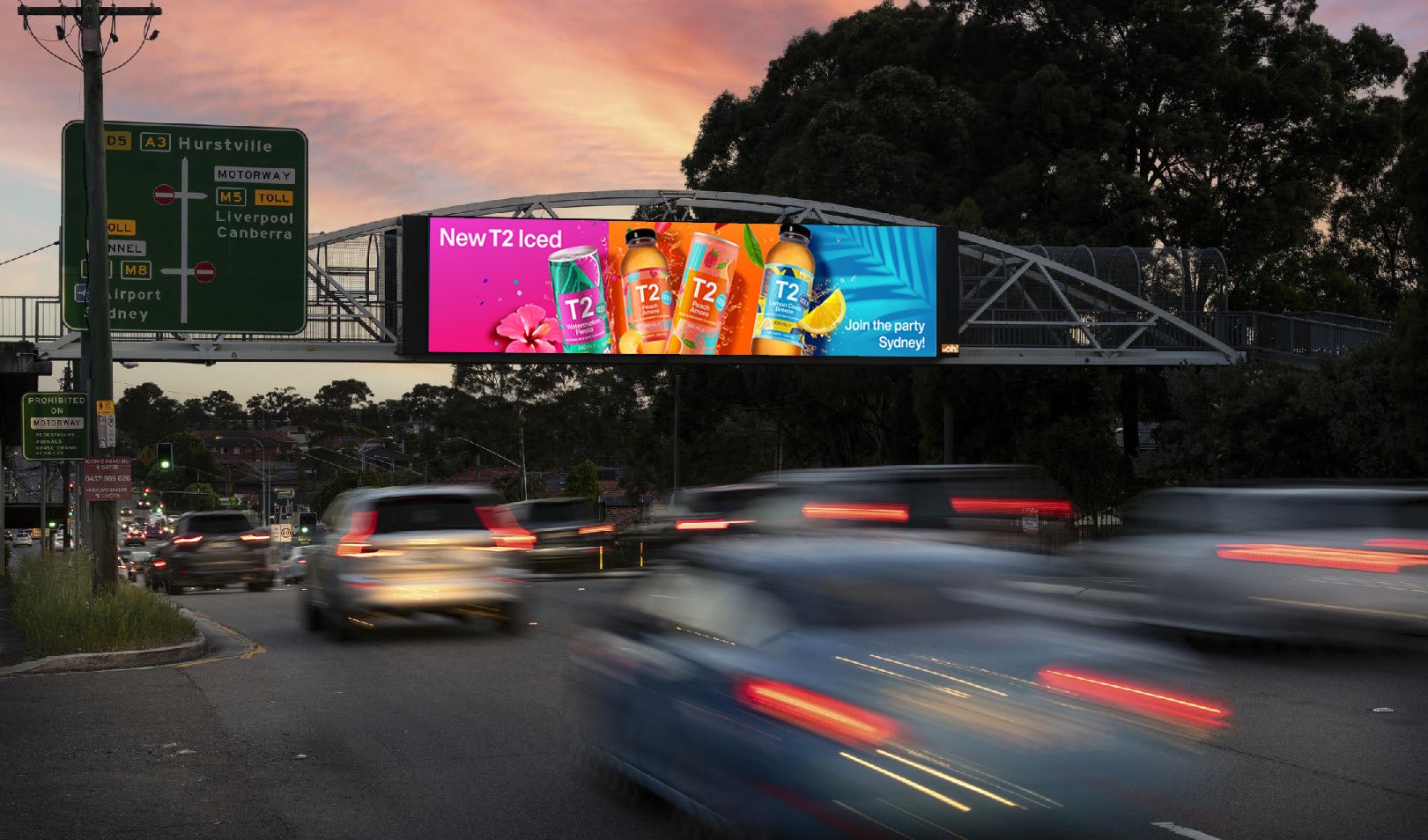
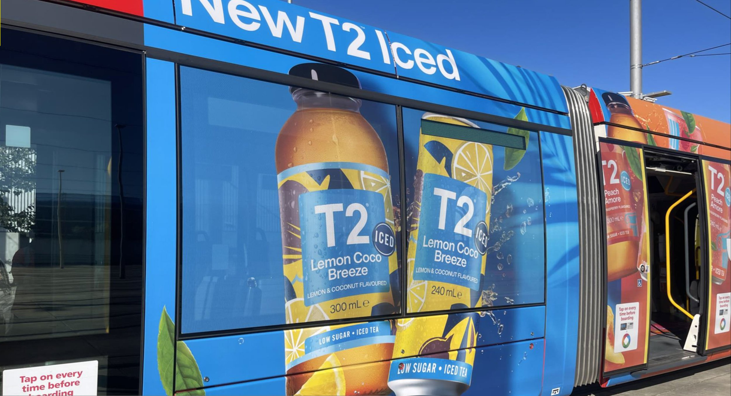
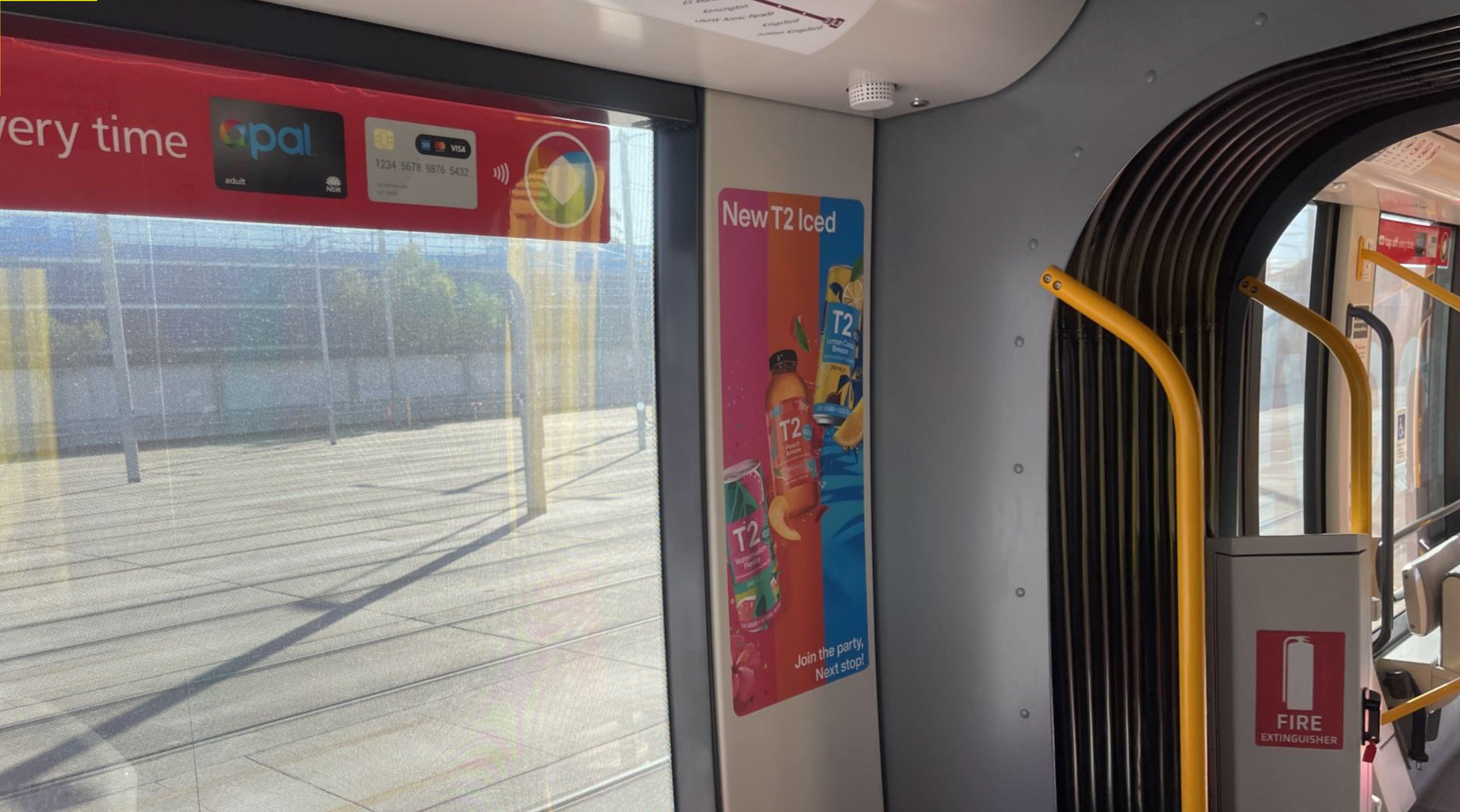
T2 Iced
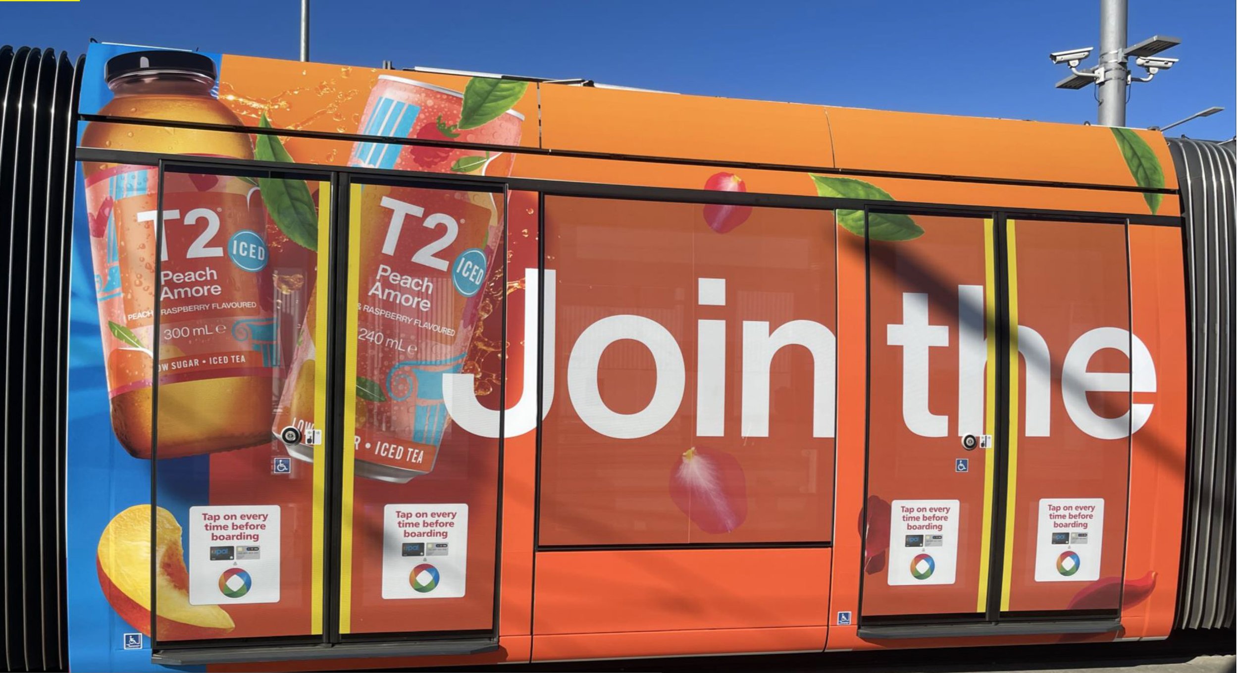
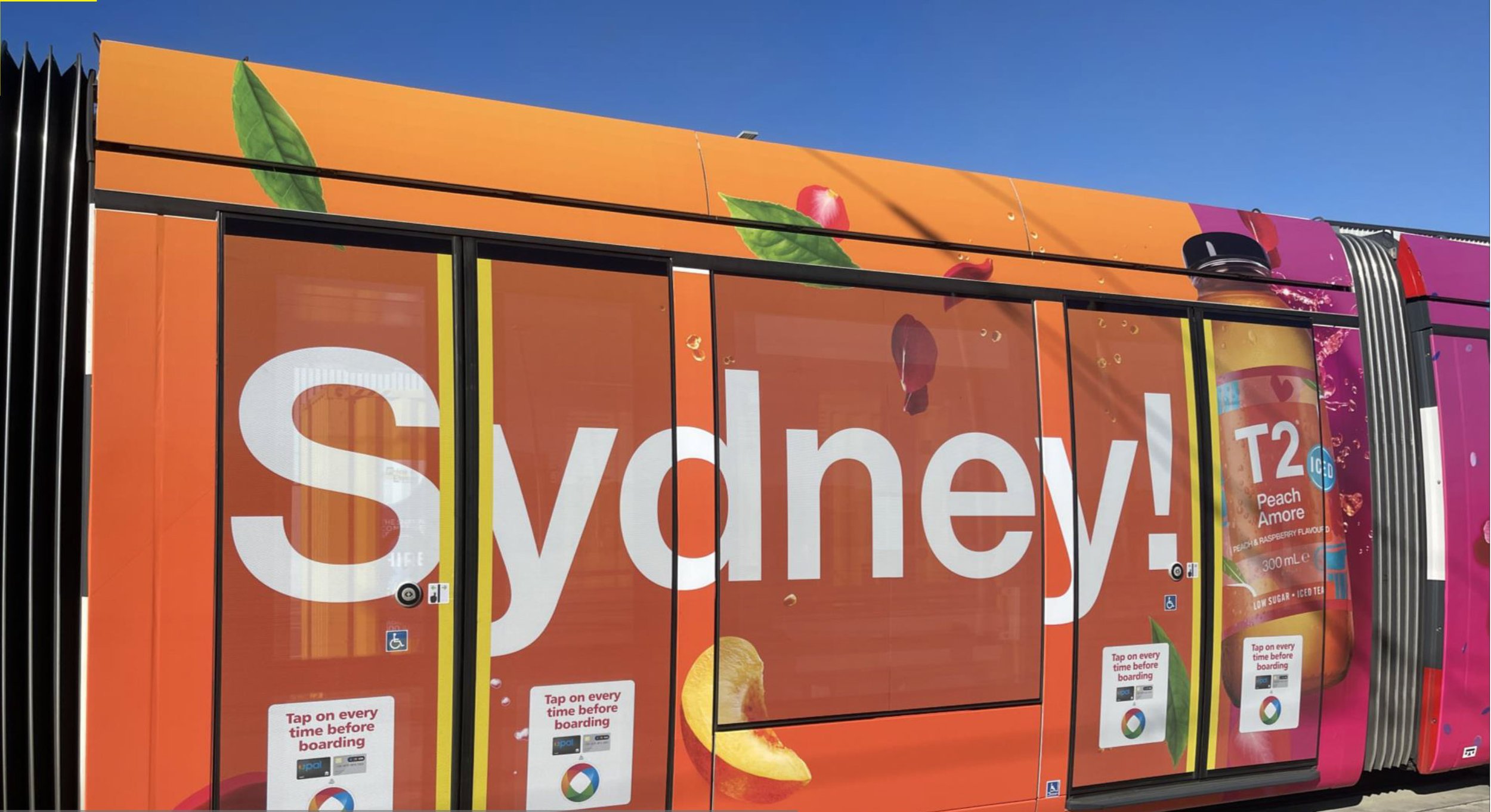
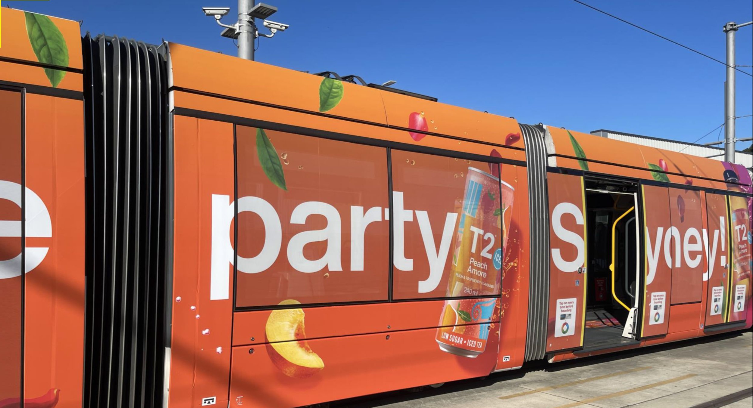
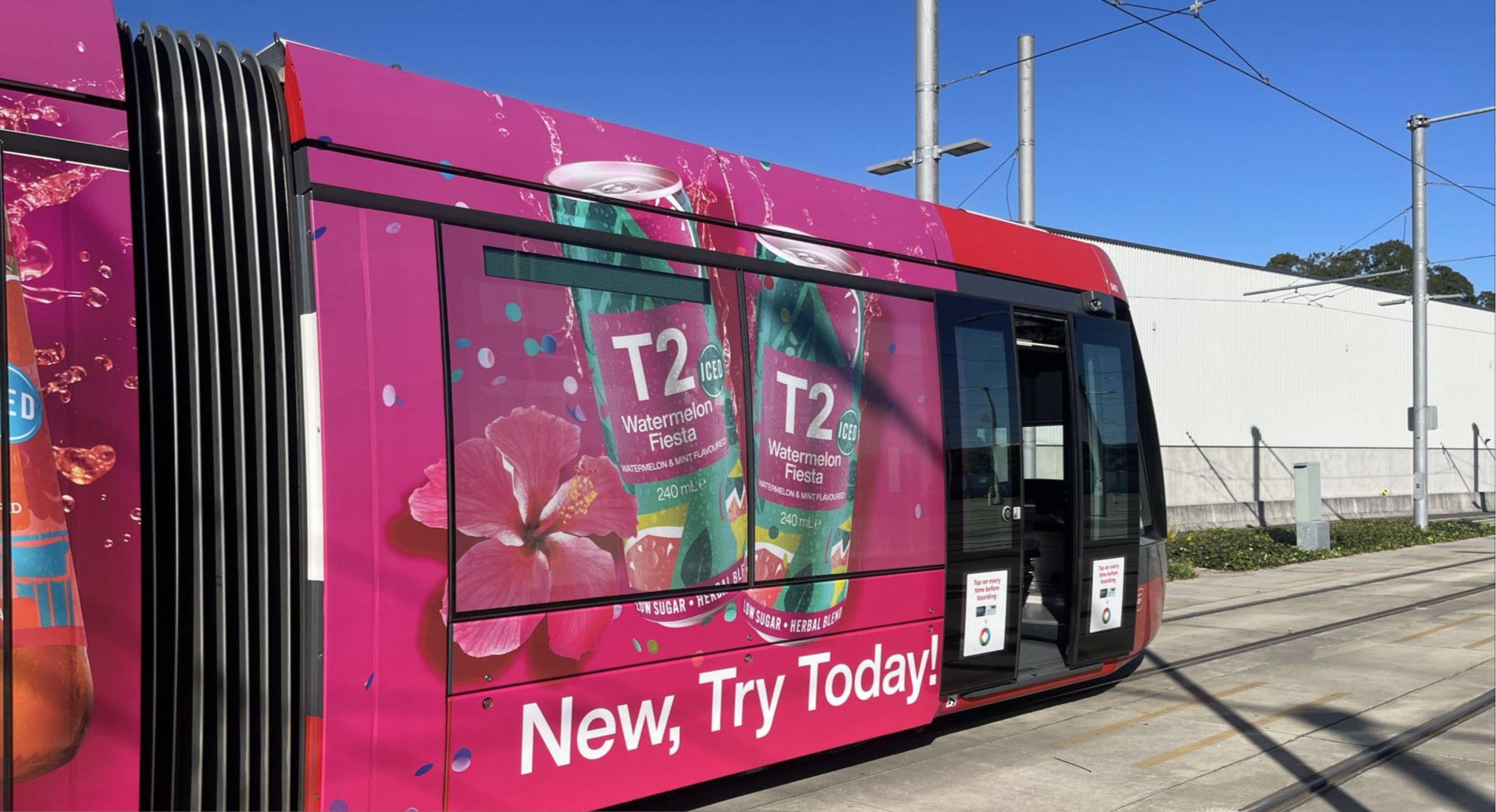
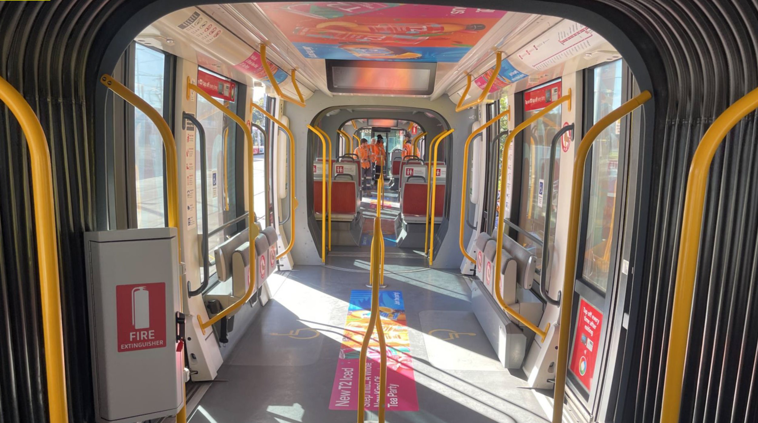
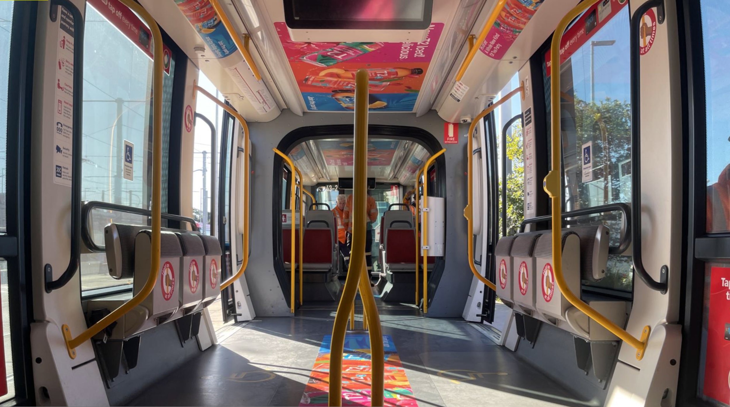
In 2023 T2 Launch their new Iced Tea range in Australia and pulled out all the punches as they introduced 3 mouth watering flavours: Peach Amore, Watermelon Fiesta and Lemon Coco Breeze. Our mission was to help drive awareness of these new products with Out of Home visuals for the wonderful people down under in sunny Australia

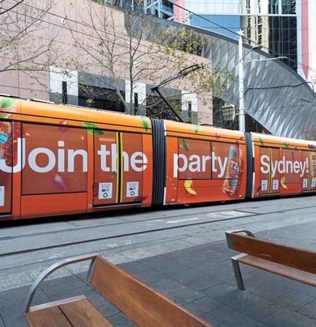
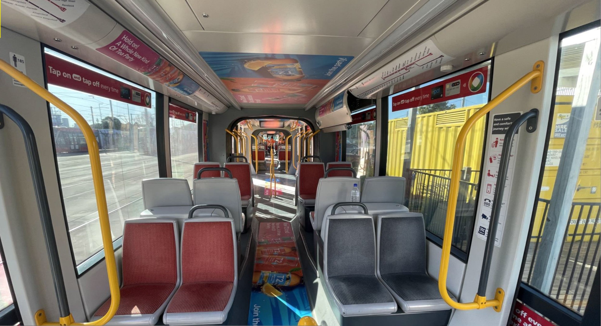
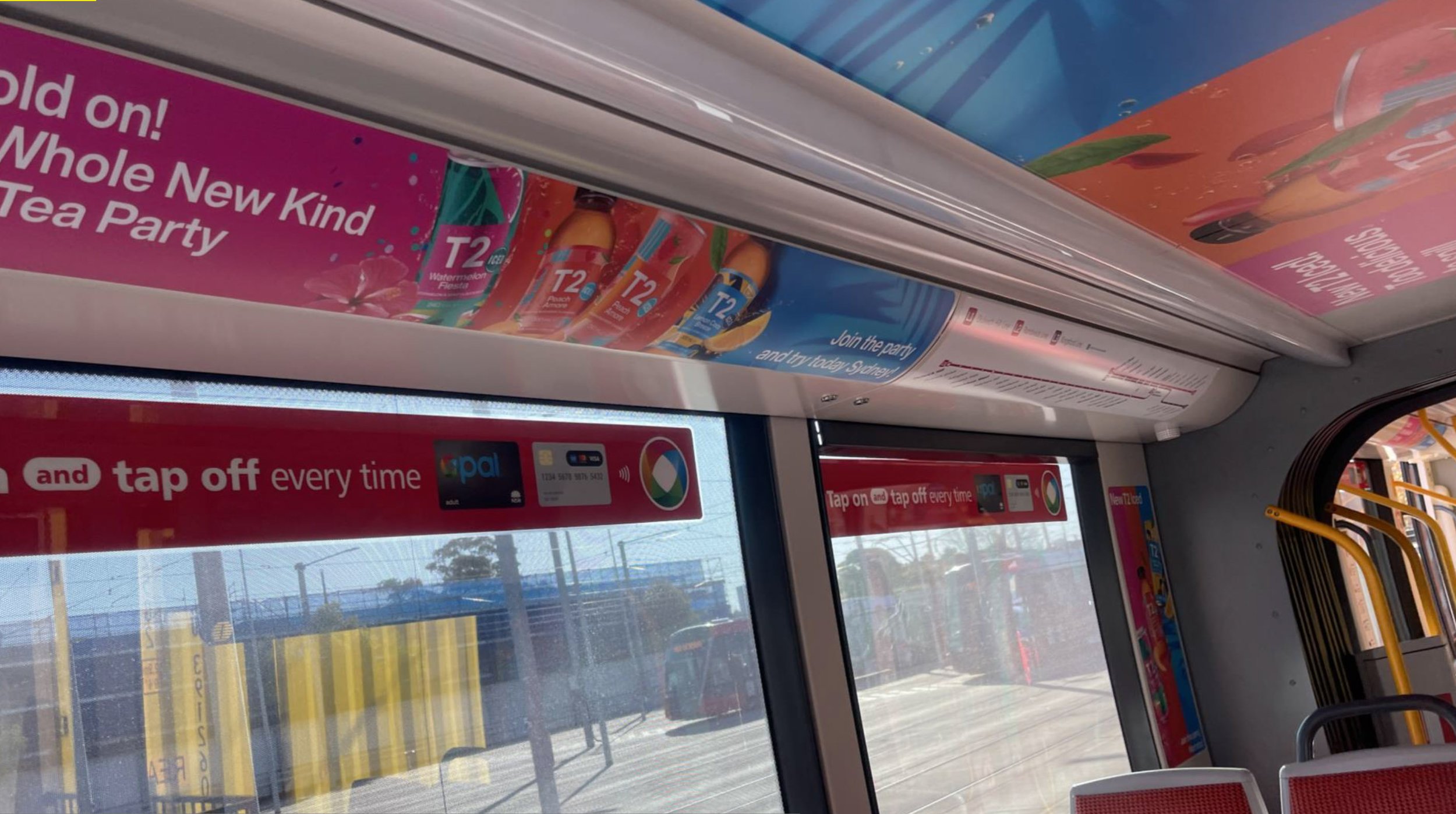
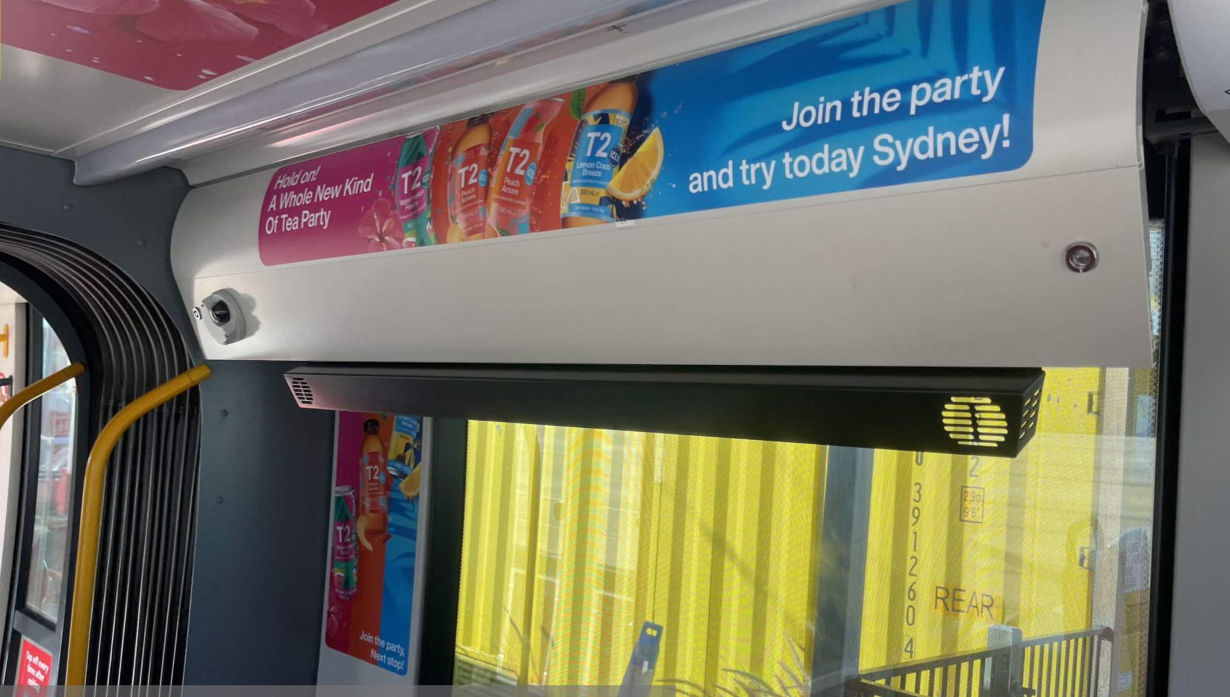
Join the Party
Getting the party started with confetti everywhere we celebrate the 3 new products, peach being its leading star. The key visual developed highlighted that the product comes in both Can and Bottle form.
We went in with the idea of having all 3 flavours together and not having them individually, like a bright party bringing everyone together.

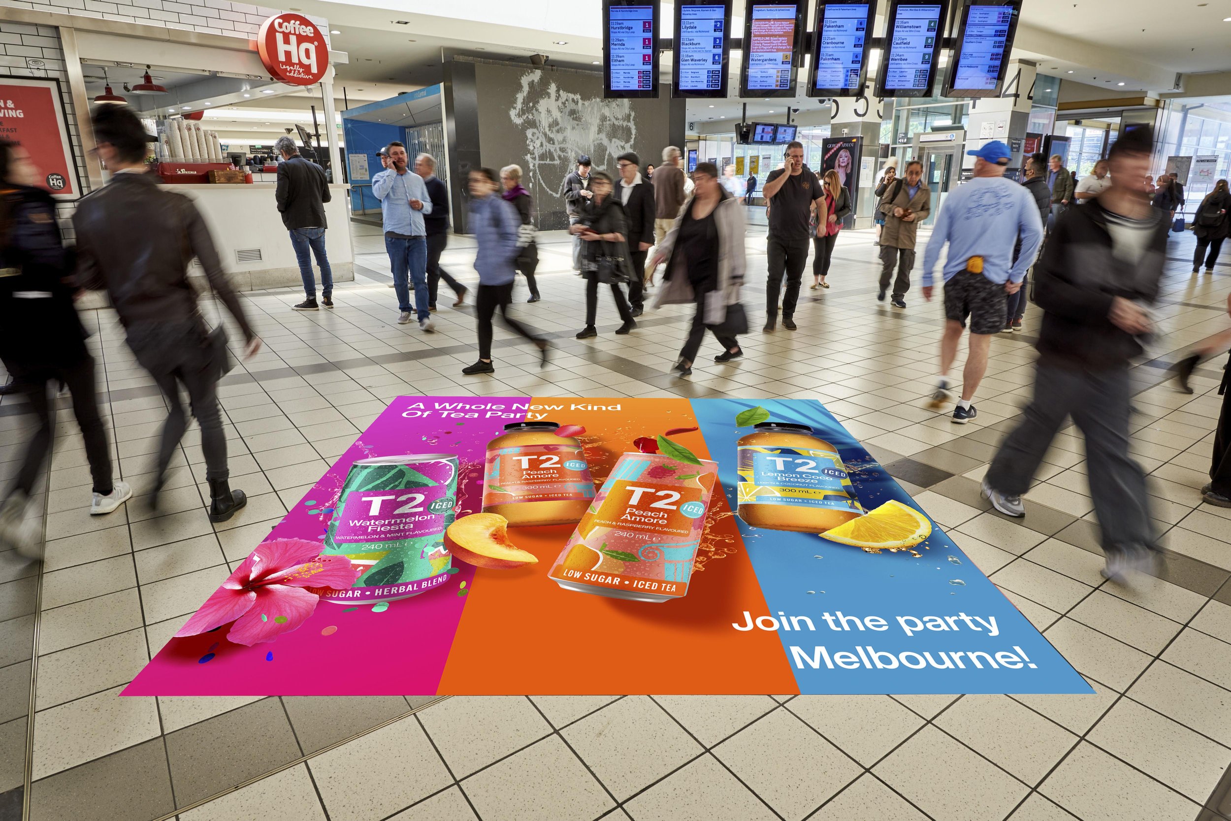
Put on a show
Building awareness we took over stations in Sydney, Melbourne and other locations in Australia with floor graphics, Digital billboards, a Tram wrap/takeover.
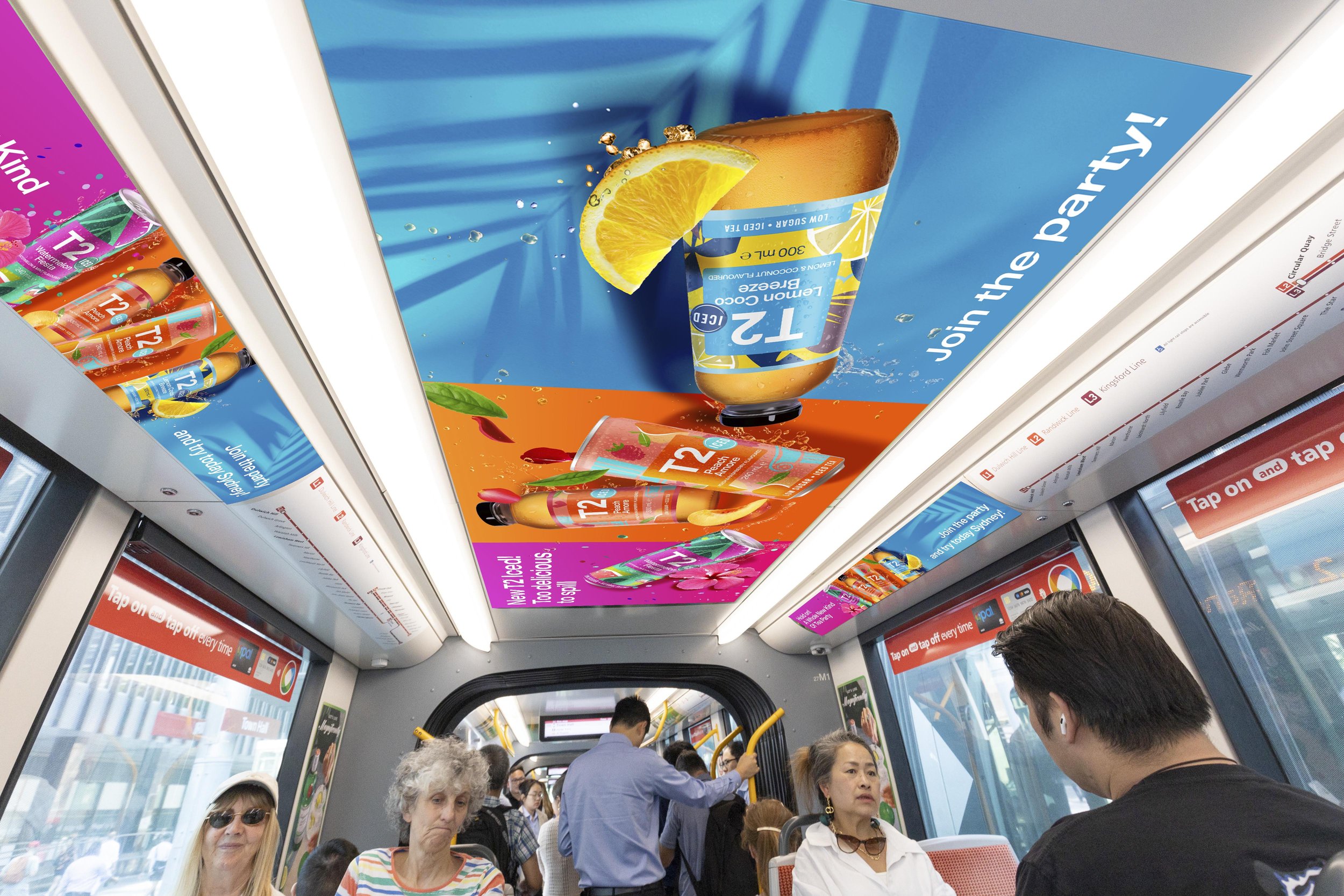
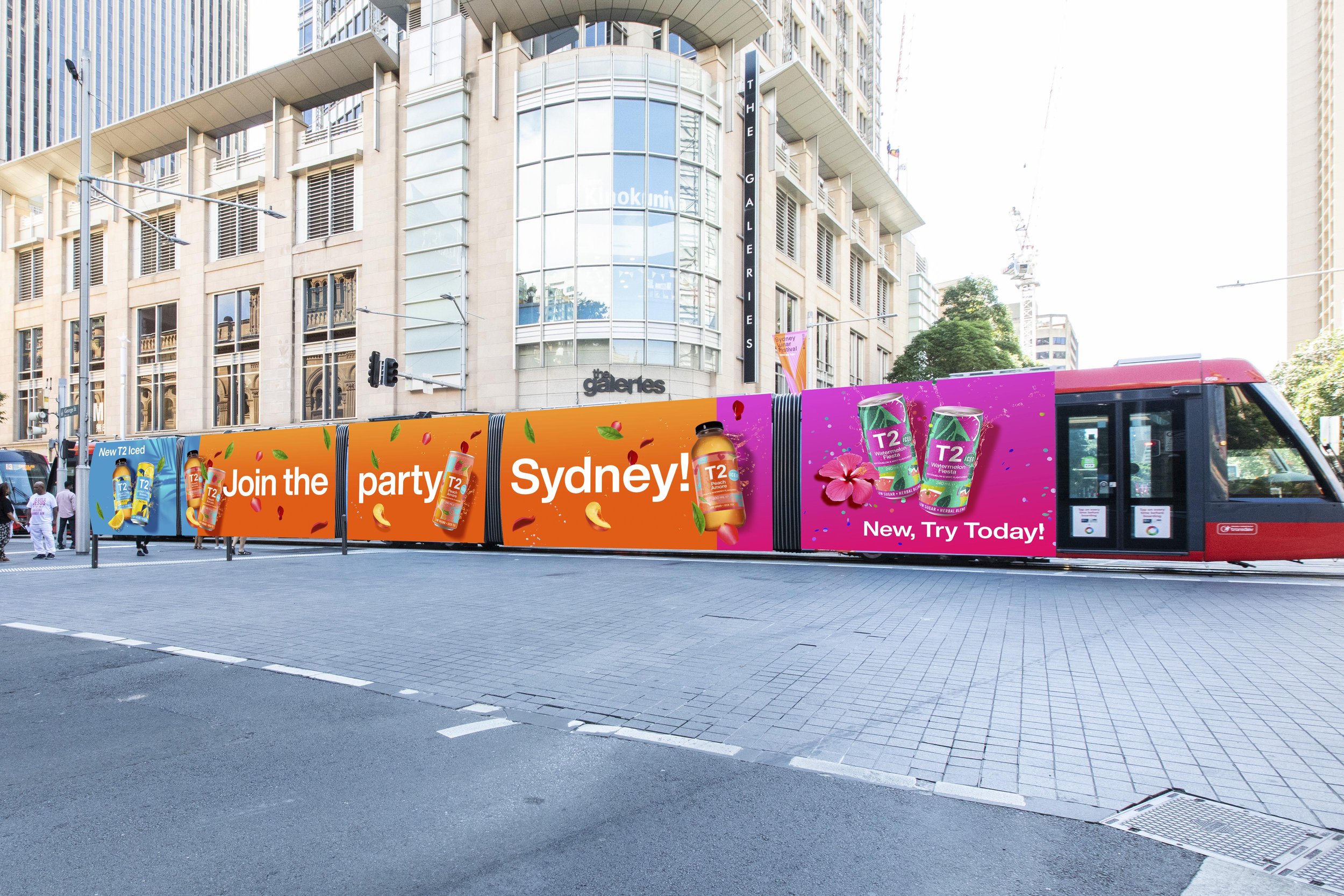


Tram Take over
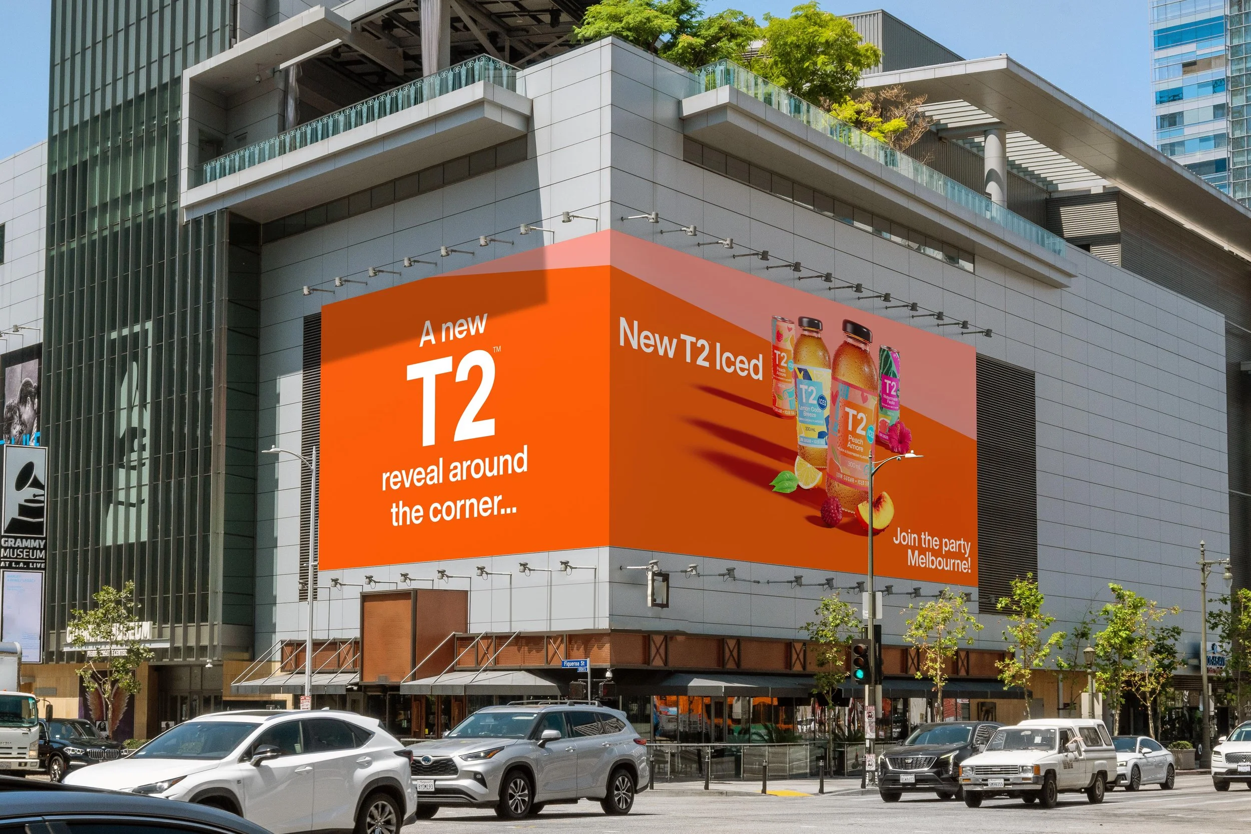
Around the Corner
Another out of home display was a corner billboard, leveraging a mix of bottle and can graphics.
Client: T2,
Project scope: Key Visuals, Tram wrap, Billboard ooh, DoOH
Graphic design, Creative Direction, Motion design
2023
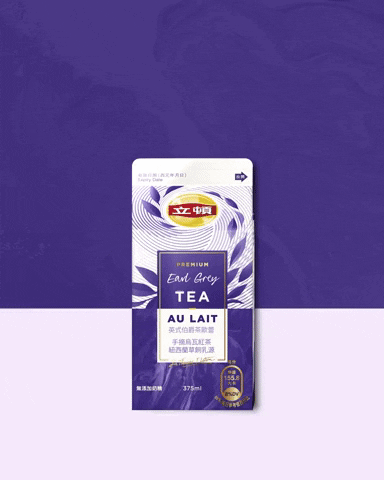
Lipton - Premium Tea Au Lait
With the successful launch in 2020, Lipton Taiwan knew they had a winner on for their premium milk tea range. Now jumping in to 2023, aimed at older demographic, this relaunch of milk tea is for those who love the combination of New Zealand sourced milk and a beautiful blend of black tea.
Why not both?
We developed short form :03s videos to promote the new launch of the product, targeting facebook and instagram users. We find ourselves following a Actor or should I say Singer who can’t choose what path to take. So why not Both? Just like the mix of Black tea and Milk.
The journey…
We toyed around with focusing on the tea leaves as a link between the product and the actor/campaign. Adding motion to his signature and the hand writing font to add a personal touch to the videos.
YouTube Bumpers
The original advert
Based on the original advert we optimised our short form video and YouTube Bumpers.
Client: Lipton Taiwan
Project scope: Digital Advertising, Social media advertising
Art Direction, Motion Graphics
2023
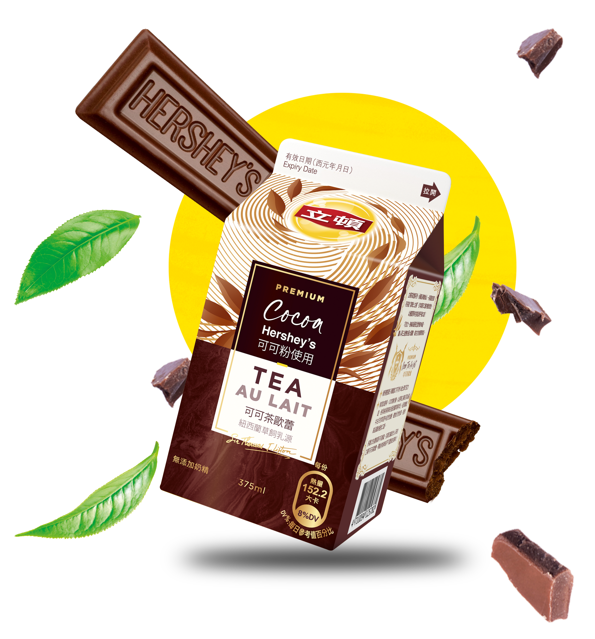
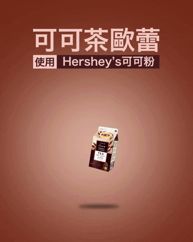
Tea Au Lait - Hersey Colloboration
In 2021 Lipton Taiwan and Hershey’s collaborated on a fun limited edition flavour - Hershey Cocoa. To promote the product and launch we created a short form social media adverts on Facebook and Instagram.
Early Mix - Storyboard and concepts
Quick storyboard and drafts for the :03s adverts. My approach was to highlight the burst of flavours through key the ingredients. Milk, tea leaves and the addition of the Hershey cocoa (Chocolate).

The final sip
The final outcome, a :03s advert fir the new product and a successful campaign. We scored high in engagement rates click through rates.

Client: Lipton Taiwan / Pepsi Lipton,
Project scope: Social media advertising
Creative Direction, Motion design, Graphic design
2021
With Milk Tea being the staple of Lipton Taiwan, we worked closely with he Taiwan team to create quick social media adverts for their portfolio of products. These are a collections of multiple campaigns spanning across 2021-2022. Portfolio includes premium products (Tea Au Lait) to a range of everyday milk tea flavours.
Tea Au Lait

Tea Au Lait - Hershey's collaboration
In 2021 Lipton Taiwan and Hershey’s collaborated together on an exciting Premium Tea Au Lait flavour. Hershey’s cocoa was a fun limited edition release. To promote the product and launch we created a short form social media advert for Facebook and Instagram to show the bursting flavour.
Oct 2021


Premium Tea Au Lait
With a successful launch of the Premium Tea Au Lait in 2020 we worked on a short form social media advert to target a major audience in 2021. Fun, elegant, premium was our core focus in creating these ads for a facebook audience,
July 2021

Social media adverts that went along side a new Taiwan Milk Tea advert Let’s have some fun - Milk tea campaign.
September 2022
Let's Have fun


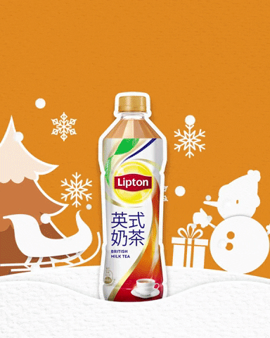
Christmas in Taiwan
Celebrating Christmas with fun, we worked on a cool paper-cut out style advert to celebrate the launch of the Strawberry Milk tea flavour. New seasonal bottles for the strawberry flavour was the main attraction for this sequence/advert. Nov/Dec 2021
Nov/Dec 2021
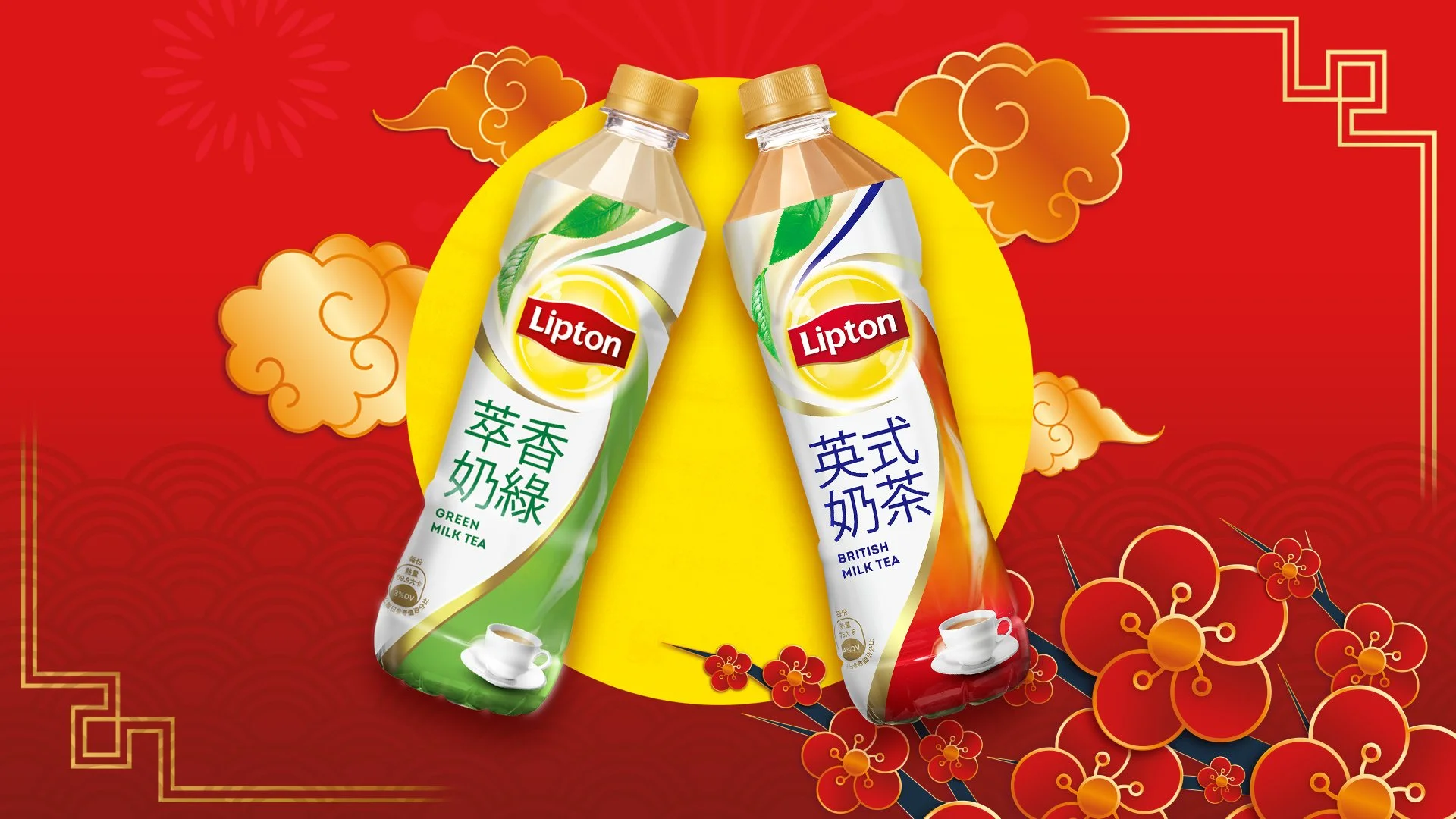
Chinese New Year 2022
Quick Social media adverts for the guys at Lipton Taiwan, 2023 Chinese new year. Year of the Rabbit. Happy Chinese New Year.
January 2023
Chinese new year 2023
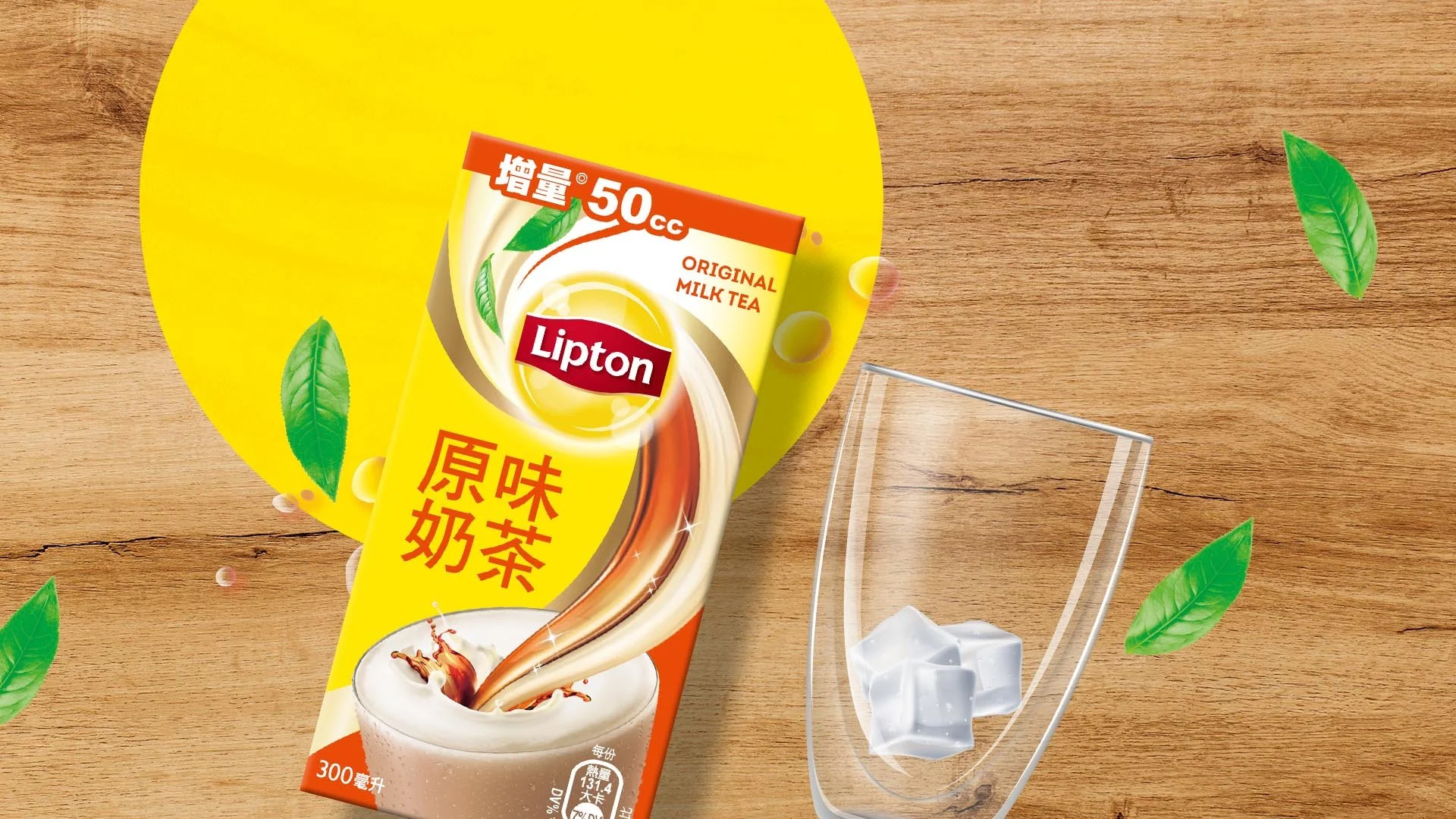

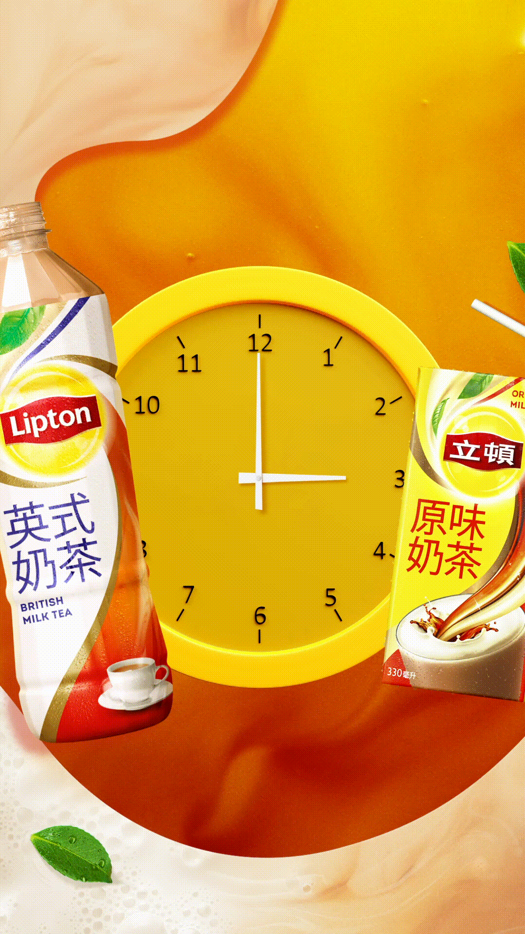
Milk Tea Advert
Unique creative adverts for Lipton Taiwan, showing the range of flavours in their portfolio
June 2021
Lipton Milk Tea
Client: Lipton Taiwan / Pepsi Lipton, 2021 - 2022
Project scope: Social media advertising
Creative Direction, Motion design, Graphic design
Next Project
Share Some Sunshine
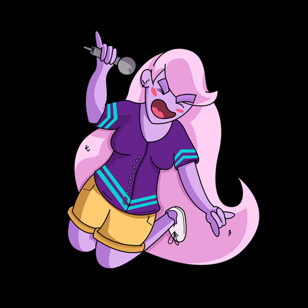
Step away from your screens and get outside. Lipton’s 2021-2022, Share Some Sunshine campaign encourages people to step outside, enjoy the sun and spend quality time with your mates. A key message coming out of the 2020-21 Covid pandemic.
The Brief
The Brief: Adapt the new TVC adverts for social media purposes, targeting a Gen Z audience. How can Lipton best reach a newer audience that doesn’t watch TV?
Execution: Understanding that Gen Z was our targeted audience, a generation known to not watch as much TV compared to the others, we decided to repurpose the TVC adverts for social media with a time length of 3 or 6 seconds. This meant we really had to land the message straight away.
The Product and market
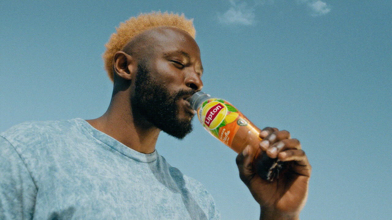
One of the starting points for this campaign is understanding that Lipton Ice teas has many flavours. Individual markets or countries have their own key flavours. Peach Ice Tea is a big seller in France and would be our key market working on this brief.
Developing the social adverts
Taste
Early in the process we understood the areas of exploration. Taste is a key favour into why we buy a product to drink. How can we land this message instantly in 3 seconds? Are there any key moments or shots from the advert we could use to get this message across?
Here’s the results…
Green no sugar
Flavour and permissibility is another angle we tried to explore and here’s the results.
Reinventing Cinemagraphs
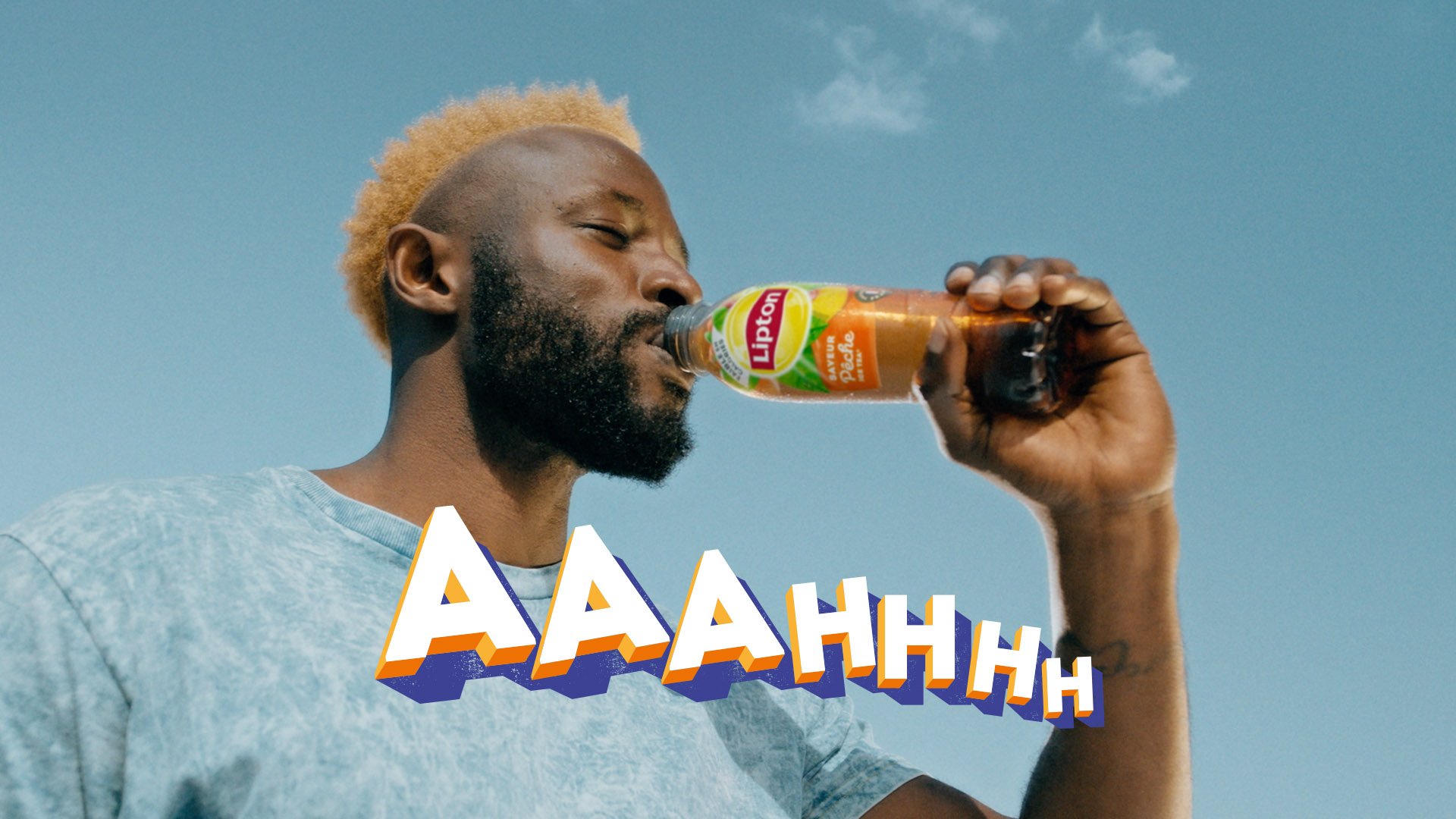
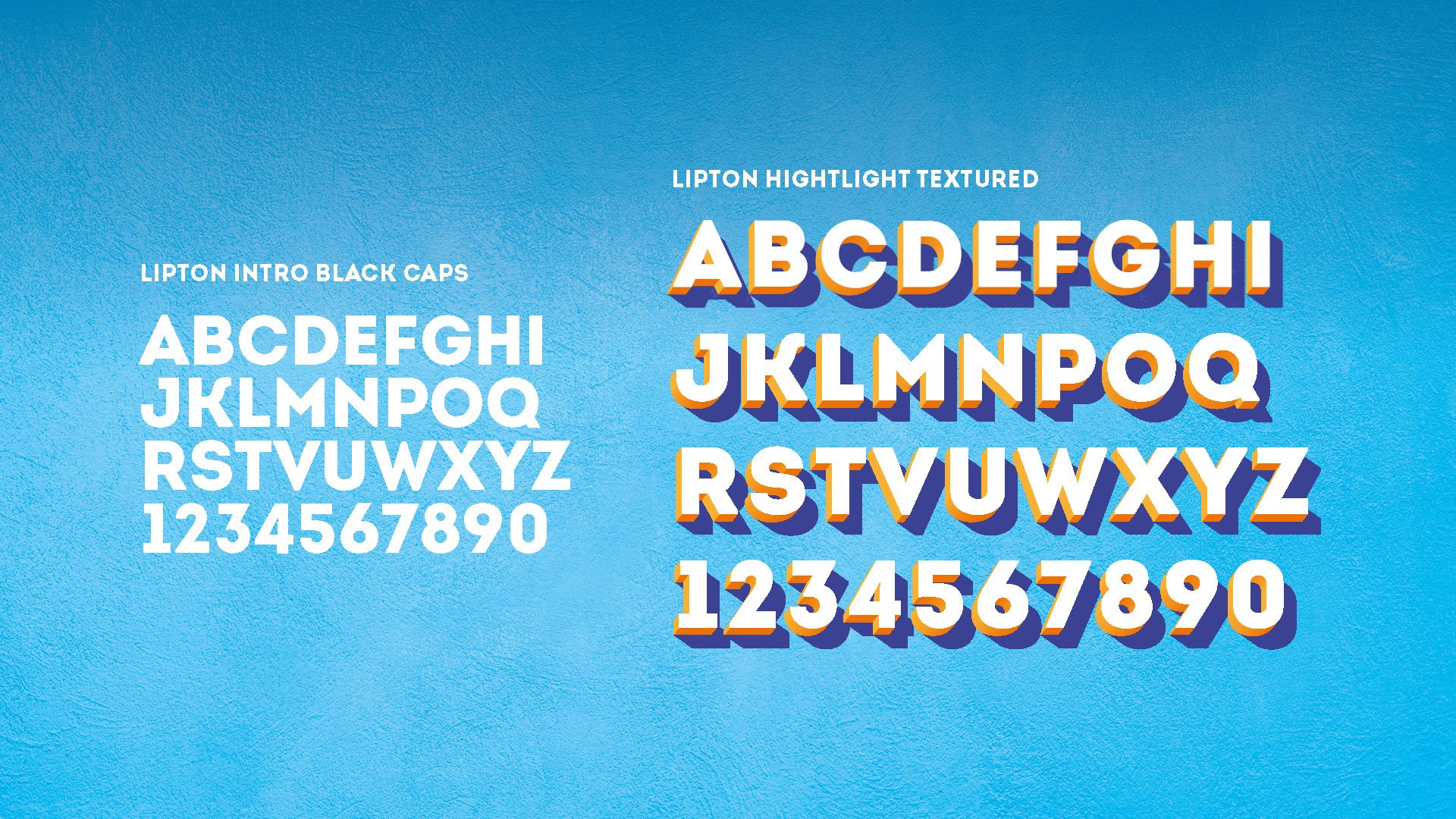
In our experiment, we tested the idea of using one shot to land the message, we all felt the drinking shot was the key on to drive with. This gave me the opportunity to animate the custom Lipton font to give a refreshment/enjoyment cue to the cinemagraph and play around with the footage.

the Results
Movement, text animation and the peach rotation animation brought of excitement to the video, combined with pick-up bottle shot, this became our best performing video, when we end into testing.
When we went into testing phase we soon understood that a drinking shot/ clear product shots were a clear winner with our target audience. Adding an “Aahhh” text animation also made the video unique. Both drinking shots and the text animations were great cue for refreshment and enjoyment.

While we were still building our learnings, we soon realised what assets worked best for instagram in-feed and what worked best for stories. Cinemagraphs or asset that focused on just one shot did well in testing.
Tik Tok versions
Putting it all together


Lipton Ice Tea
Client: Lipton Ice Tea / Pepsi Lipton
Project Scope: Social media, Editing, Motion Graphics, Graphic design
2021-2022
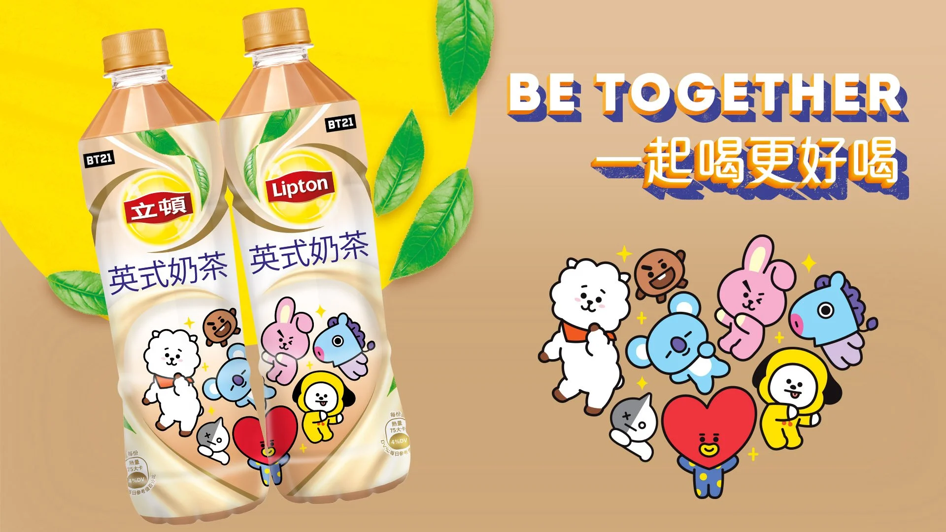
BT21 - Be Together
One of the most important things is life is friendship and togetherness. This is a value that Lipton Ice Tea/Taiwan hold strong too. This lead to an exciting collaborations with BT21(from The K-Pop group BTS) and launching limited editions back.
The Brief
I developed :06s and :12s YouTube Bumpers to promote this spectacular collaboration. It was important to us to adapt the milk tea campaign to the current Lipton ice tea look and feel. The bottles are positioned in a top down view.
Storyboards
As part of the development for this campaign I created :06s and :12s storyboards for the bumpers. One challenge I found in the process was having to find a way for all characters to appear on screen at the same time, meaning no individual character could have the spotlight at any moment in the adverts.
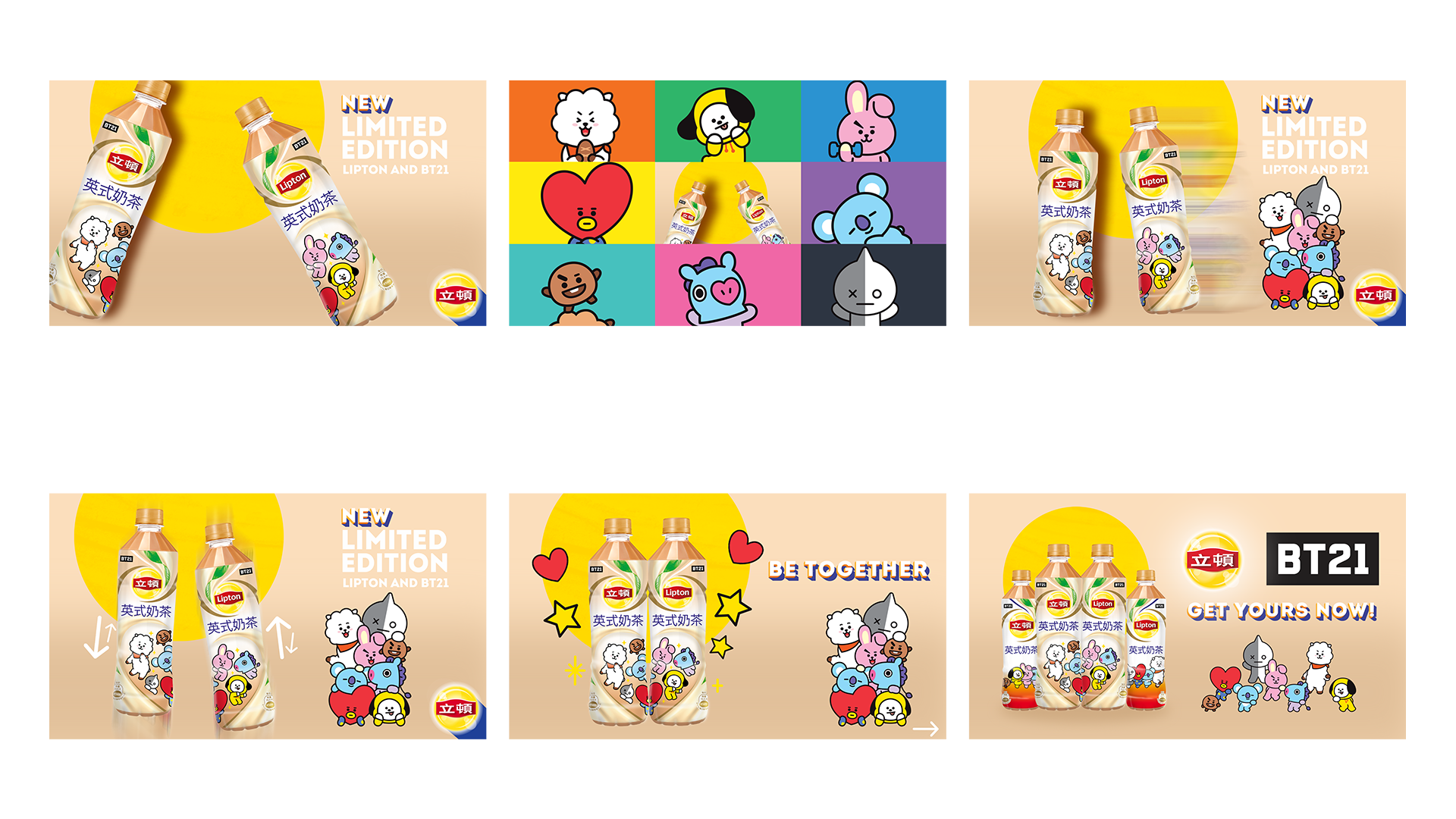
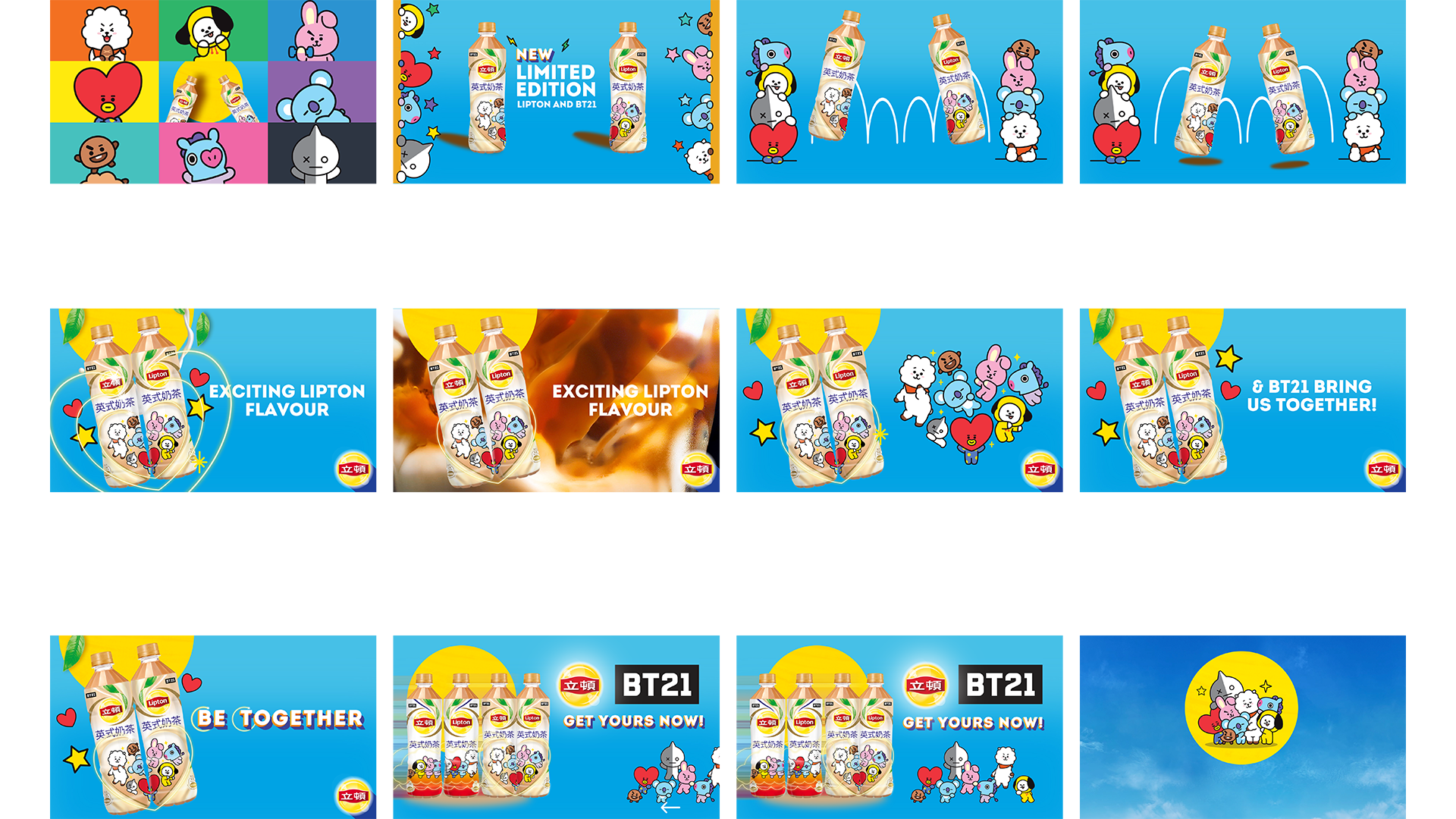
Close out together
The final bumpers x2 :06s Bumpers and a :12s version. A fun collaboration between BT21 and Lipton Taiwan.

Client: Lipton Taiwan, BT21,
Project Scope: YouTube Adverts, Social media post
Creative Direction, Motion design, Graphic design
2022
With Milk Tea being the staple of Lipton Taiwan, we worked closely with he Taiwan team to create quick social media adverts for their portfolio of products. These are a collections of multiple campaigns spanning across 2021-2022. Portfolio includes premium products (Tea Au Lait) to a range of everyday milk tea flavours.
Tea Au Lait
Tea Au Lait - Hershey's collaboration
In 2021 Lipton Taiwan and Hershey’s collaborated together on an exciting Premium Tea Au Lait flavour. Hershey’s cocoa was a fun limited edition release. To promote the product and launch we created a short form social media advert for Facebook and Instagram to show the bursting flavour.
Oct 2021
Premium Tea Au Lait
With a successful launch of the Premium Tea Au Lait in 2020 we worked on a short form social media advert to target a major audience in 2021. Fun, elegant, premium was our core focus in creating these ads for a facebook audience,
July 2021
Social media adverts that went along side a new Taiwan Milk Tea advert Let’s have some fun - Milk tea campaign.
September 2022
Let's Have fun
Christmas in Taiwan
Celebrating Christmas with fun, we worked on a cool paper-cut out style advert to celebrate the launch of the Strawberry Milk tea flavour. New seasonal bottles for the strawberry flavour was the main attraction for this sequence/advert. Nov/Dec 2021
Nov/Dec 2021
Chinese New Year 2022
Quick Social media adverts for the guys at Lipton Taiwan, 2023 Chinese new year. Year of the Rabbit. Happy Chinese New Year.
January 2023
Chinese new year 2023
Milk Tea Advert
Unique creative adverts for Lipton Taiwan, showing the range of flavours in their portfolio
June 2021
Lipton Milk Tea
Client: Lipton Taiwan / Pepsi Lipton, 2021 - 2022
Project scope: Social media advertising
Creative Direction, Motion design, Graphic design

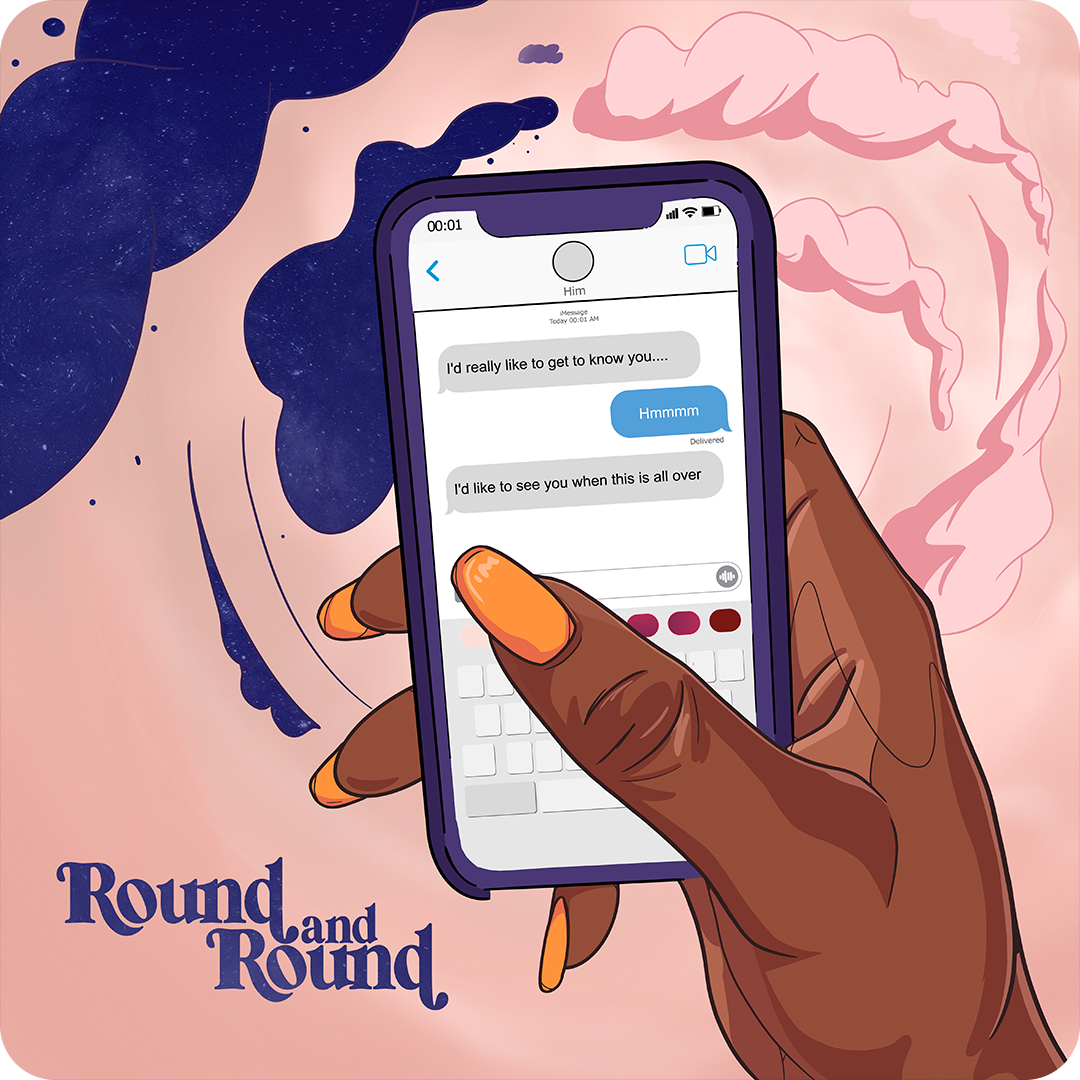
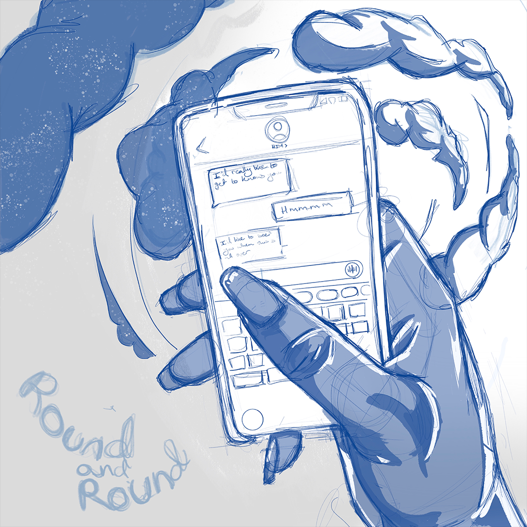
Round and Round
Working closely with singer/songwriter Zoé Collins (a British Nigerian artist) this was our 4th time working together on a single cover - Round and Round. This song explore the awful talking stage and going through the motions with a guy.


And here we go…
The cover represents the conversations we have through messages and the day and night cycle always repeating itself. I wanted the lyrics to feeling represented on the cover visually as well as verbally.
Development situation…
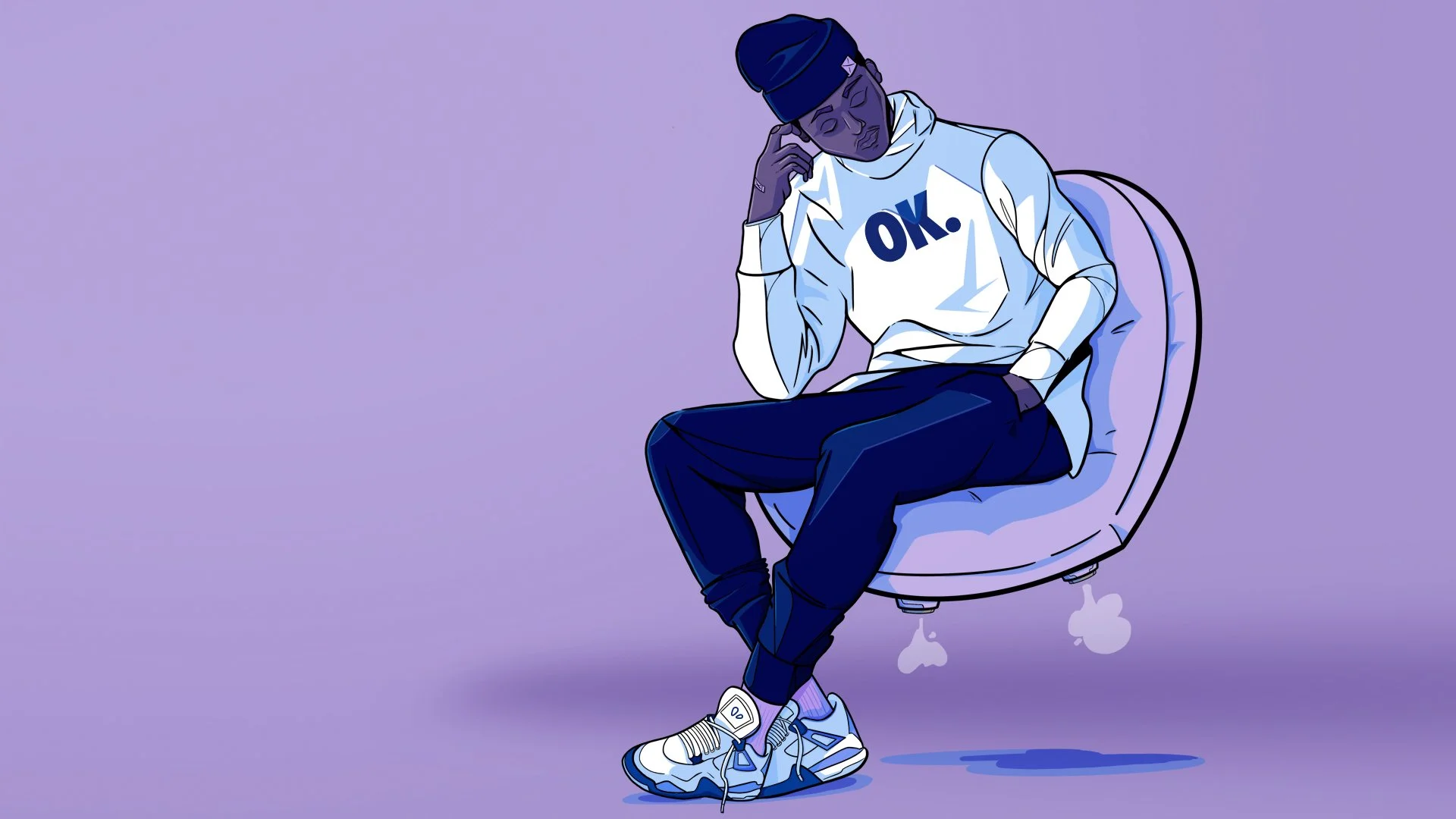
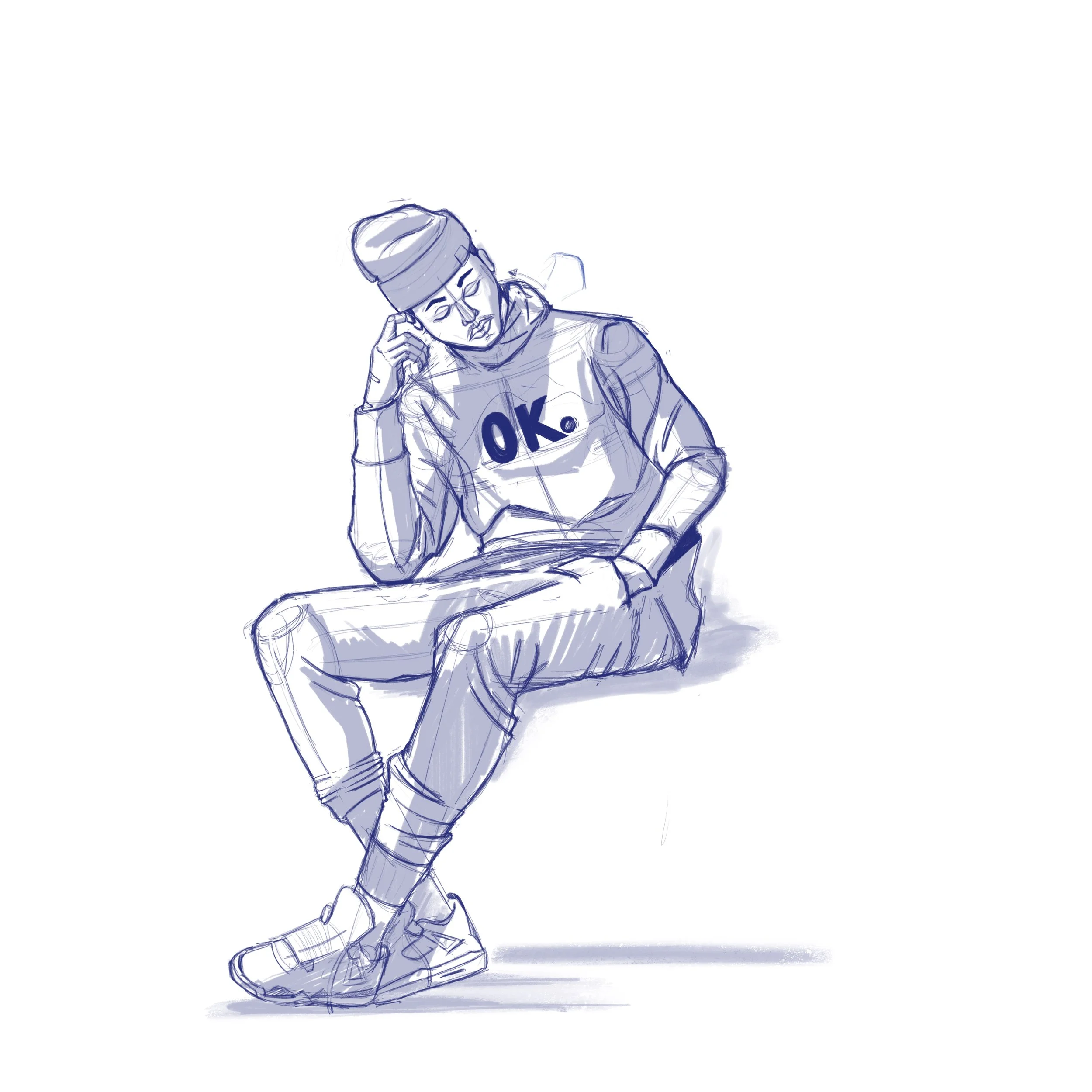
Original sketch, very important to set the tone of what i’d like the cover to look like. Highlighting the right side being light and left being the darker side. Fun fact: the final colour scheme was actually my original idea but changed it to a darker colour scheme (see below) before changing it back to the original.


Round and Round
Client: Zoé Collins,
Project Scope: Album/Single cover, Illustration design
2022
More covers


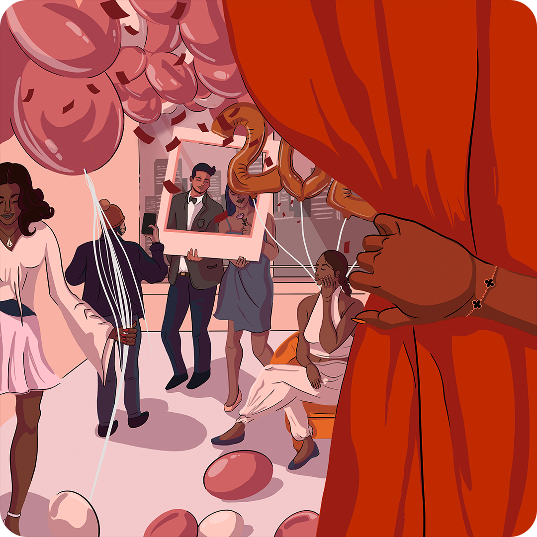
Salutations
Working closely with singer/songwriter Zoé Collins (a British Nigerian artist) this was our 3rd time working together on a single cover - Salutations. A song to welcome the new year and a new start. A soft sounding song that celebrates the joyful moments to come ahead of us.


Single cover
The New year is such a pivotal time for many people, we look at it as an introduction to what’s to come. Many exciting opportunities and memories to happen. This inspired my approach to the cover. Walking into a positive atmosphere from the perspective of you, the listener. A time of celebration and friendship.
Illustration development
There were two important aspects to the cover, the foreground and then putting the background together. The hand opening the curtains is the starting point, the opening, entering into a positive situation.


Salutations
Client: Zoé Collins
Project Scope: Single cover design, Illustration design,
2022
More Covers
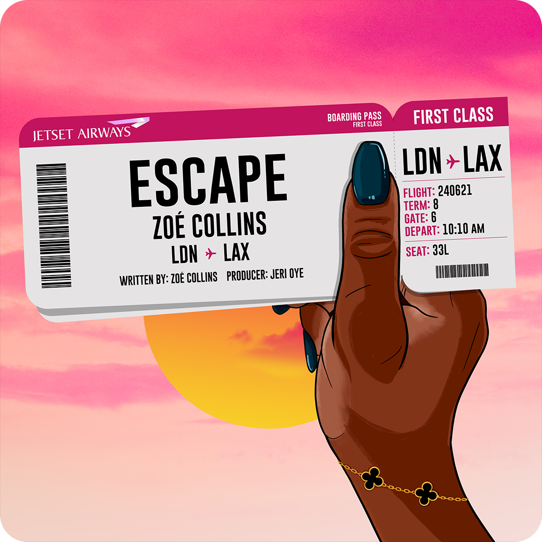


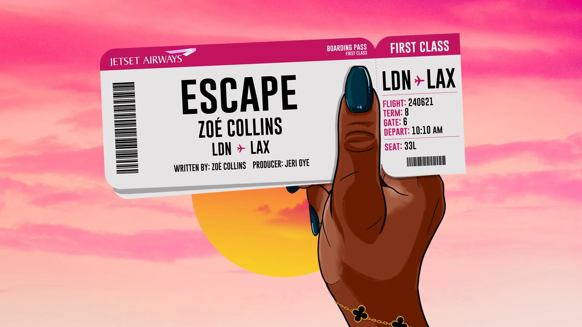
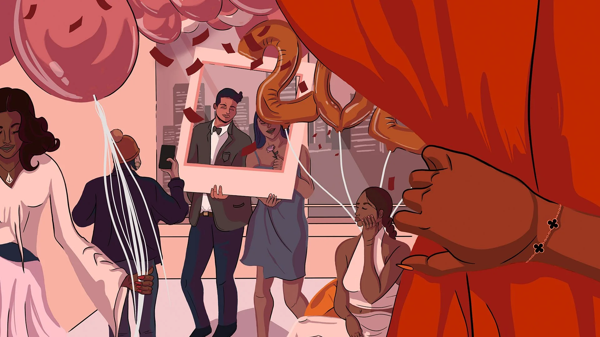
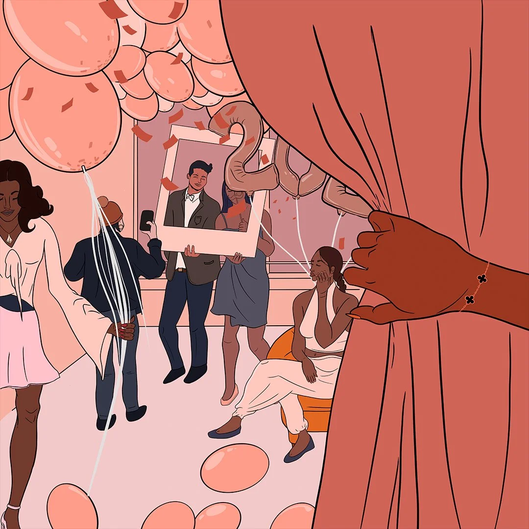
Escaspe
Zoé Collins is an independent British - Nigerian singer and songwriter from Brixton South West, London. Growing up in church, her sound is a soulful infusion of Gospel, Jazz and RnB.
Execution: Create a motion graphic sequence for Spotify/ social media and an illustration cover for the launch of Zoé’s new single.


Single cover & motion
As part of the single roll-out we created a fake boarding pass, similar. to the one found in apple wallet. We added some motion and snippet of the track before the roll out of the single.
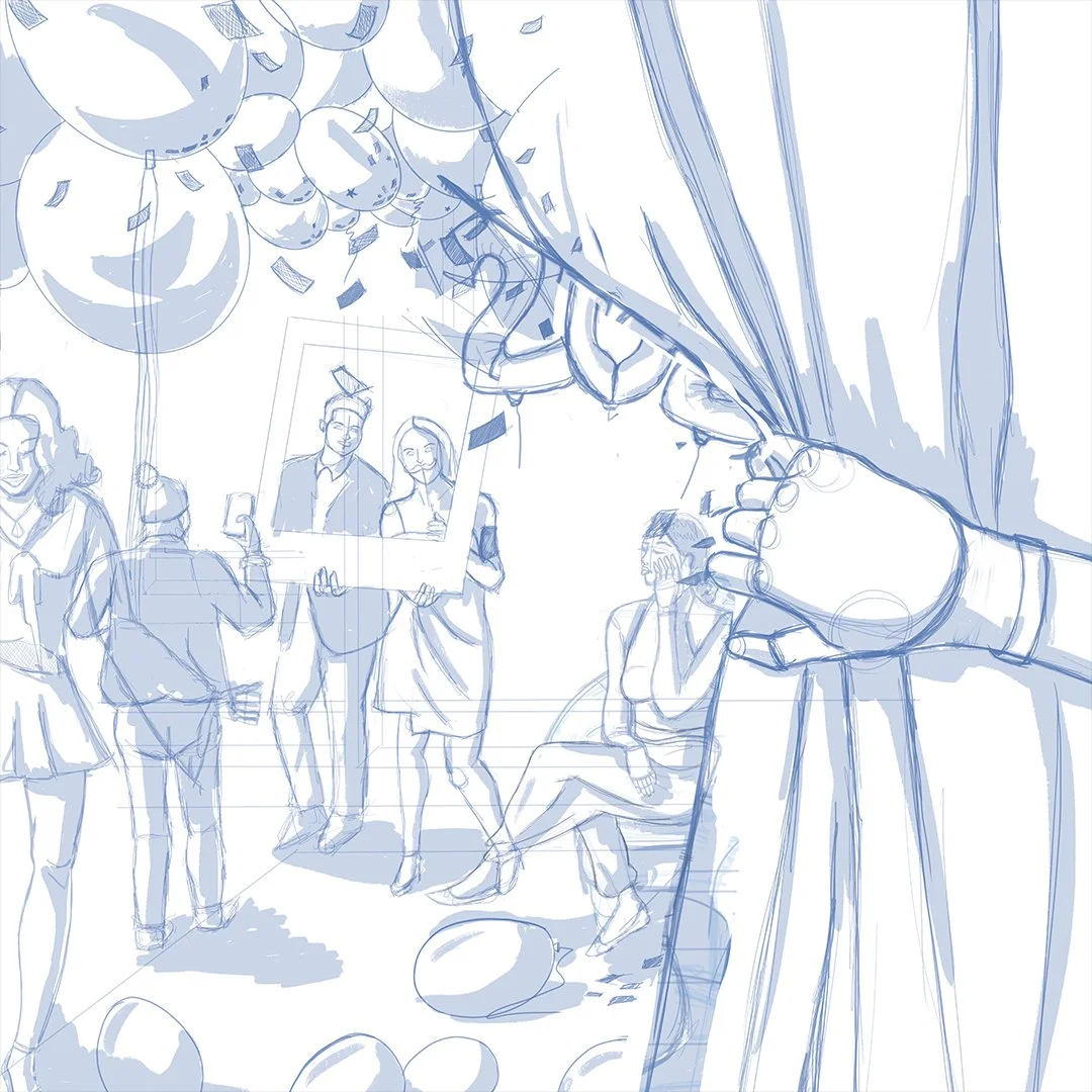
Illustration development
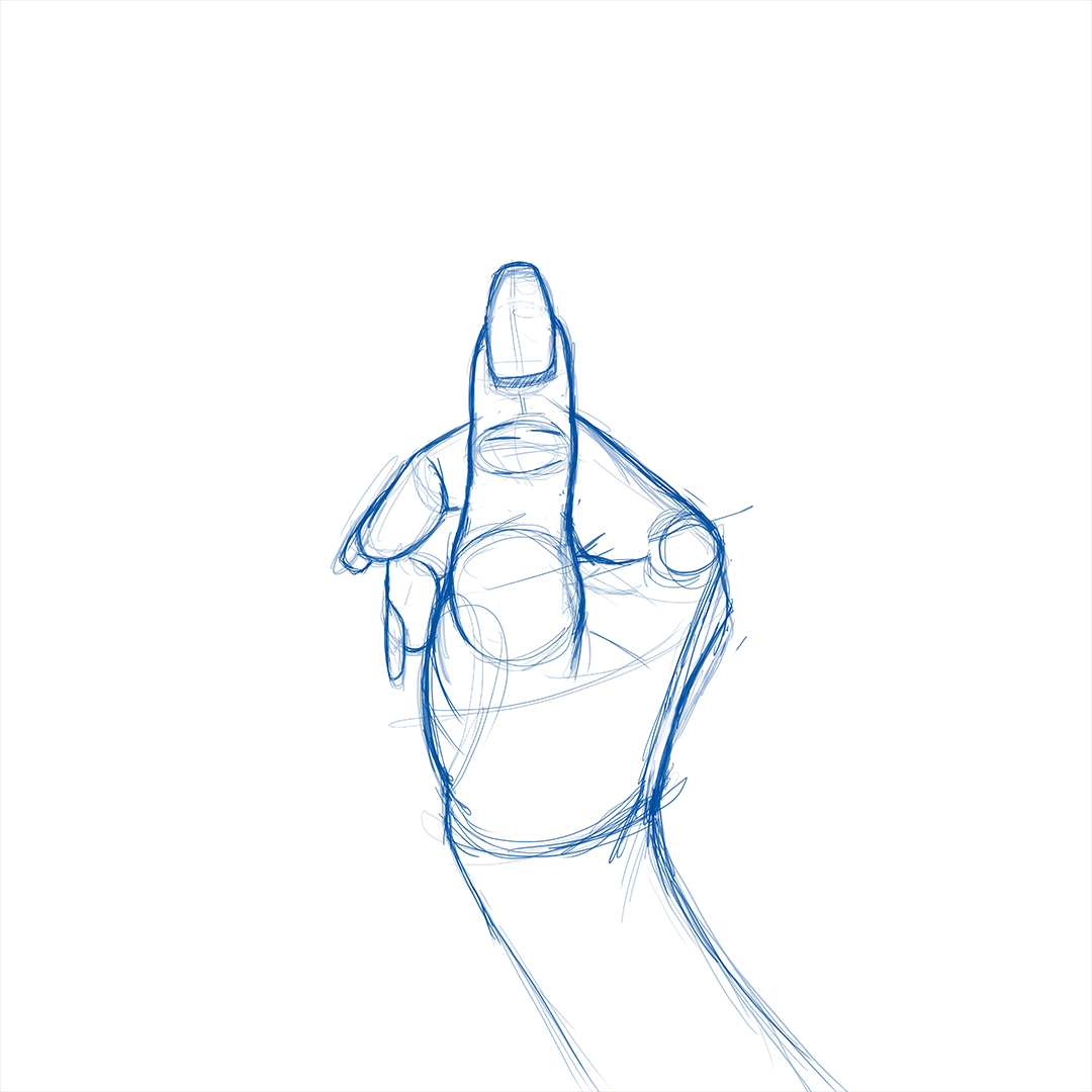
Most creative find drawing hands difficult but not m… Well it wasn’t difficult to draw but I knew it was important to get the hand right first as it’s the focal point of the cover. Once I got this right it when setting the tone to match the vibe of the song.


And were off
Once just that the cover is put together, Two tickets with Jetset airways and we fly away, find your seat, lean back and enjoy the flight. Music available at your request.

Safe landing
Sit back an enjoy some music.
Press play
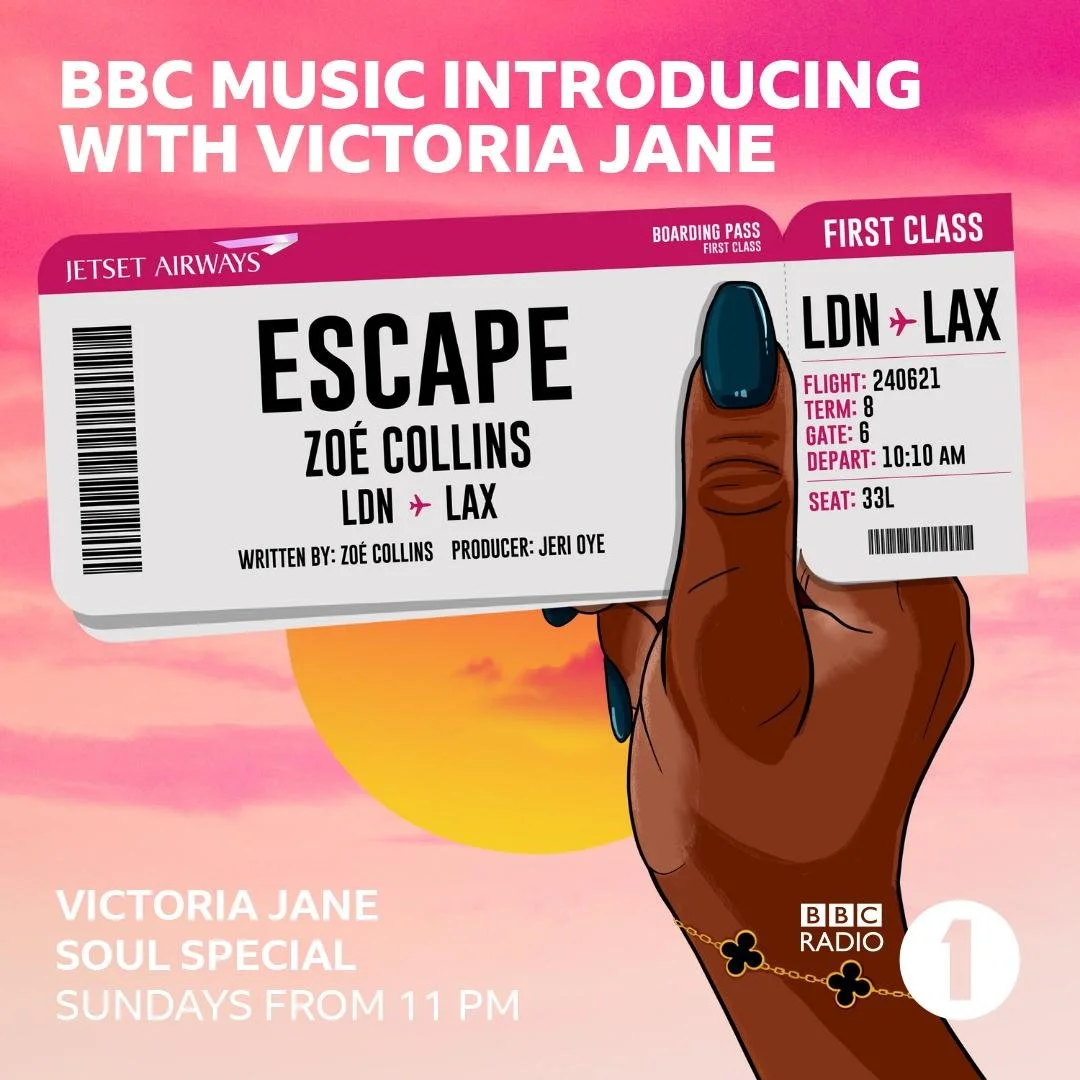
As part of the single roll out, Zoe Collins - Escape featured on BBC introducing Soul special on Radio 1 hosted by Victoria Jane.
Escape
Client: Zoé Collins
Project Scope: Single cover, Illustration design, motion graphics
2021
More covers


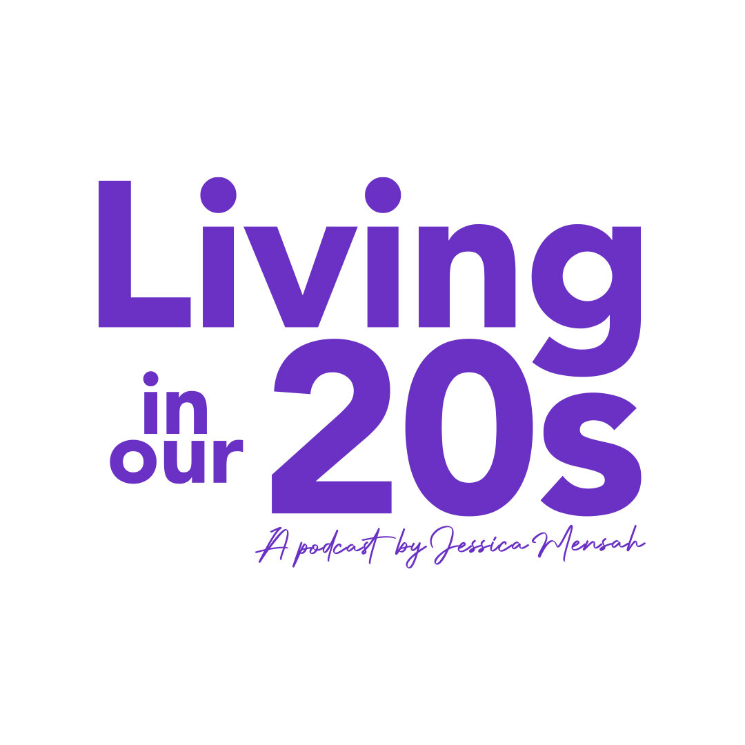
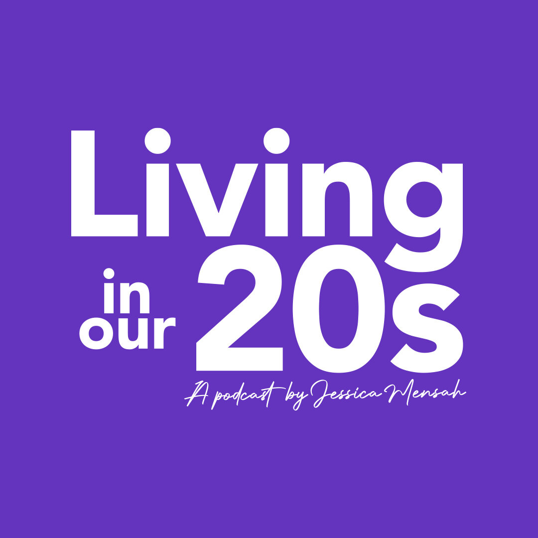
Living in our 20s
Living in our 20s is a podcast series started by Jessica Mensah, interviewing young adults from 20-29 exploring life, career, success and failures. A chilled out conversation for young people to hear about everyday people.
Execution: Create a Podcast cover and logo design for the launch of Living in our 20s.

Podcast Cover & Logo
At first we found ourselves a challenge. The client wanted the hand/peace symbol as the logo, but wanted it illustrated. A logo that could be placed anywhere, web, print, social media. We soon found that this may not work well, so we changed the approach. Why don’t we separate the two, A logo type that could be placed anywhere and an illustrated hand that will be used for the podcast cover and YouTube header.
Just for fun…
This was a great opportunity to turn the logo into a motion design. Something I passed onto the clients to use for her podcast launch.


illustration development


Living in our 20s
Client: Jessica Mensah
Project Scope: Podcast cover, Illustration design, Logo design
2021
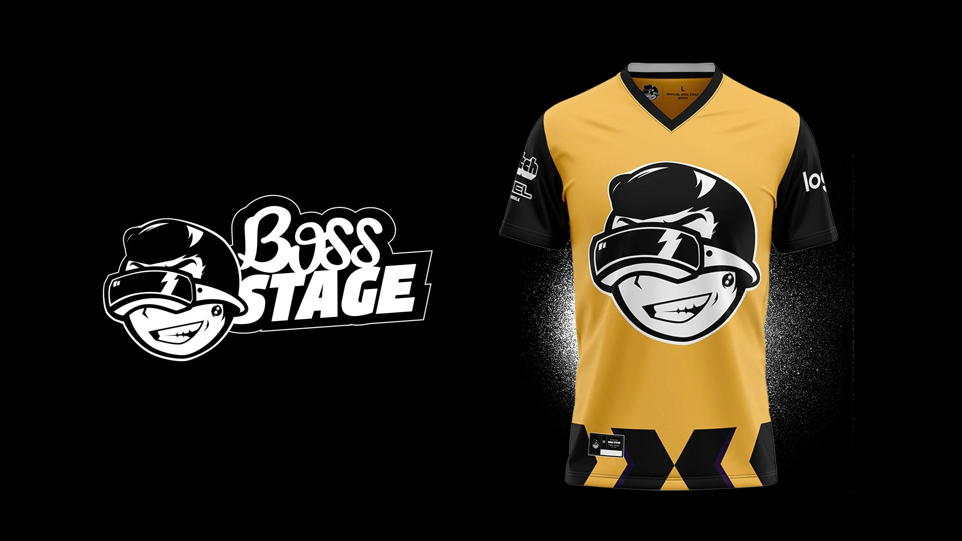
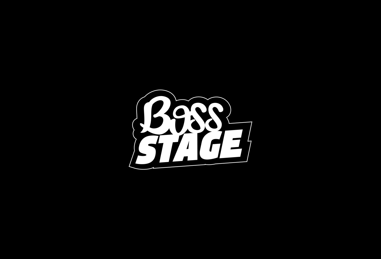
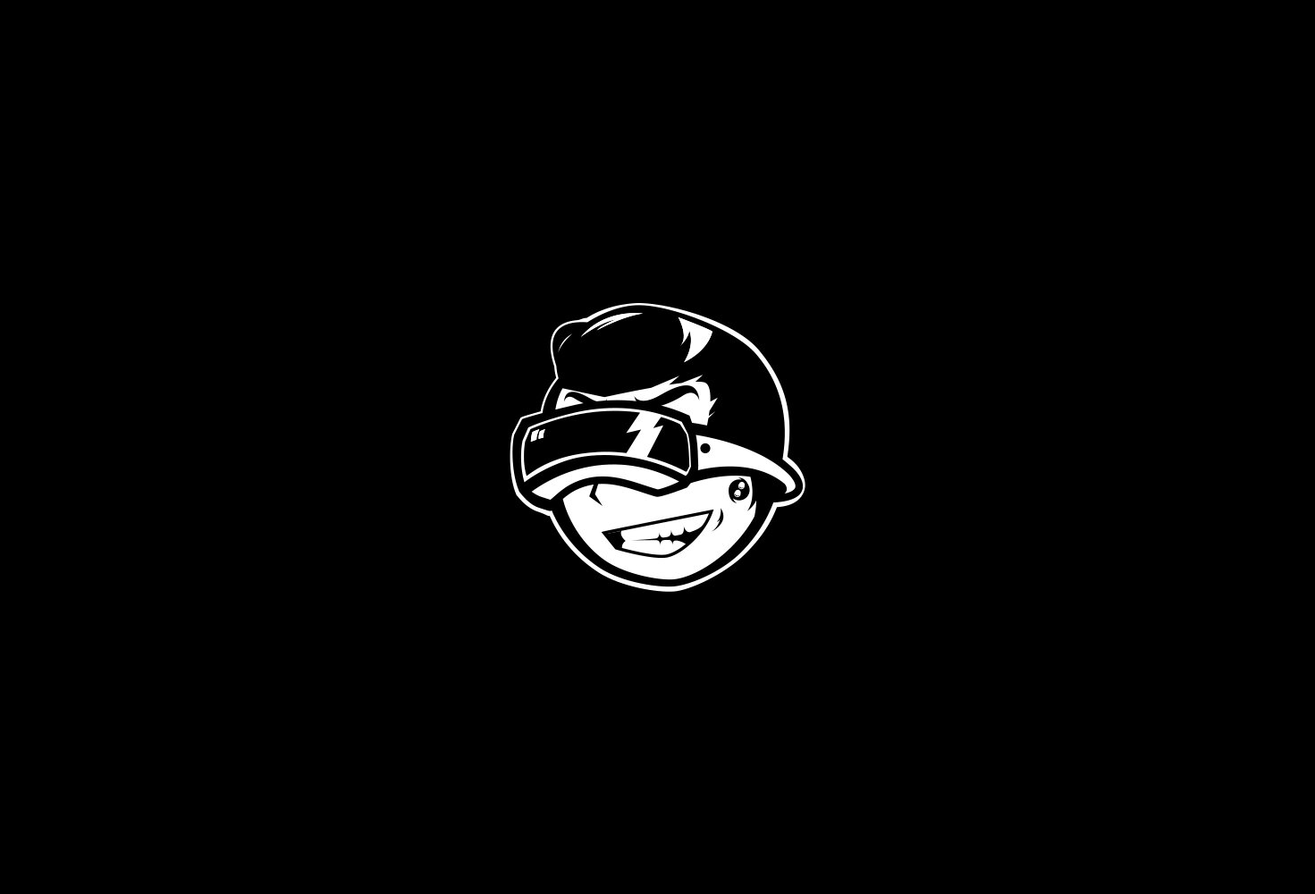
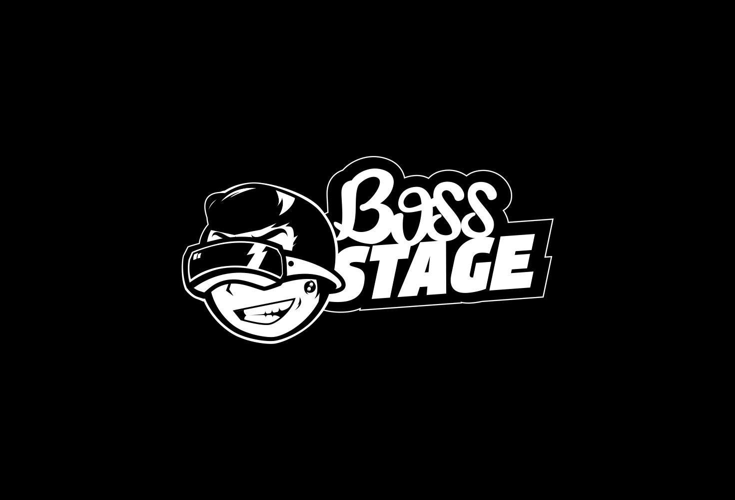
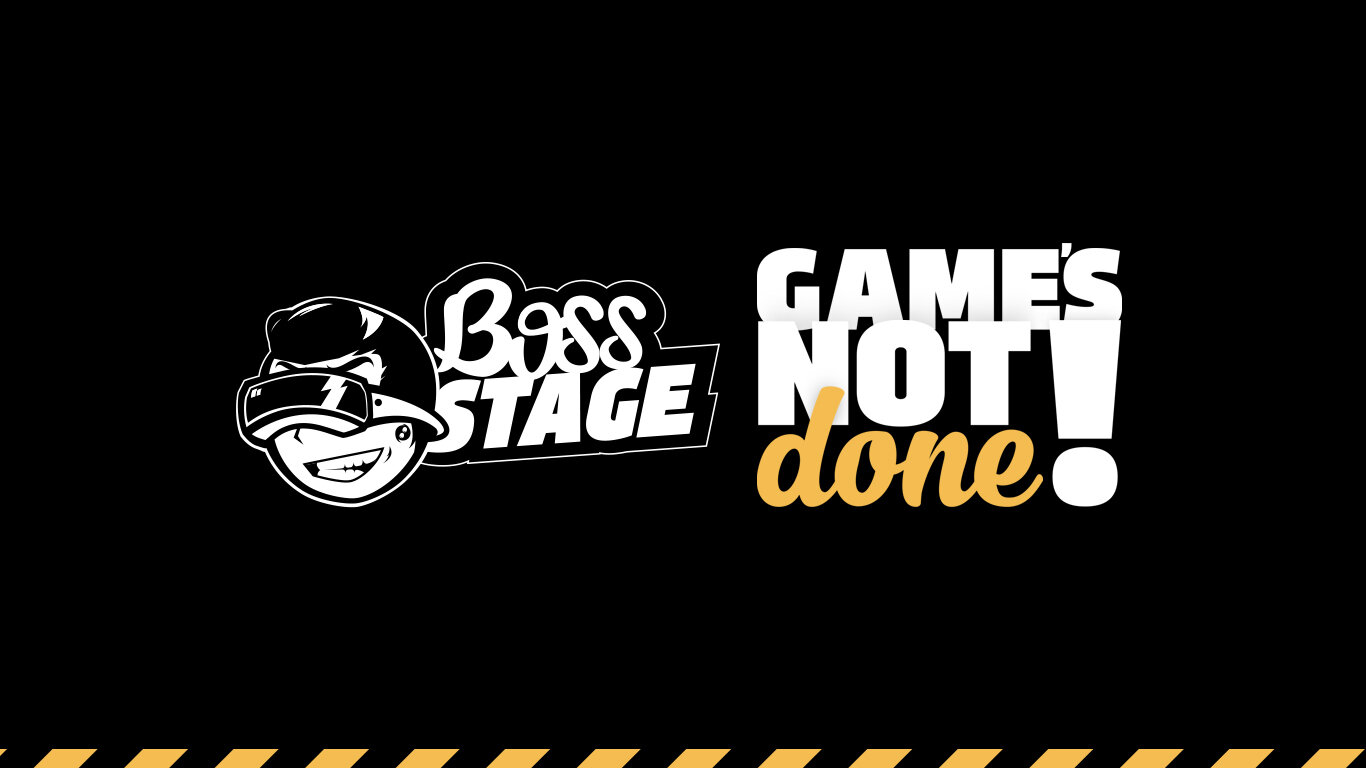
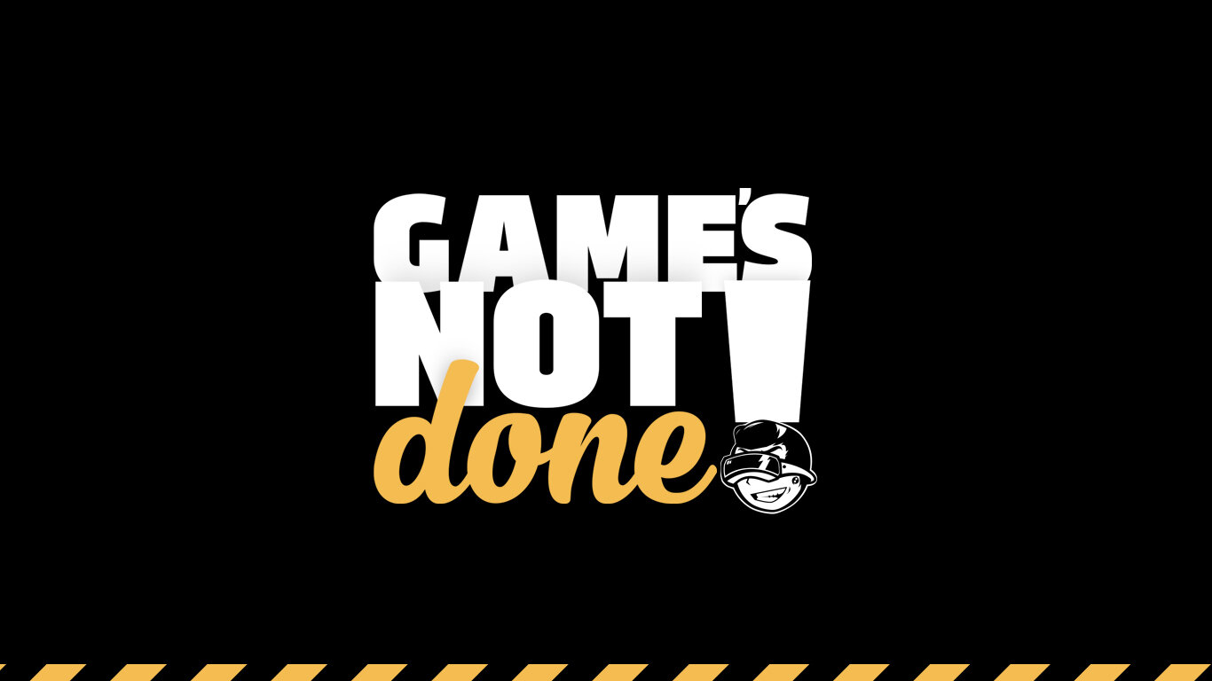
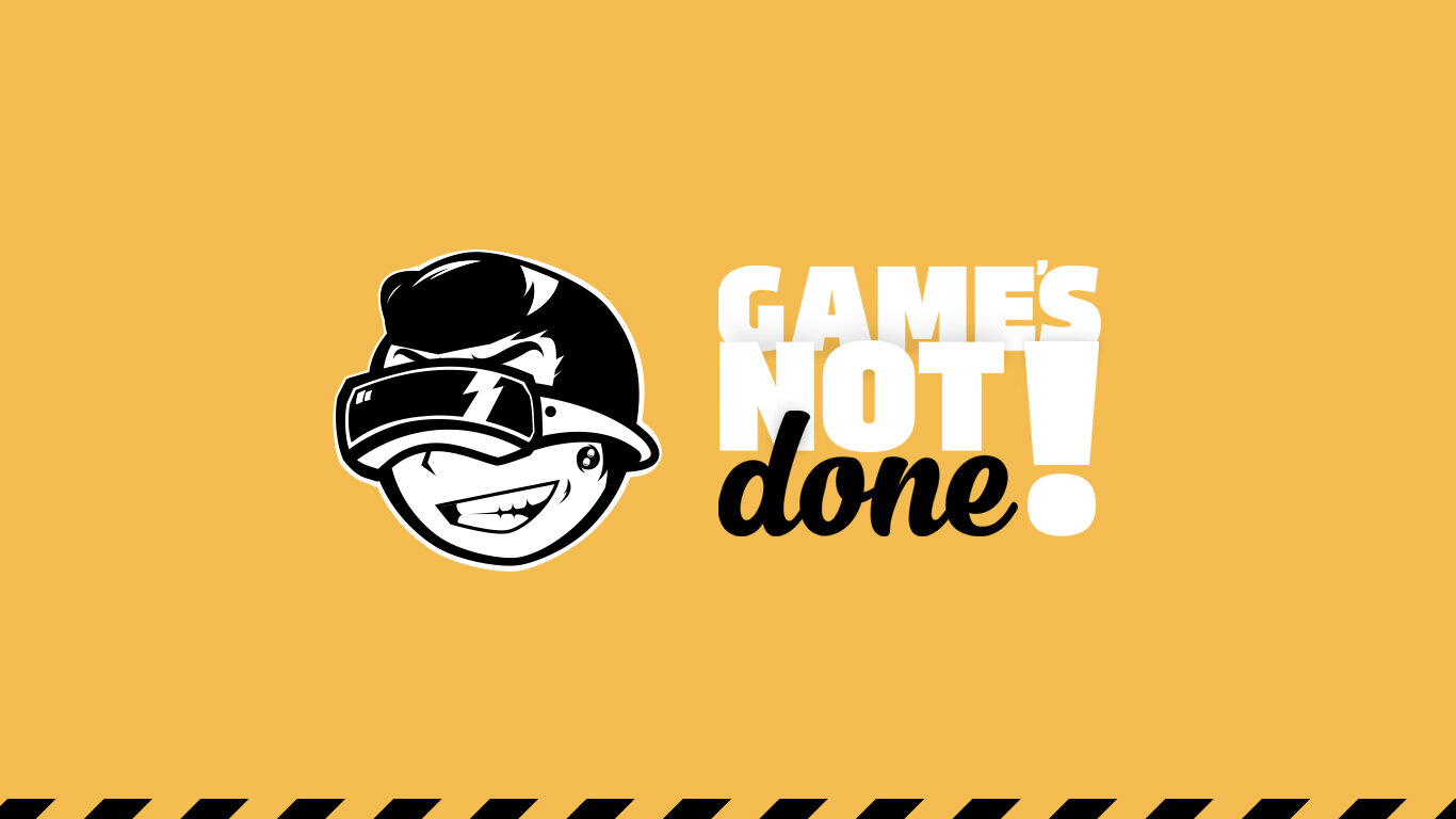
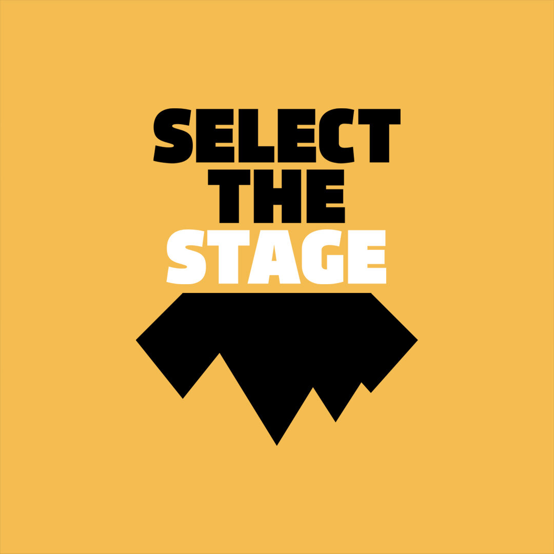
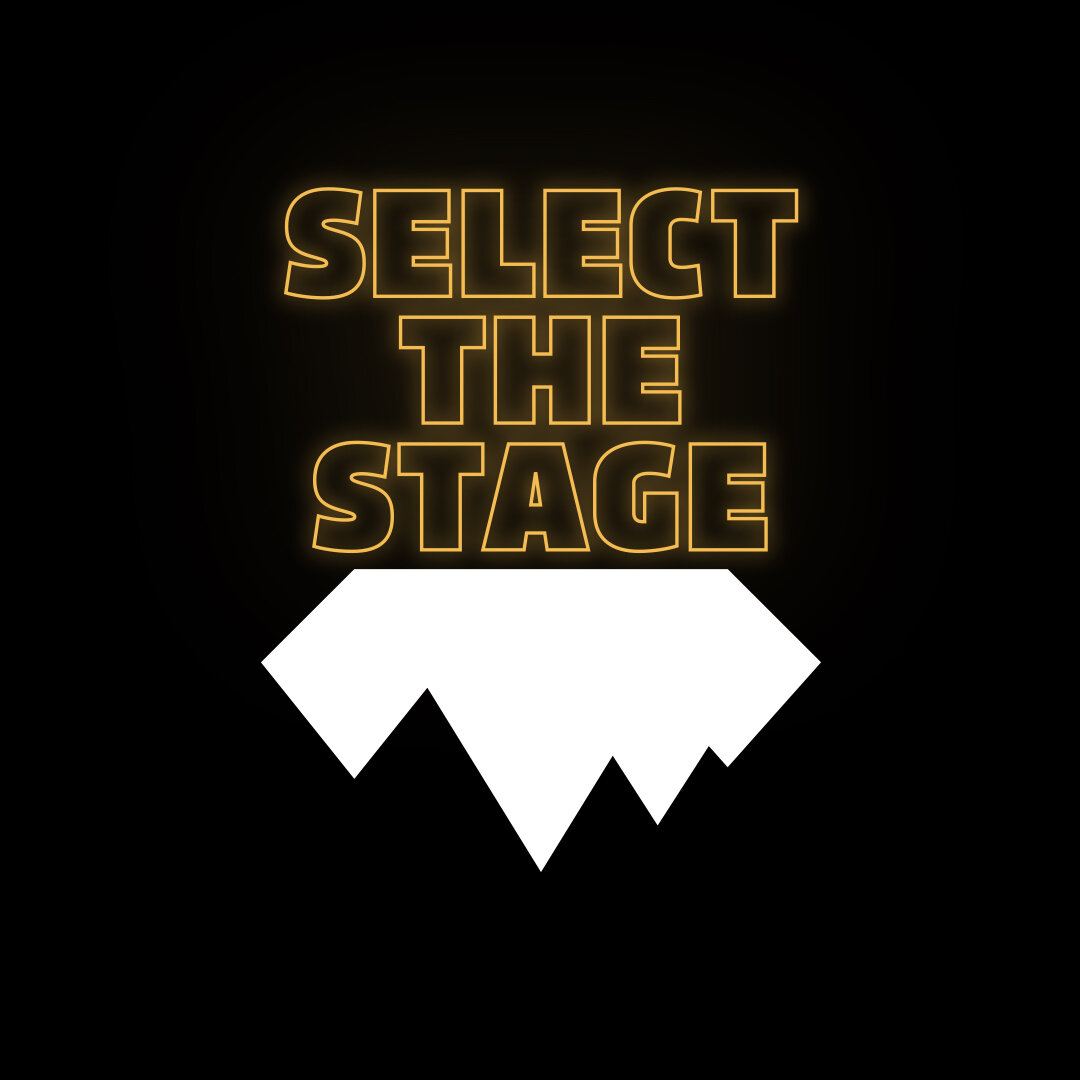
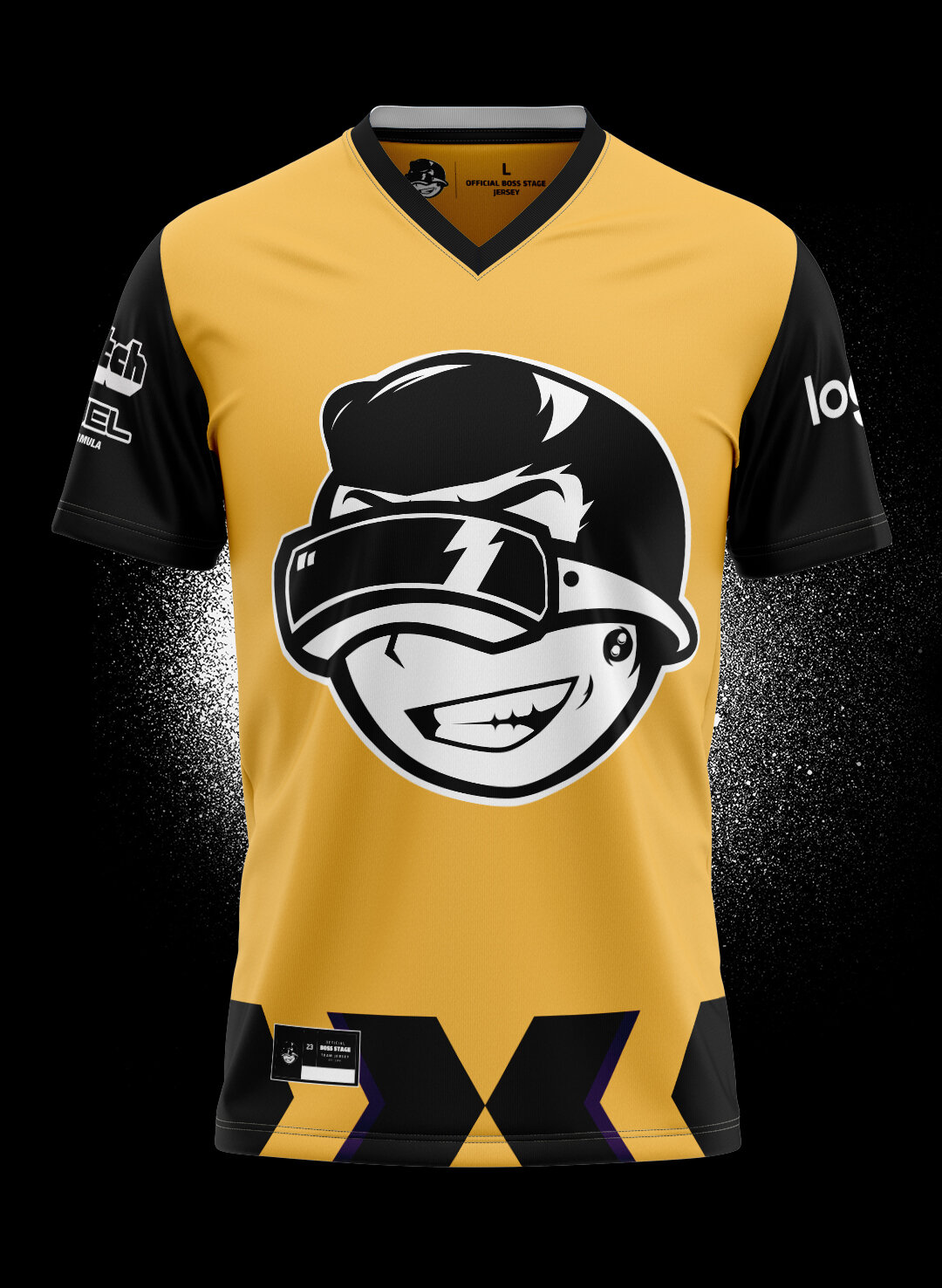
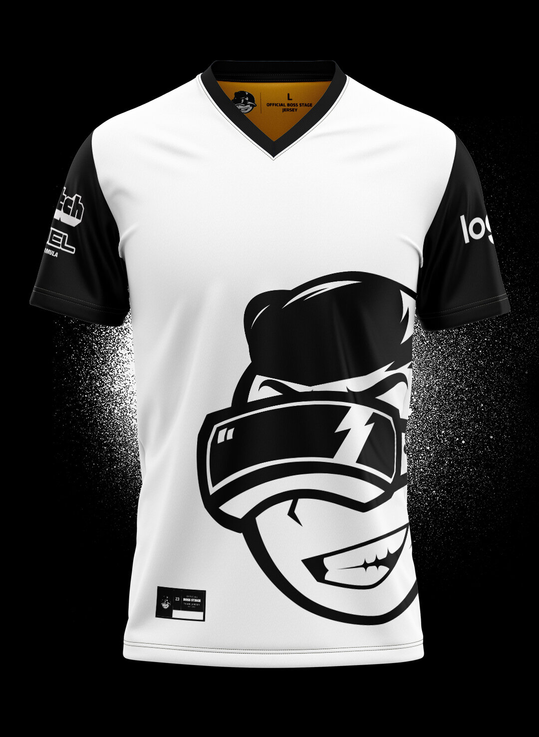
Boss Stage
What happens when you finally beat the level you’ve been grinding for hours? The Boss Stage! A blog dedicated towards gaming, movies, and everything in between.
Execution: Create a logo that identity more with the villain character, ”The boss”, but with a more friendly approach, a cheeky smile, VR Goggles, a design that could stand out from gaming channels. A colour scheme that screams challenger approaching using “warning” colours and draws your attention. Develop the social media concept, brand tagline and e-sports concept.
Logo & Brand development

Brand Tagline
Social media concept
Using the brand colours I developed some social media concepts, ranging from the brand tagline, review concepts, engaging post and event concepts.


Youtube Concept


E-Sports Concept


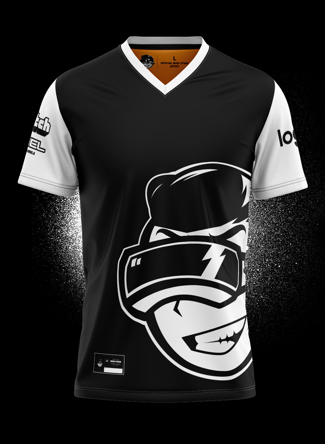

Boss Stage
Client: Boss Stage
Project Scope: Logo & Branding, Social media, Marketing content/concepts, Video concept
2018


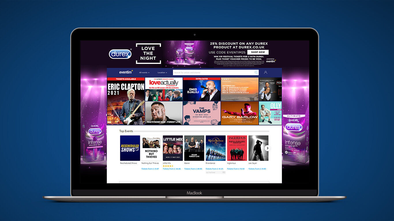
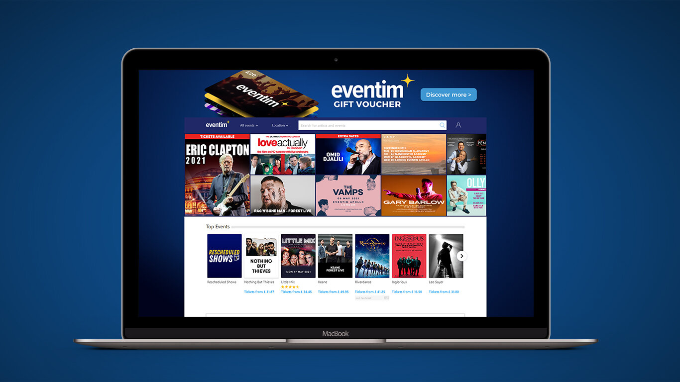
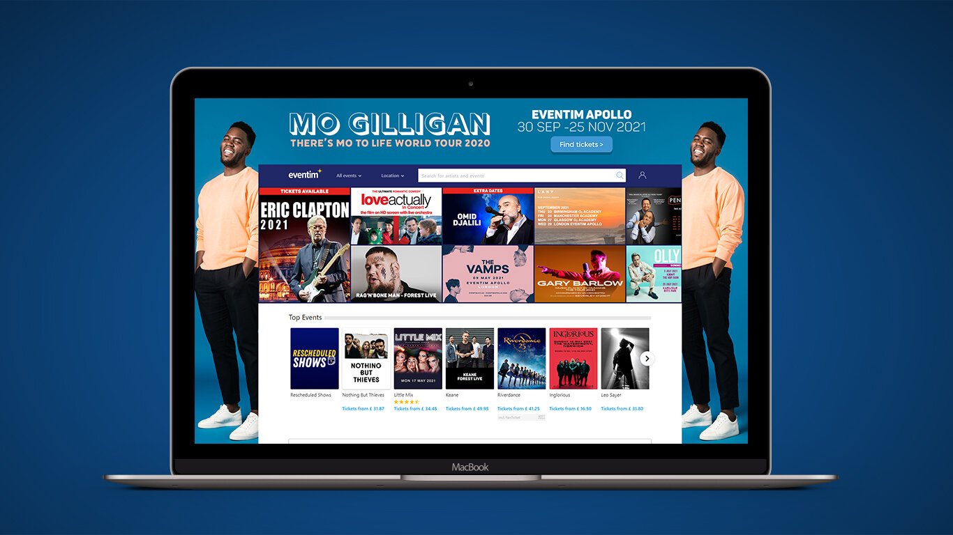
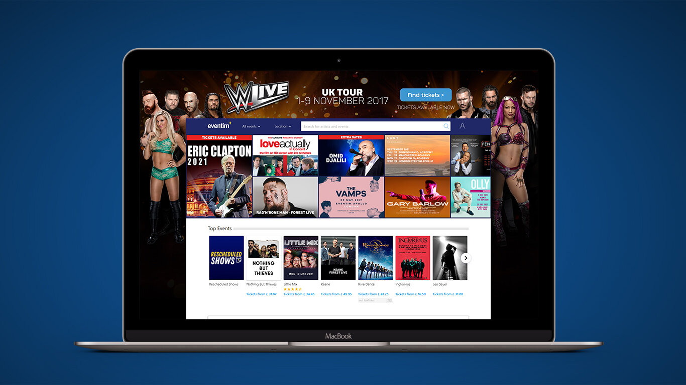
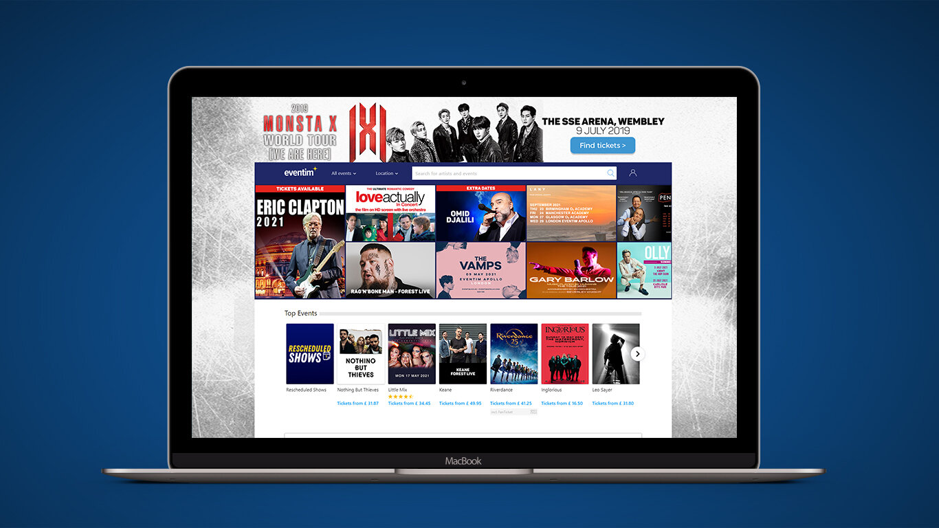
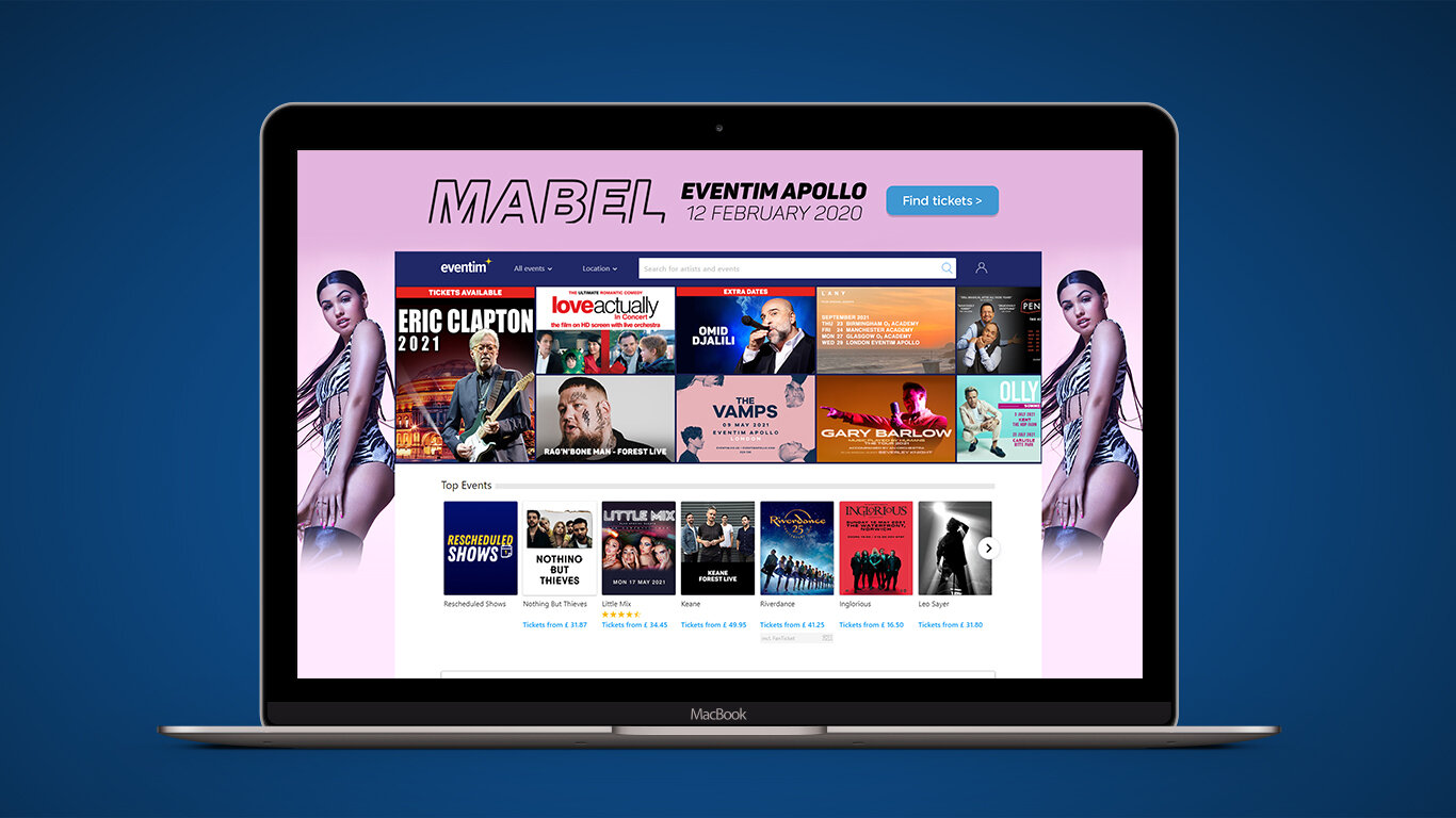
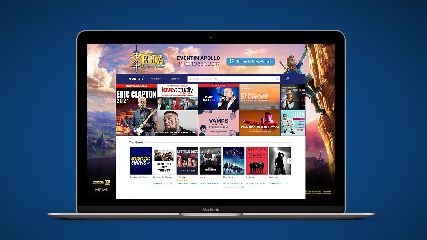
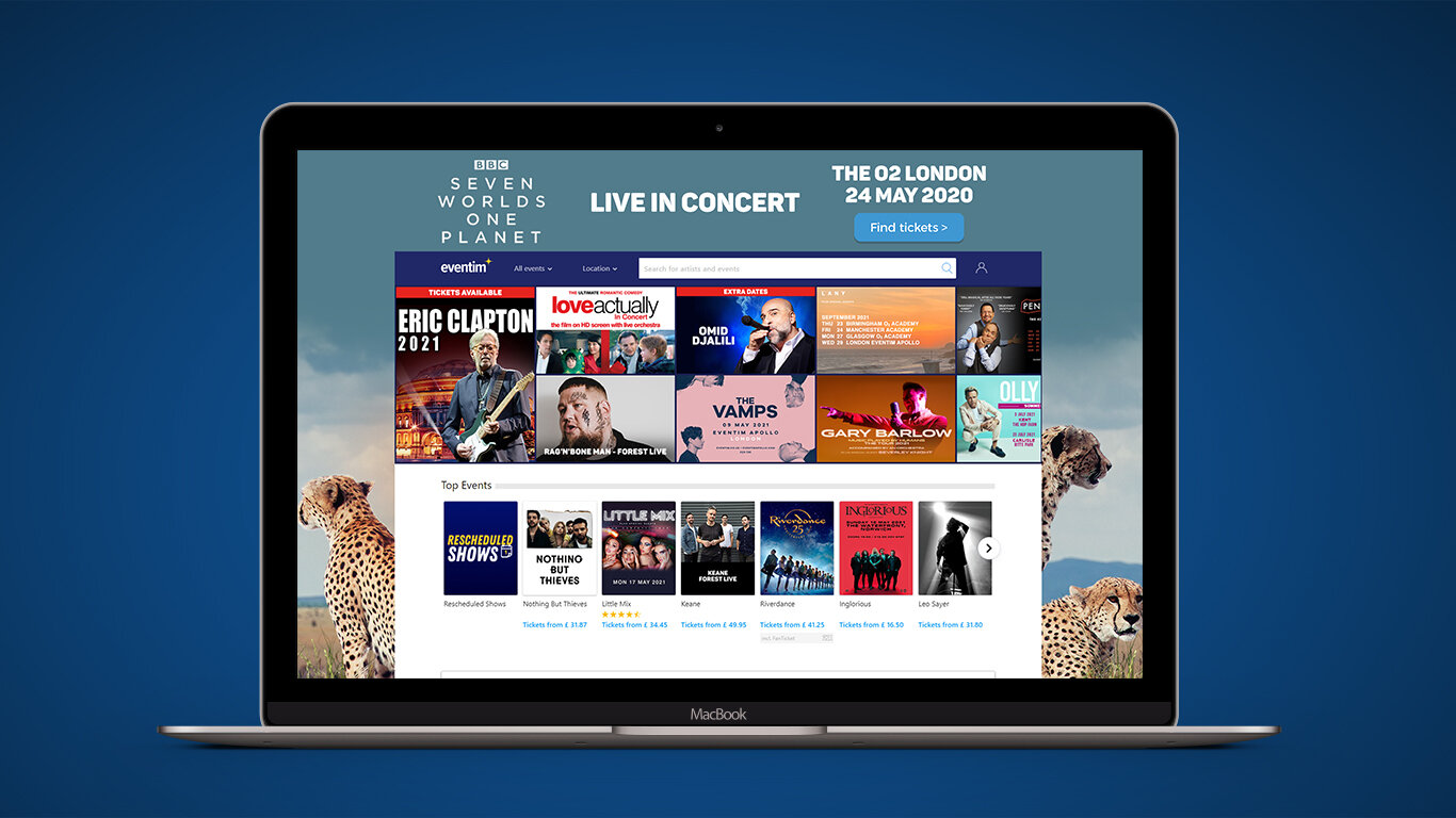
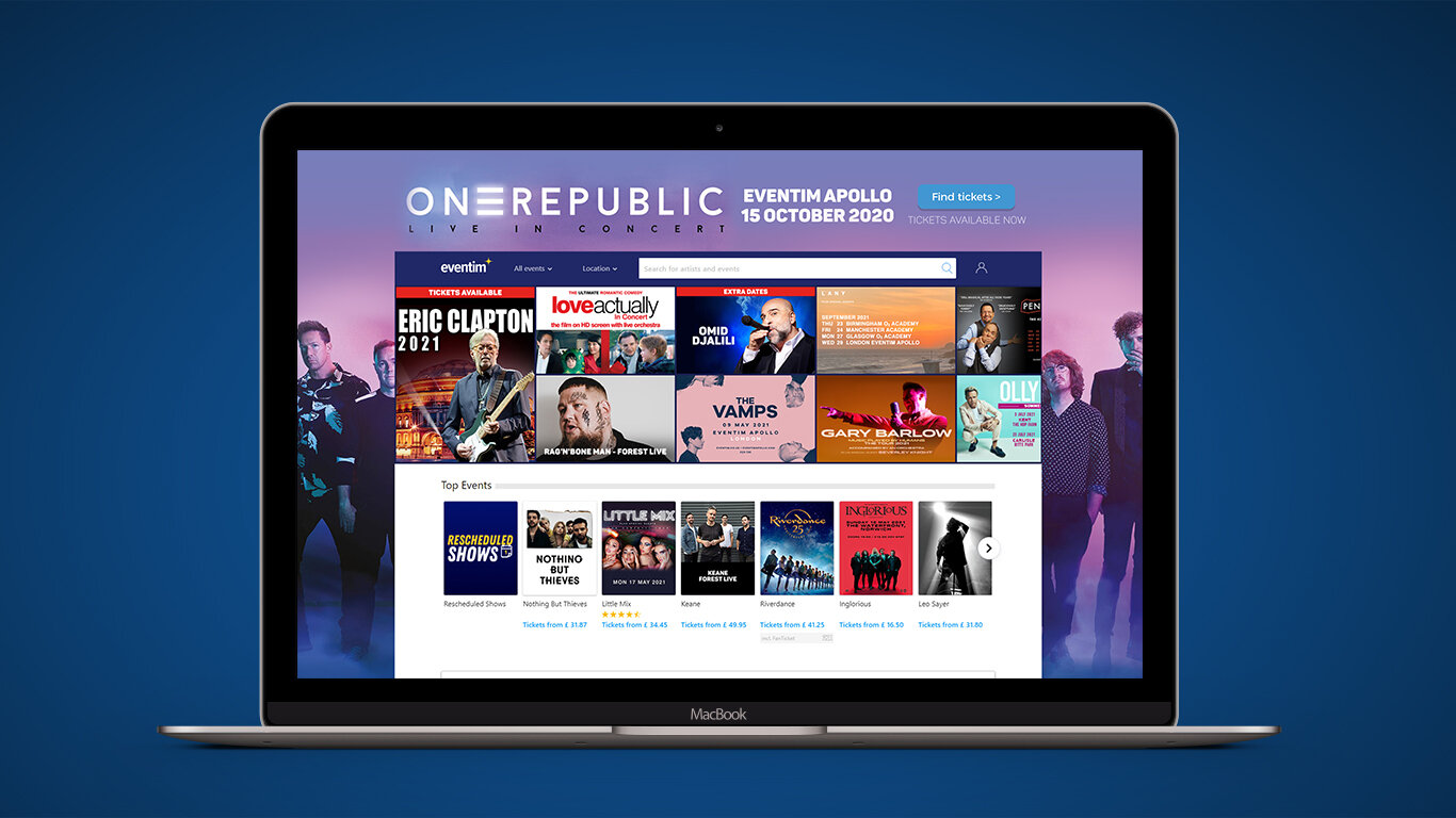
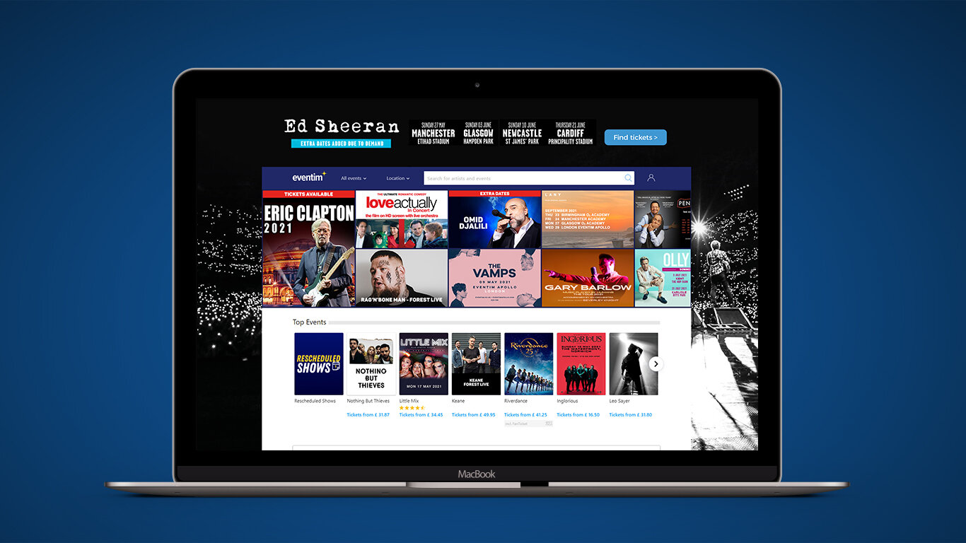
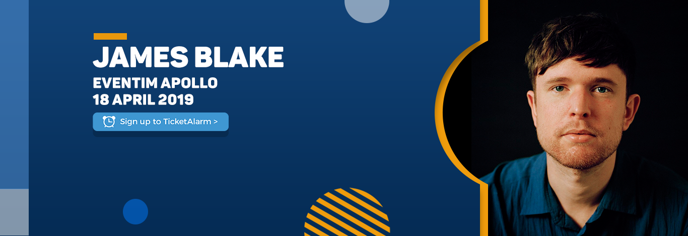
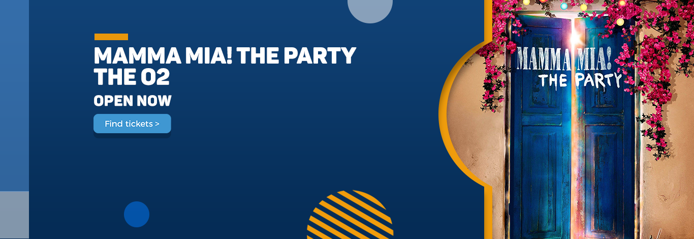
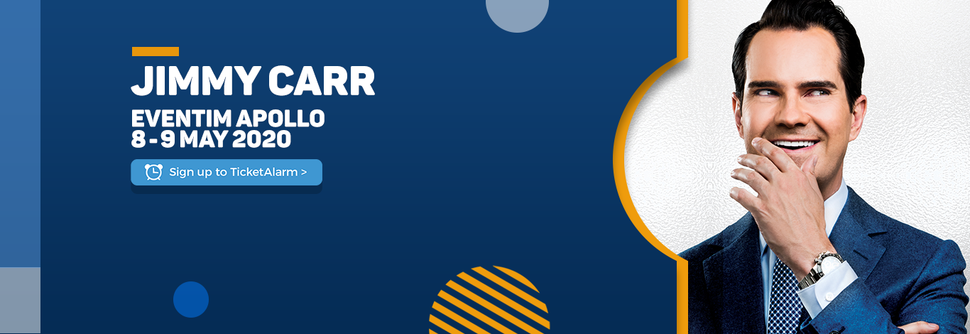
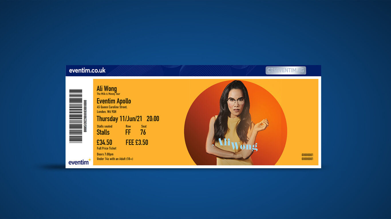
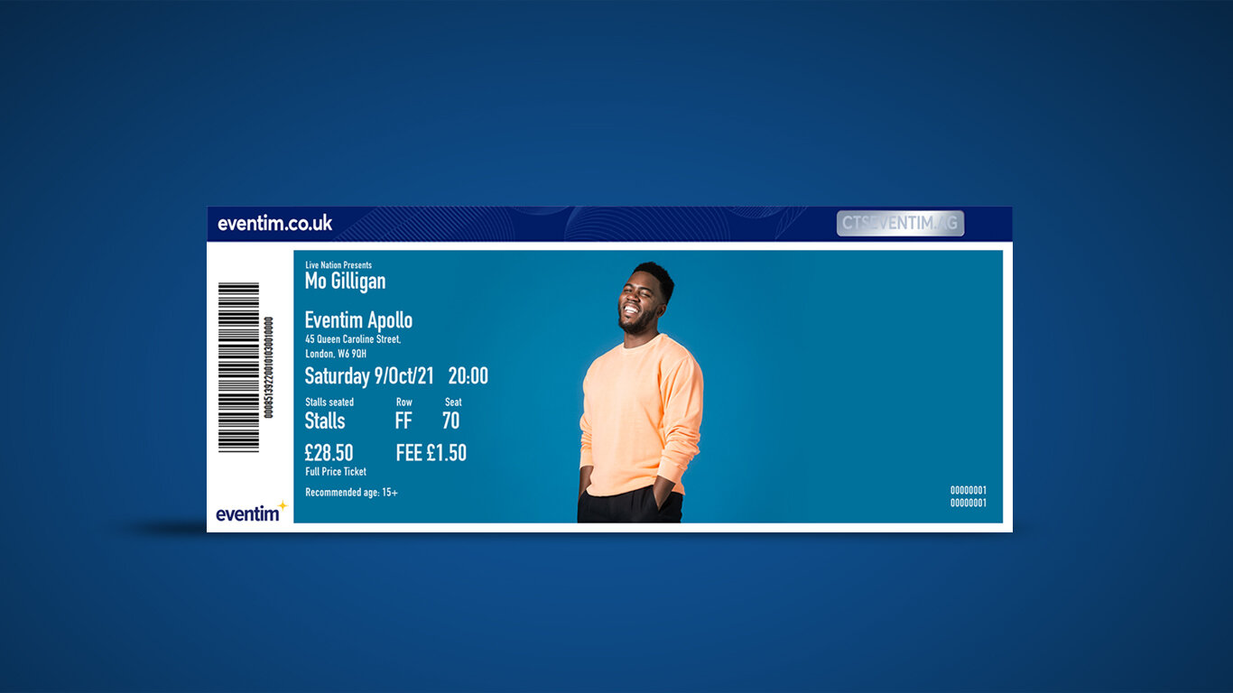
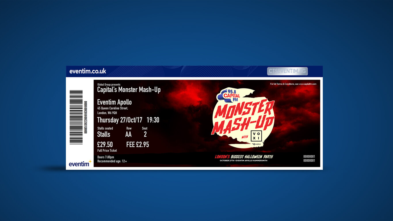
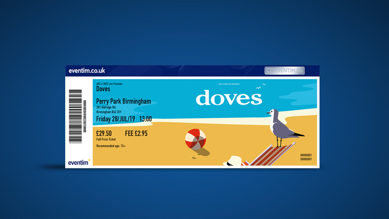
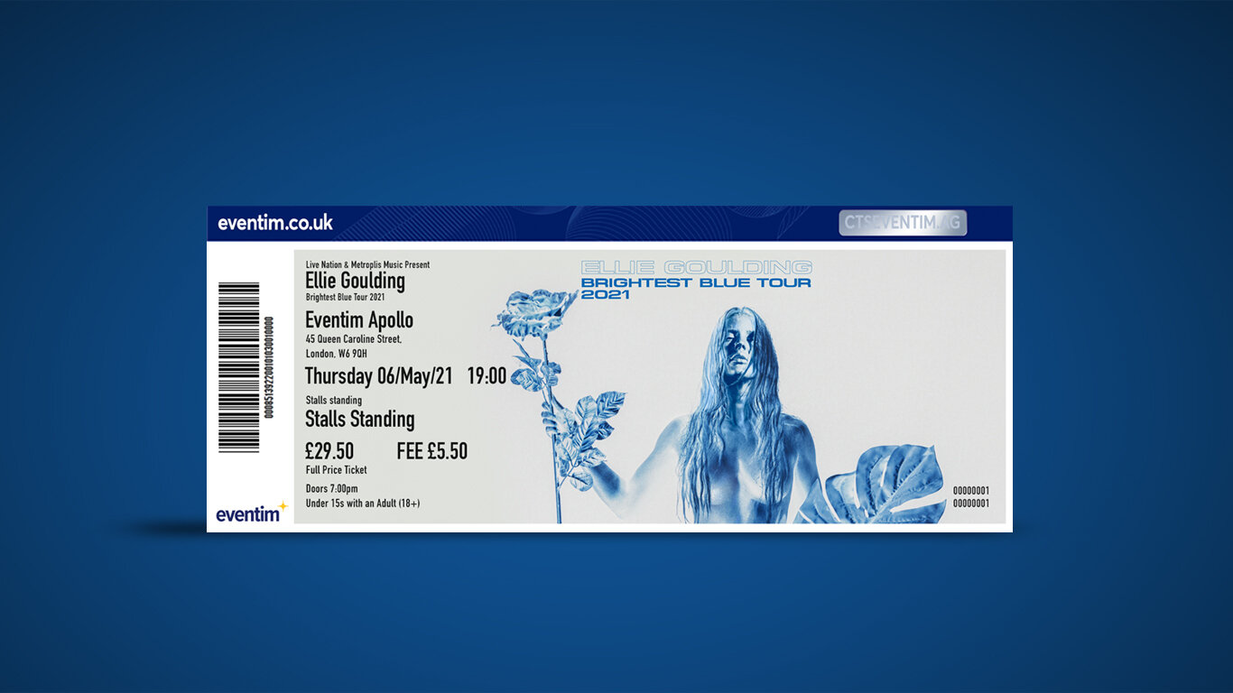
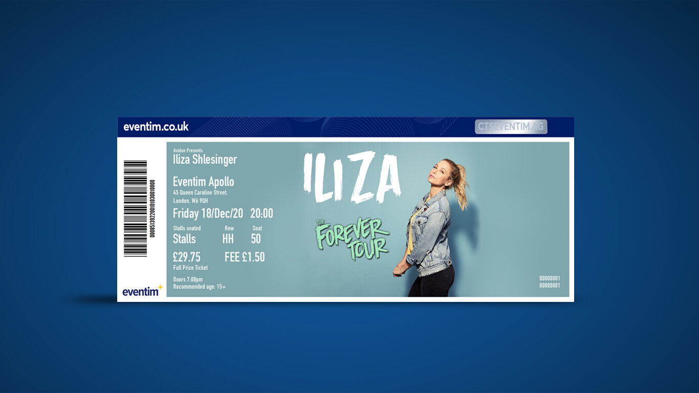
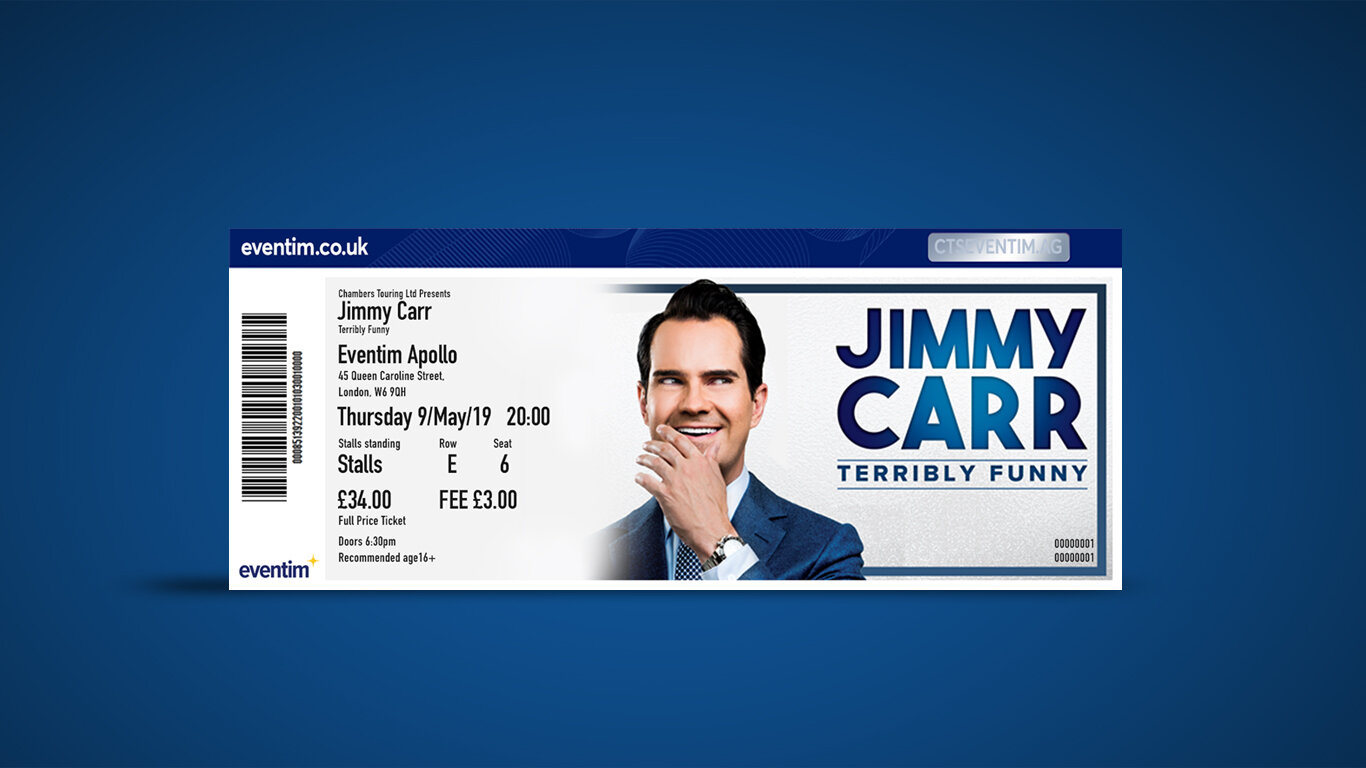
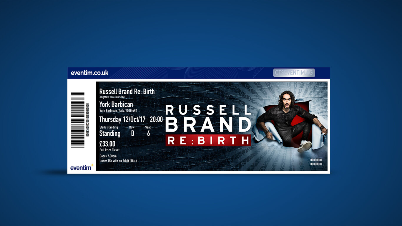
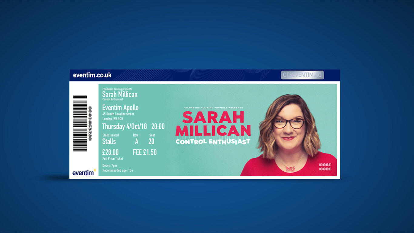
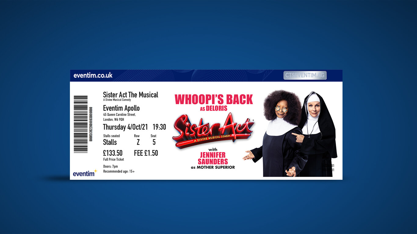
Eventim
Eventim is Europes leading ticketing company and I had the pleasure of working on the marketing team to help reach a wide audience in London to staying in the loop for all their favourite artist, acts and events.
I worked on a range of marketing content including maintaining the UK site (images), App, E-shot & newsletter graphics, Fan ticket, Print & Digital marketing material. Adverts, Posters, Landing pages and so much more.
Leaderboard & Wallpaper
Digital Screens


Social media graphics

Fanticket

Landing Pages
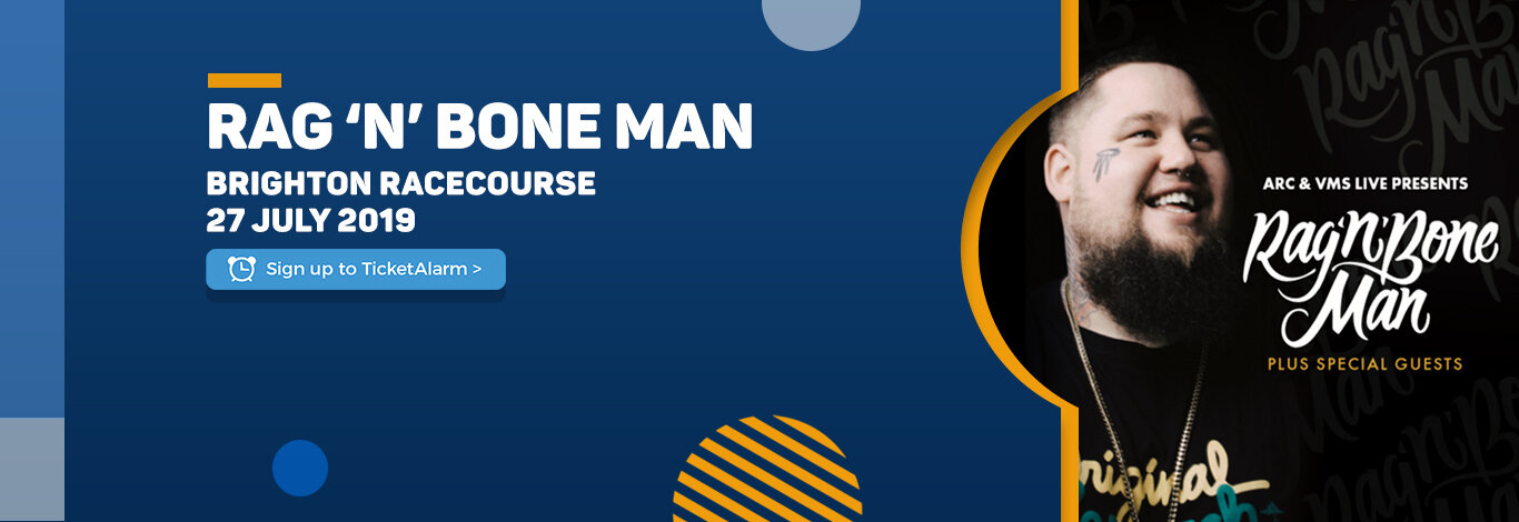
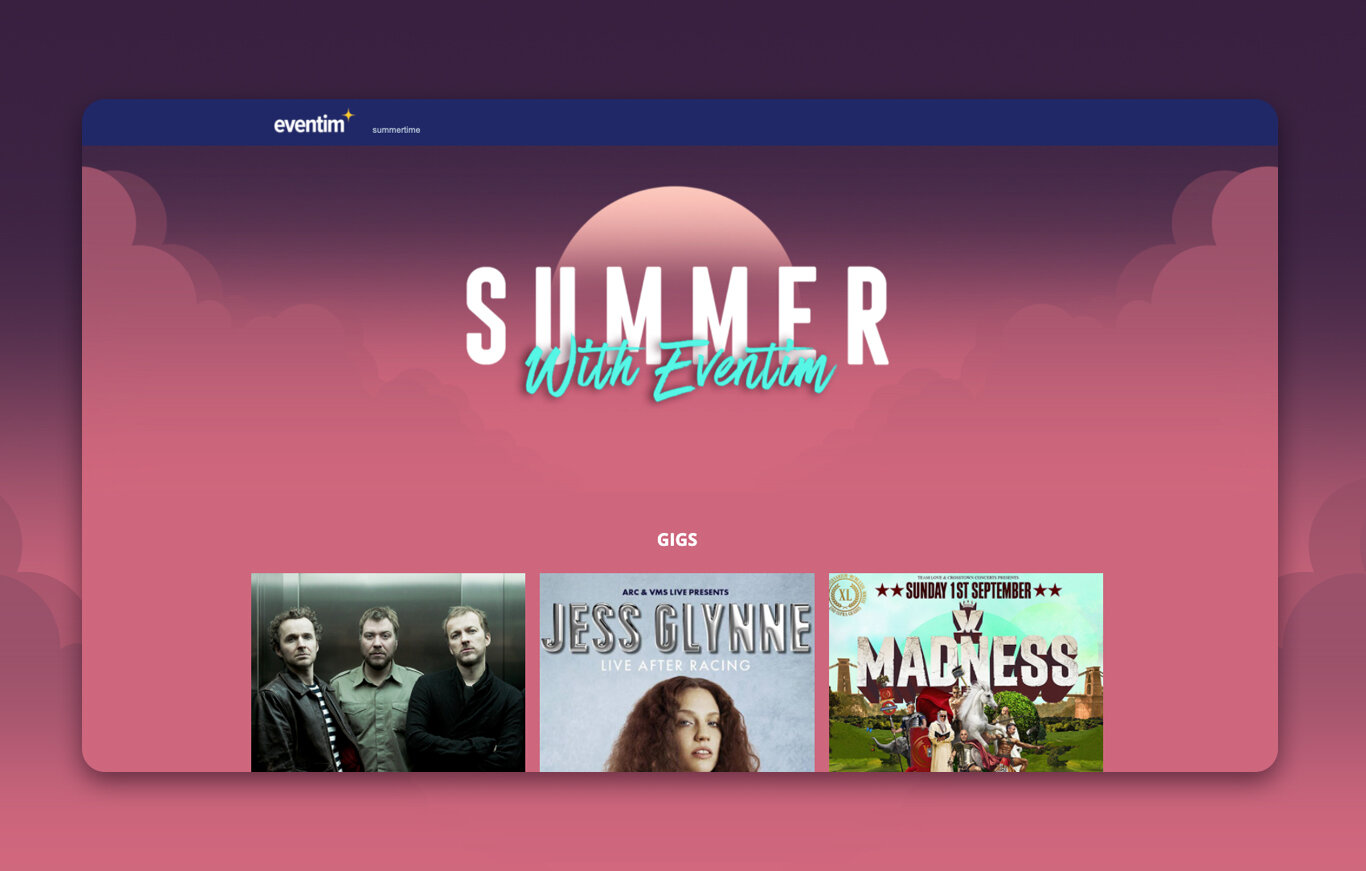
As a way to market our events, I developed a range of landing pages, from genre categories to special seasonal events.


Eventim
Client: Eventim
Project Scope: Web/ Digital marketing, Print marketing,
Illustration & Graphics design, Social media design
2016 - 2020
More Eventim Projects


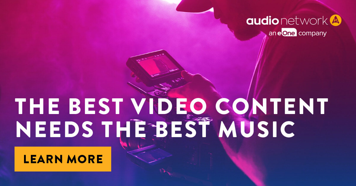
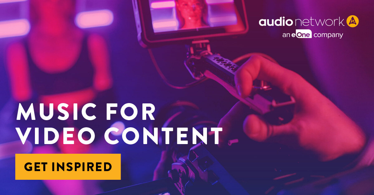
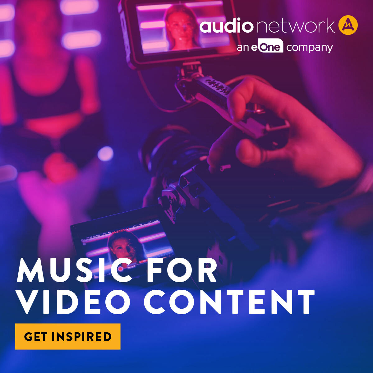
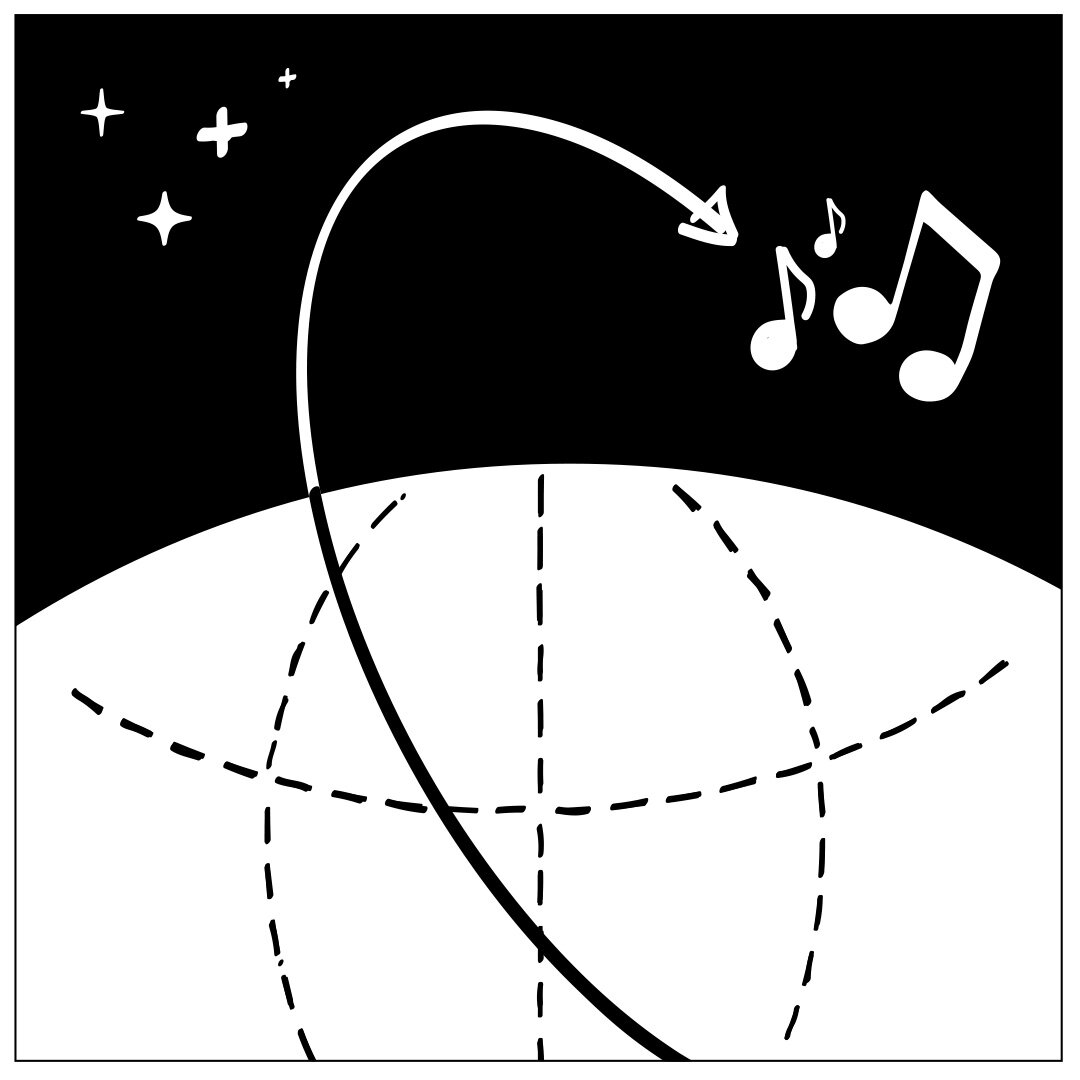
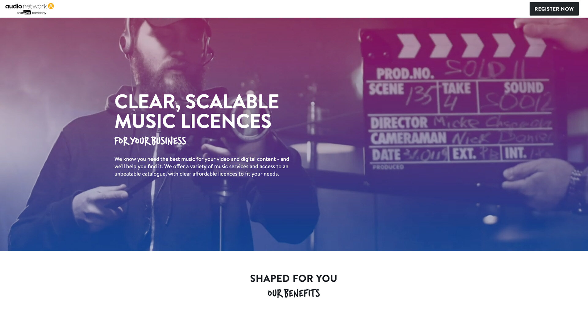
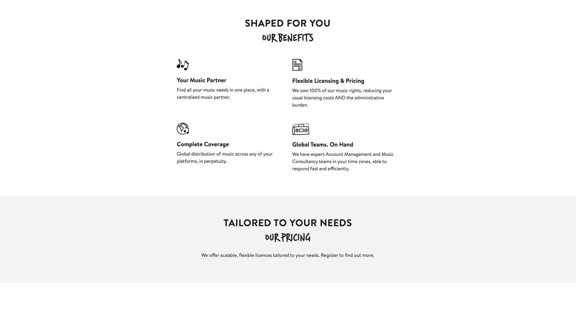
audio network provides music solutions for creatives, including for TV programming, TV Advertising, Digital entertainment and more.
Execution: Develop display assets that contain situation imagery to engage target audience leading to main website landing pages.
Licensing music can be simple
Display Banners

Page illustrations and Icons


Landing Page
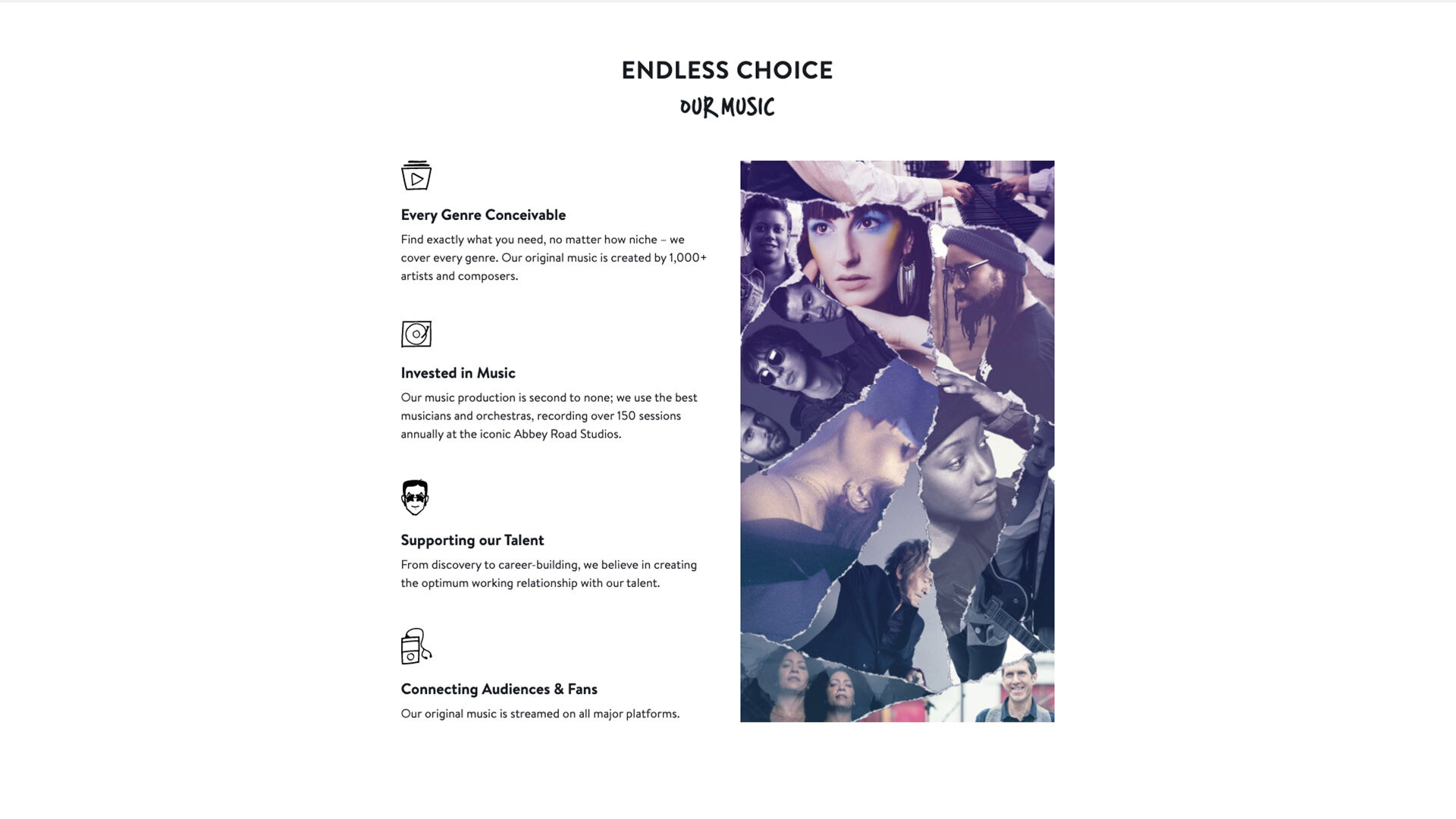
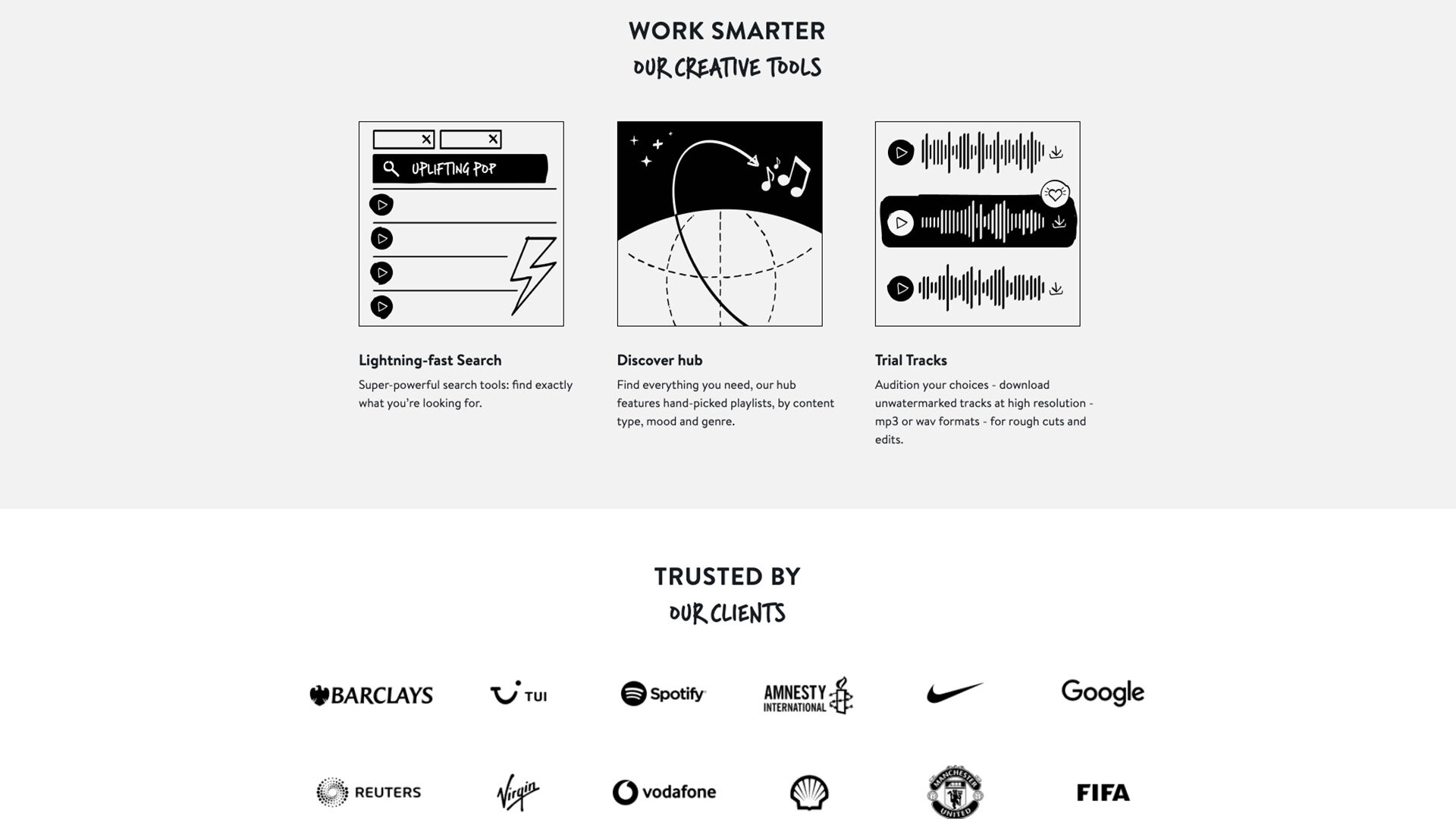
audio network
Client: audio network
Project Scope: Digital Banners, Web page graphics, Image retouching, illustrations, icons
2021
Next Project


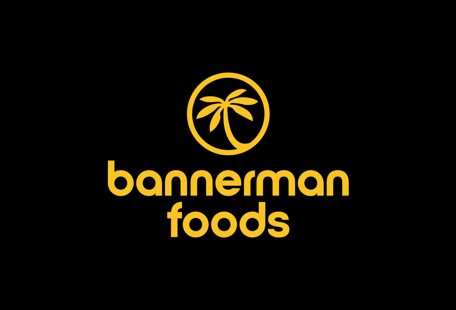
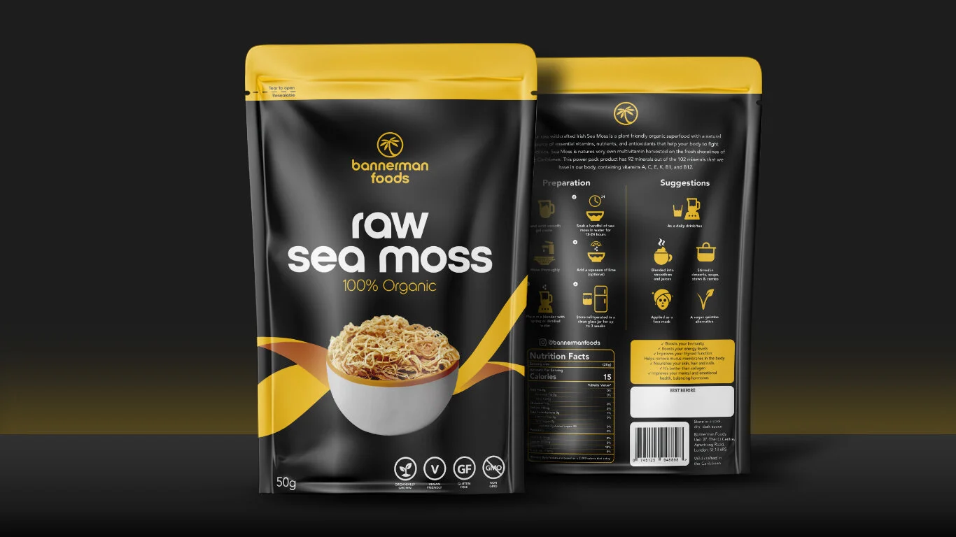
Bannerman Foods
It’s not easy living a clean & healthy lifestyle but Bannerman Foods aims to point you in the right direction. Bannerman Foods is a new company selling 100% Organic Sea Moss. Execution: Develop a the logo and branding that partners with the launch with the first product. Packaging that represents the brand & Identity.
Logo & Branding
We wanted a logo that represented culture, soft on the edges and easy to read. Colours were very important at the start of the process, Yellow representing sun, joy and freedom combined with black to give a bold aesthetic.

Packaging design
The next part of the process was putting the packaging together. A bold design combining the black and yellow together. The main communication for the targeted audience could be found at the back, How to prepare sea moss and suggestions for usage.

Other


Bannerman Foods
Client: Bannerman Foods
Project Scope: Logo & Branding, Packaging design
2020

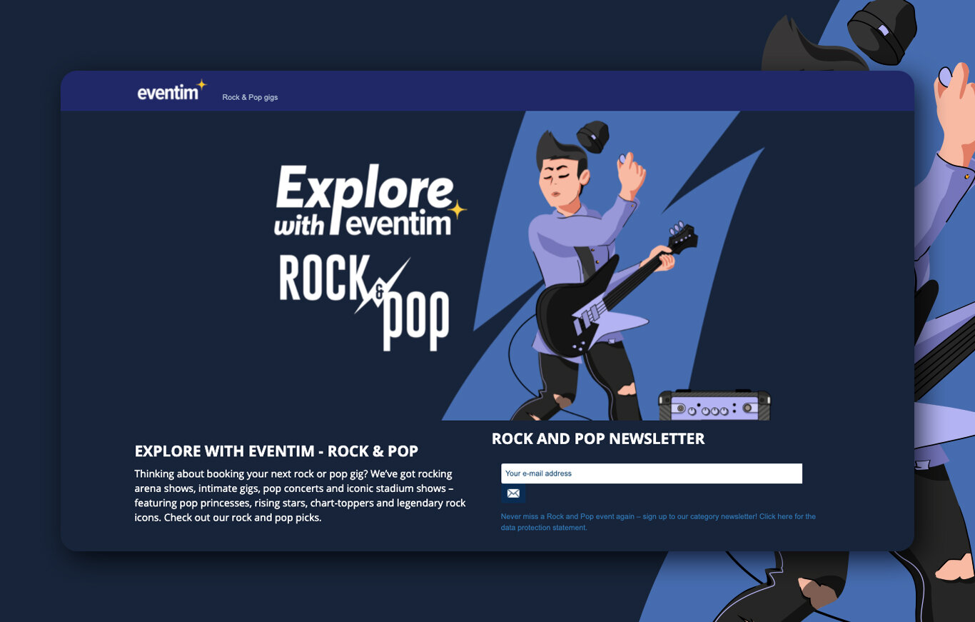
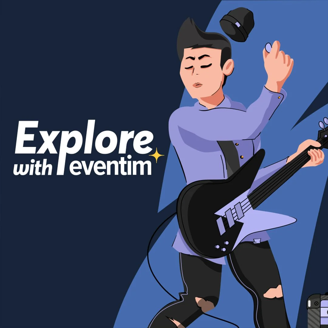
Category illustrations
Eventim is well known for selling tickets for events. 1000s of shows are put on every month, each unique to a genre and category. The real struggle for customers is digging through a site trying to find what they might want to watch.
Execution: Develop unique illustrations for landing pages, pages that customer can visit and see all their favourite shows in one place. Make each category feel like it’s own.
Category illustration
Starting off with the 4 genres that Eventim are well known for selling tickets for. Rock & Pop, Theatre, Comedy and followed by Alternative & Indie music.


Leaderboard & Wallpaper
To build awareness of the newly developed pages I created marketing assets, leaderboards & wallpaper wraps, placed across the eventim homepage.


Explore With Eventim
Client: Eventim
Project Scope: Illustration design, Landing/campaign pages,
Marketing design, Social media design
2020


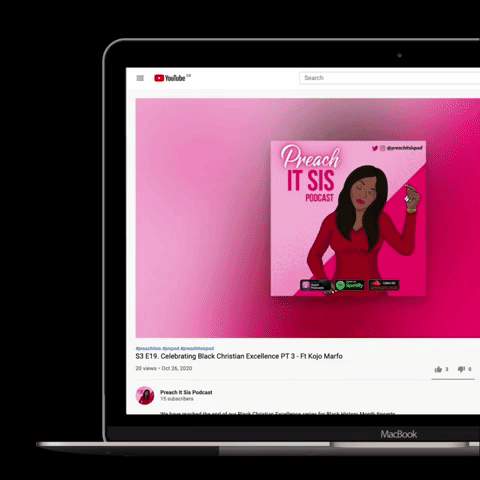
Preach it sis
Preach It Sis is a podcast that frees the real on the transitional struggles Christian women face. We will be better and do better - Everybody say AMEEEEN! Brought you to by Abisoye, Josephine, Kenyeh & Roselyn.
Execution: Develop a cover that represents the intended audience, A character that represents sassy, a part of the modern culture, one thats not afraid to voice her opinion.
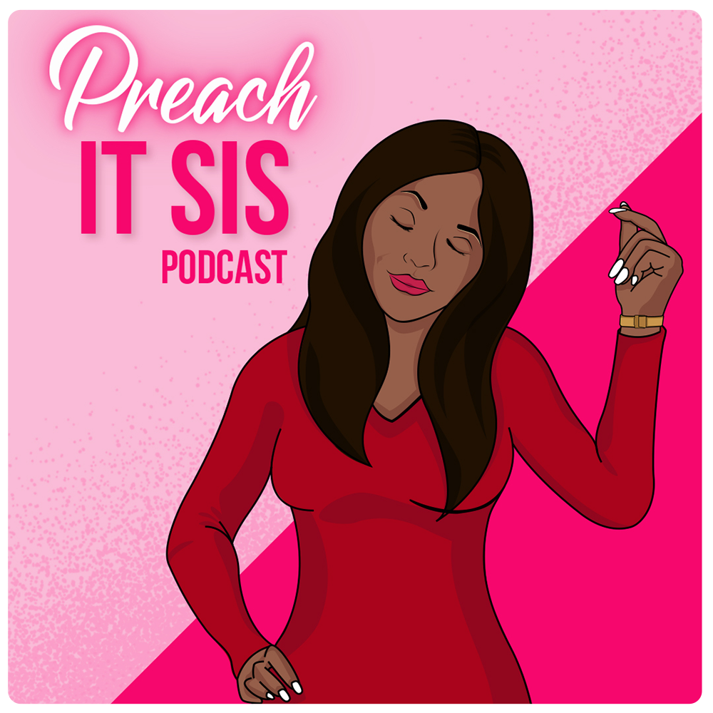
Podcast Cover & Web Graphics


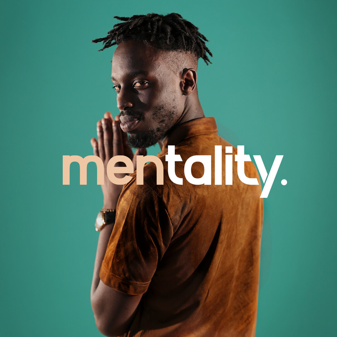
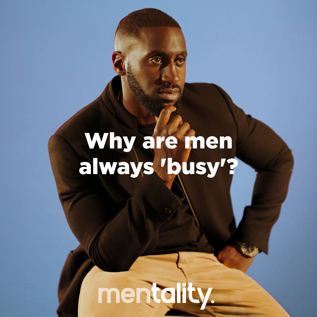
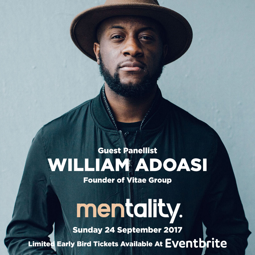
Men's mental health awareness
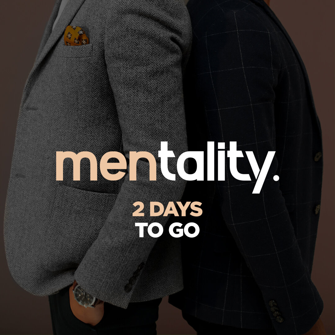
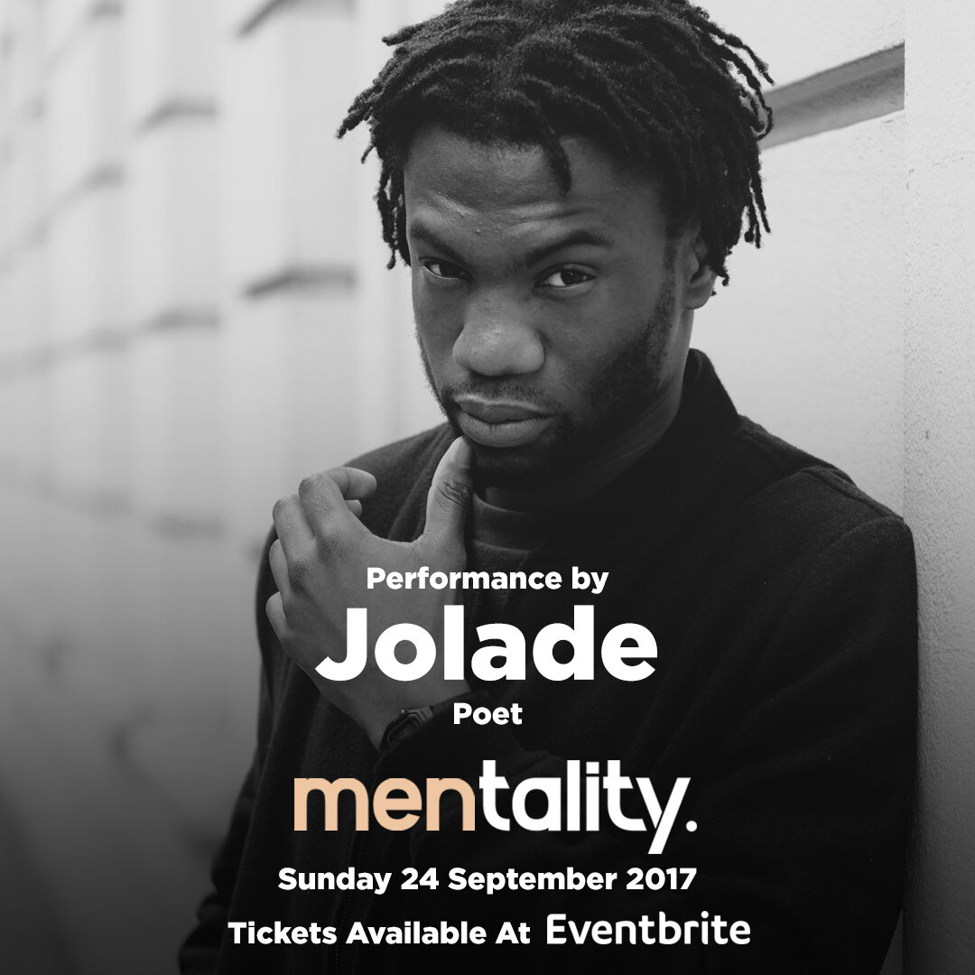
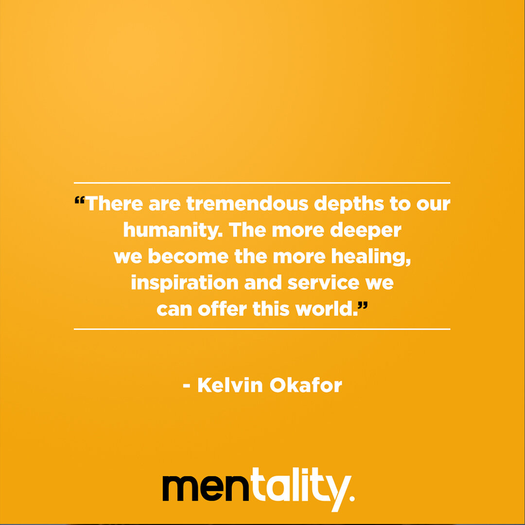
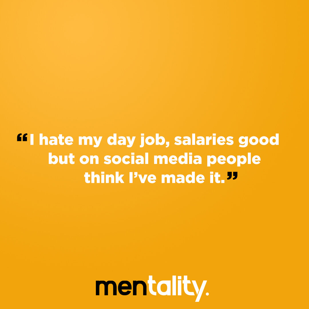
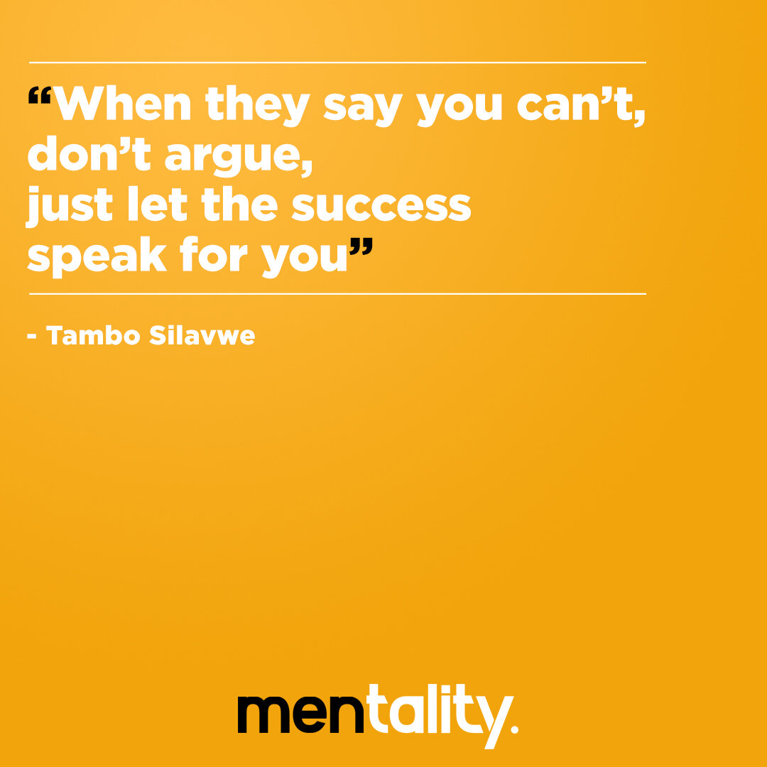
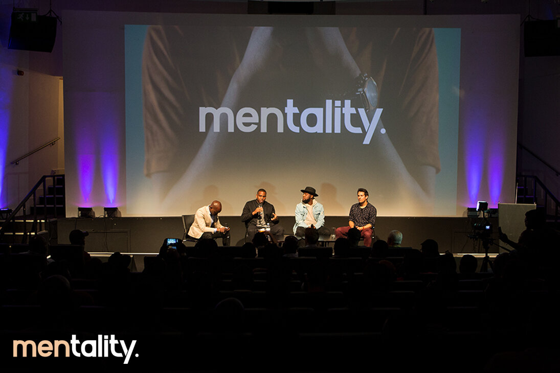
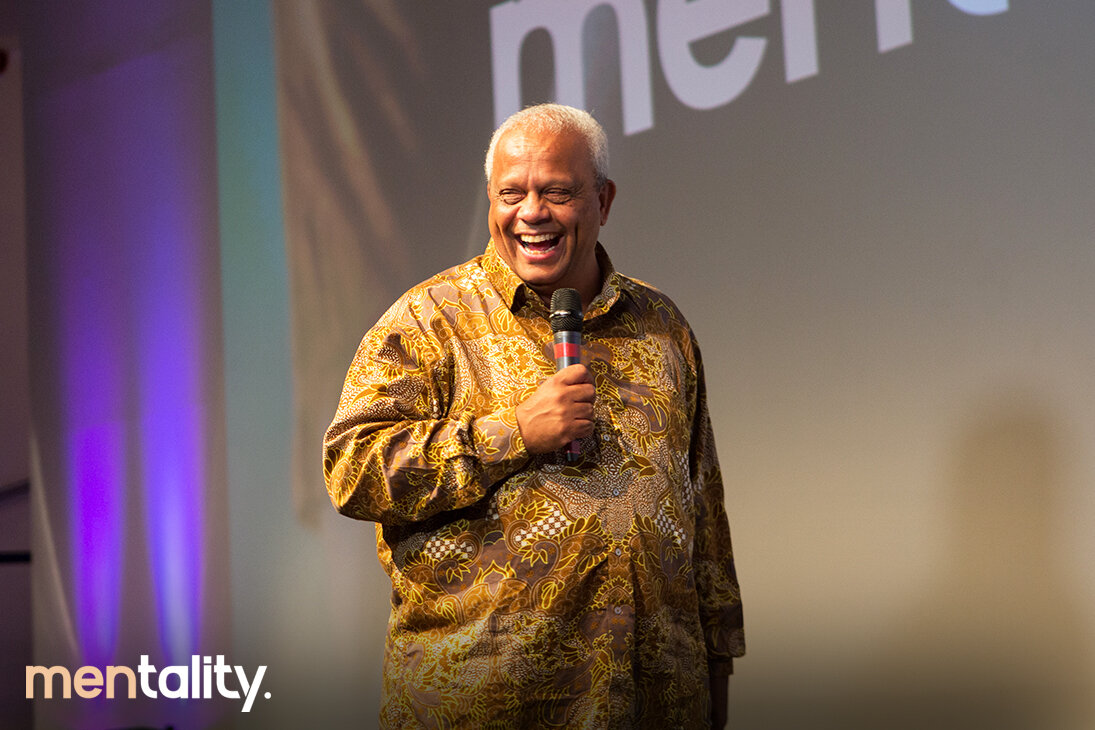
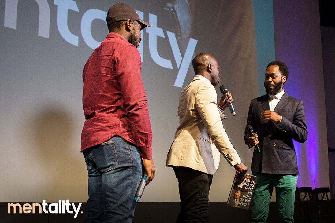
mentality is the UK’s newest Lifestyle and self development platform for Men! In 2017 we launched mentality, a social platform and event to get men together to talk everything mental health, well-being and lifestyle.
Execution: Working with a newly formed team, we organised a photoshoot, from there we build the messaging we wanted to get across to our network on social media. Social post and flyer to market the event.
Logo development
First approach to the project was to develop a logo, one that really highlighted who were targeting “Men” and the our mission to help support each others mindset “Mentality”. Colour was always important to really break down our message.

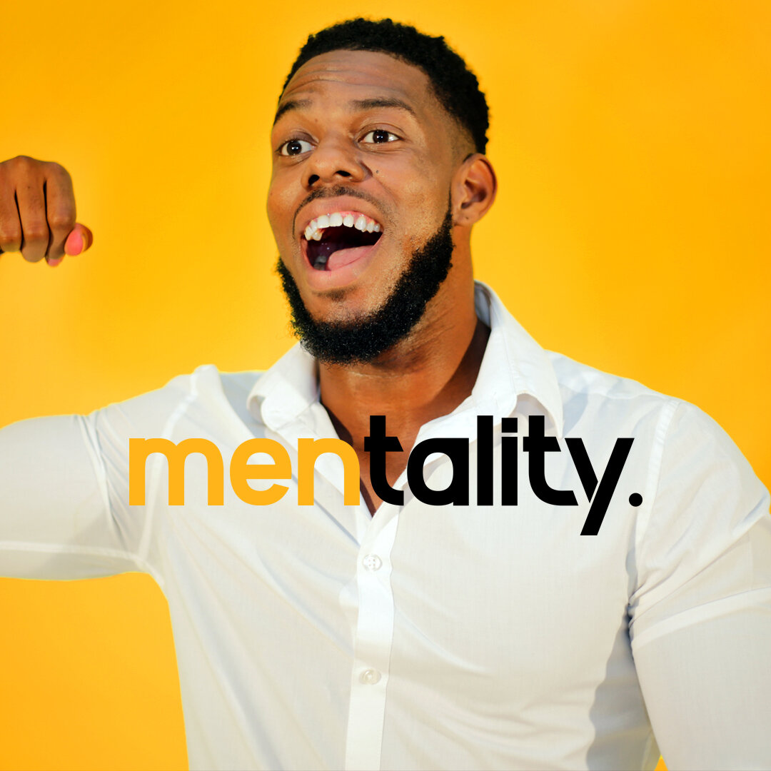
Social media Graphics
We built a campaign to explore the generational issues men face, creating content to encourage men to be more vocal, speak and engage with each other. From there I developed flyers that we used to communicate with our network and build awareness of the event.

Brand Awareness


Engaging Social post (instagram)


Event flyers


Guest Speakers


Last minute awareness


Event day
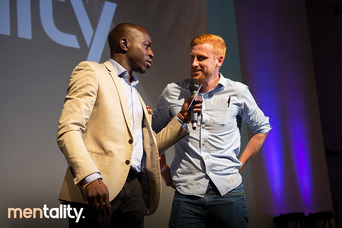
mentality.
Client: mentality. / The heart stylist
Project Scope: Logo & Brand identity, Creative direction, Marketing design,
Social media design, Video editing
2017
Links: instagram
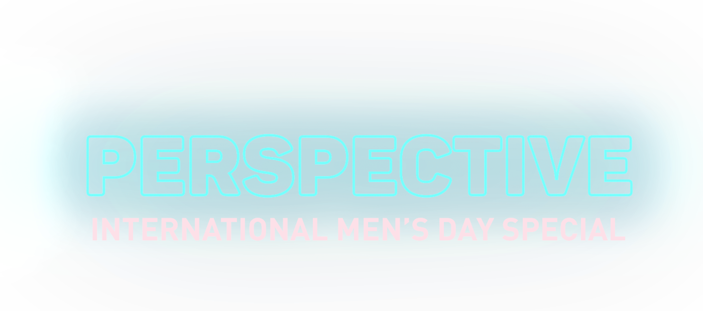
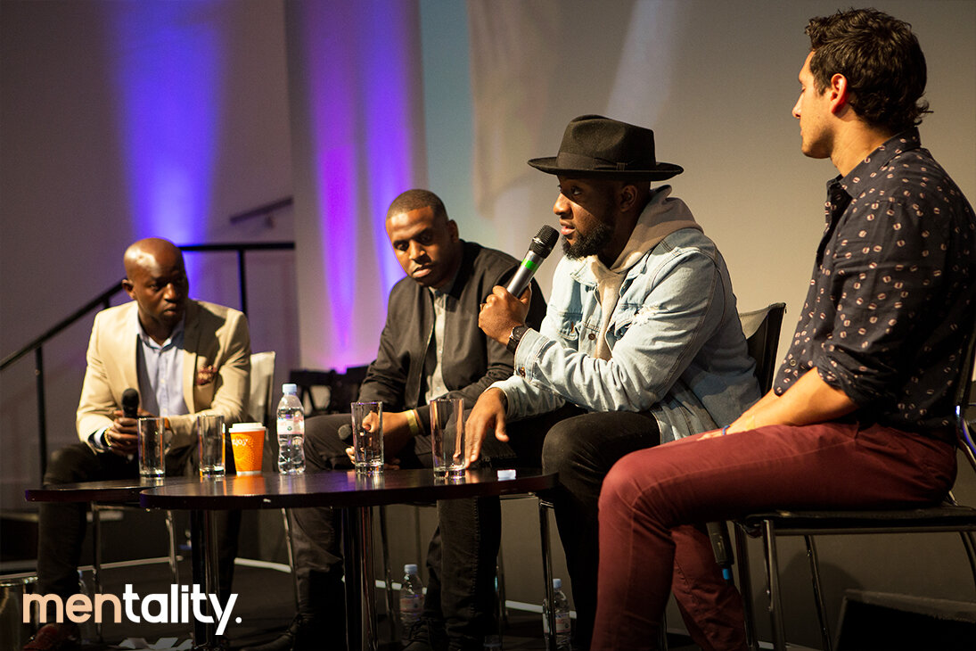
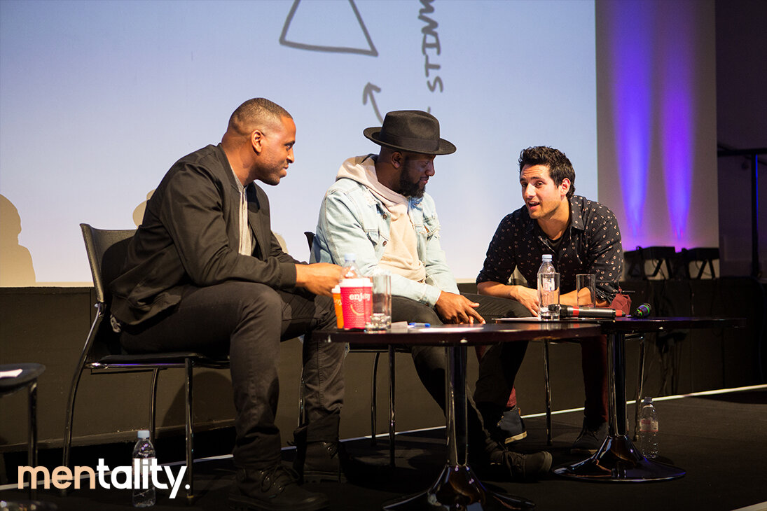
Perspective was mentality’s second and final event of 2018, the big event of the year. So I had the pleasure working on the creative direction for this event and campaign. Our aim for the event was to get all guys to come together and celebrate a day that we tend to over look. Change our perspective on many things.
Celebrating International Men's Day


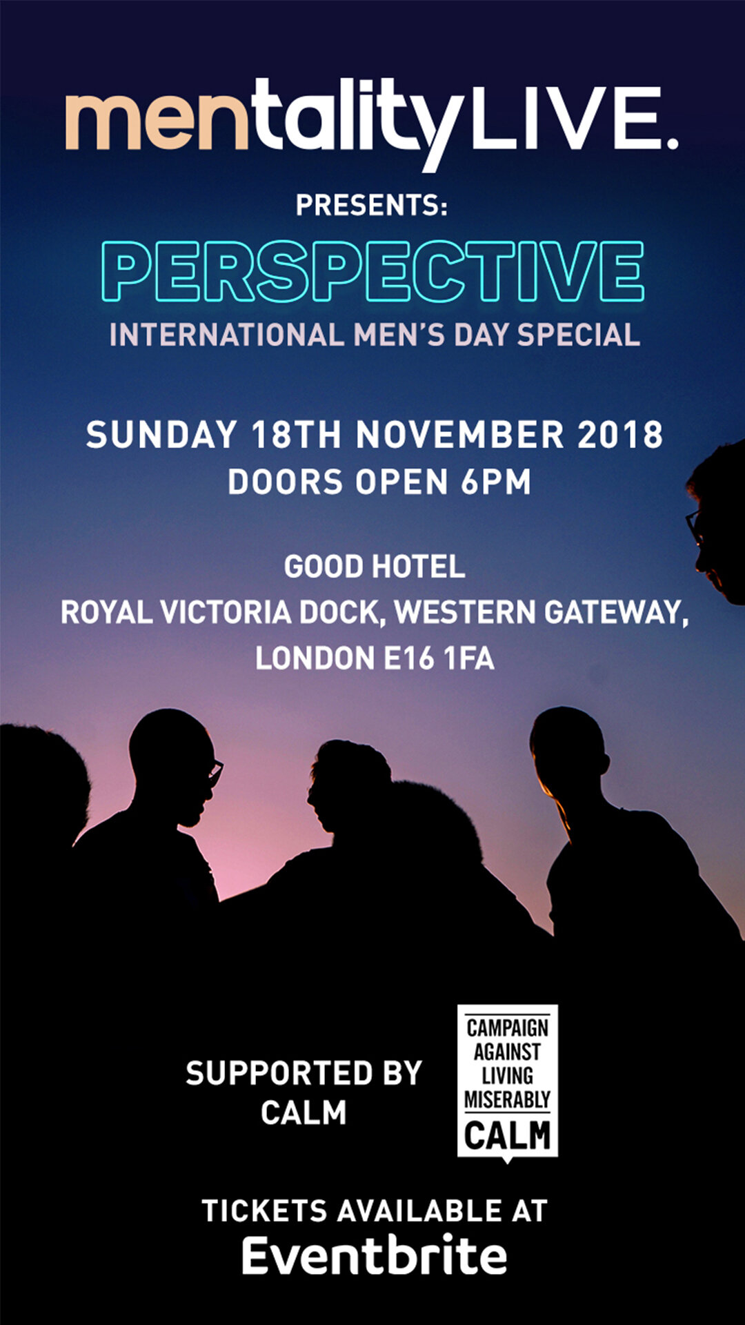
Event day
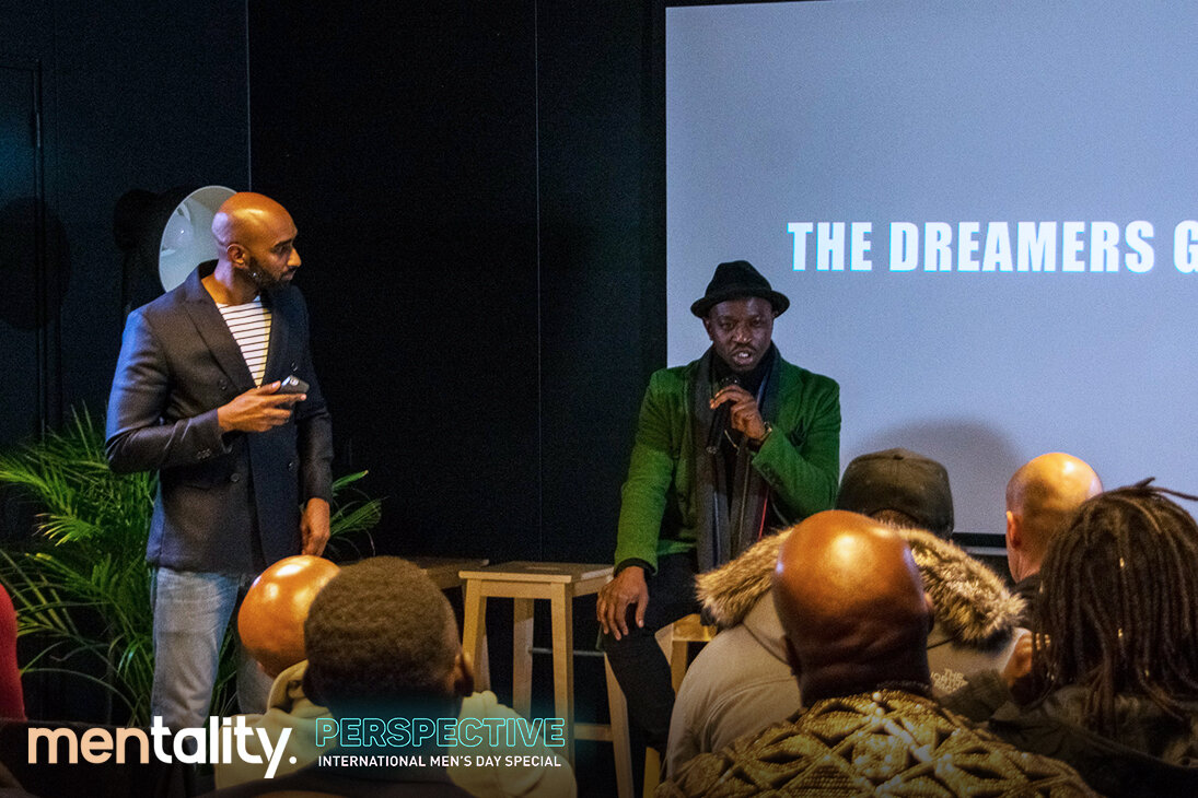
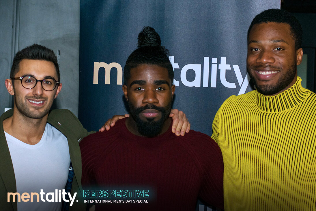
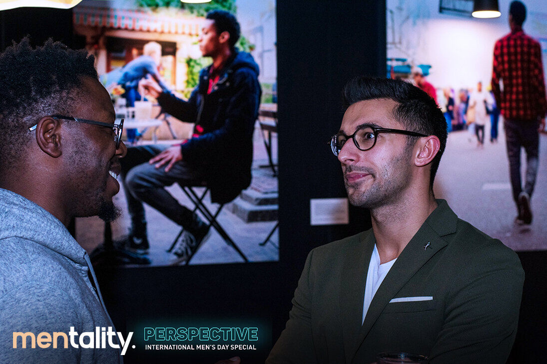
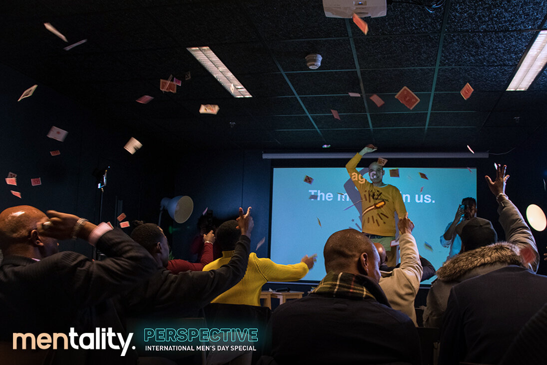
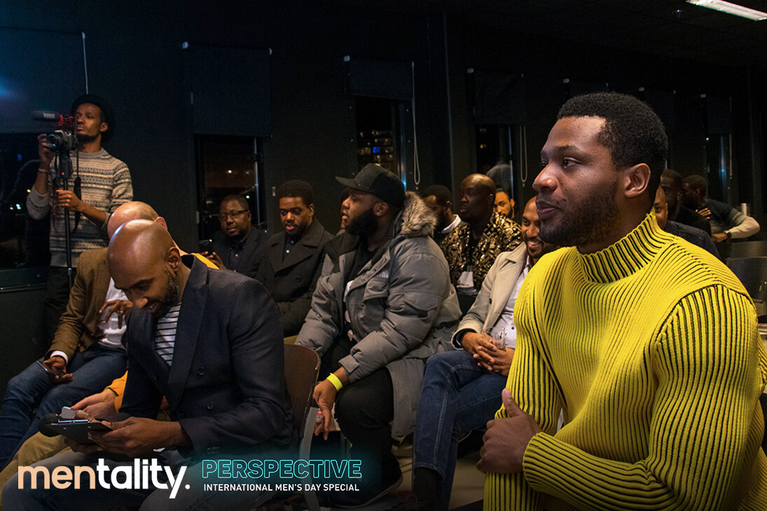
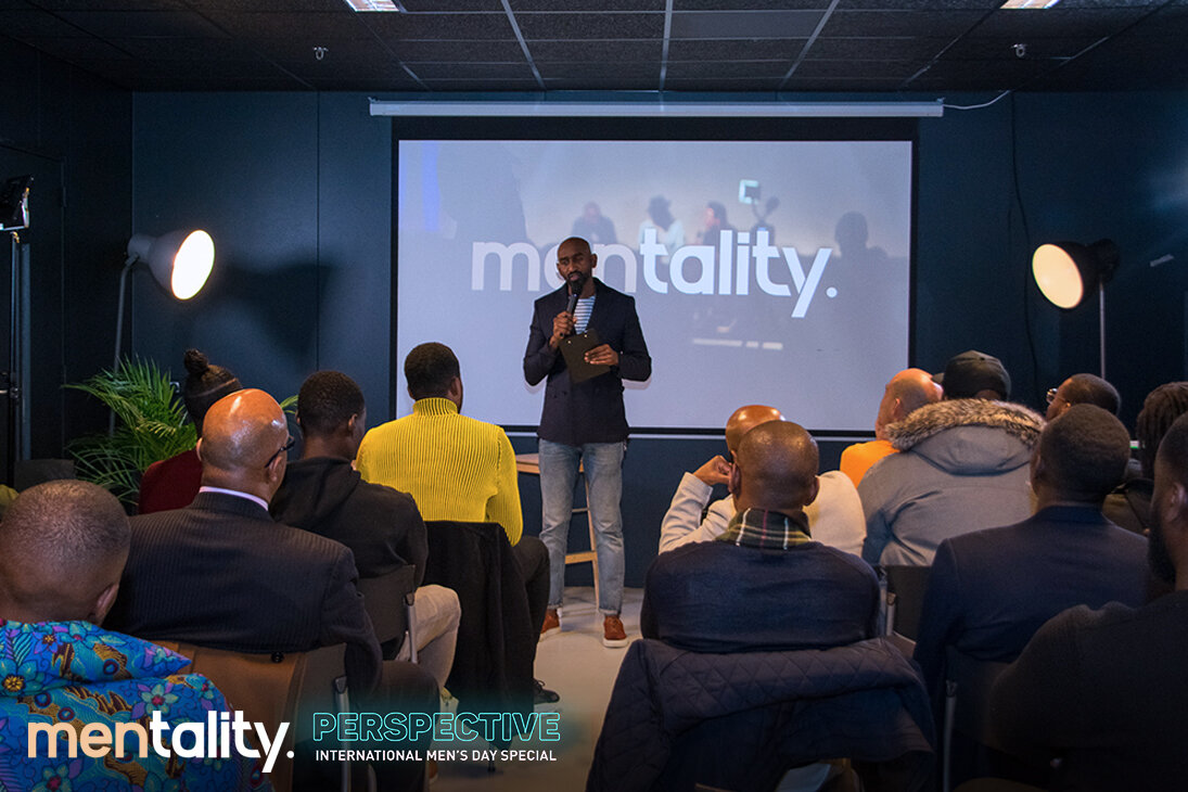
mentality. Perspective
Client: mentality.
Project Scope: Flyer design, social media design
2018
Links: instagram

The Big World of Hair & Beauty
Hair n Beauty Directory is a London based social media account directing woman to hair stylist's, make-up artists and brow/nail technicians from all around the world. With the intention of connecting business owners to knew customers,
Execution: I developed a few illustration and the company logo to help bring the brands launch. Both logo and illustration targeted a female audience.
Logo & Illustration
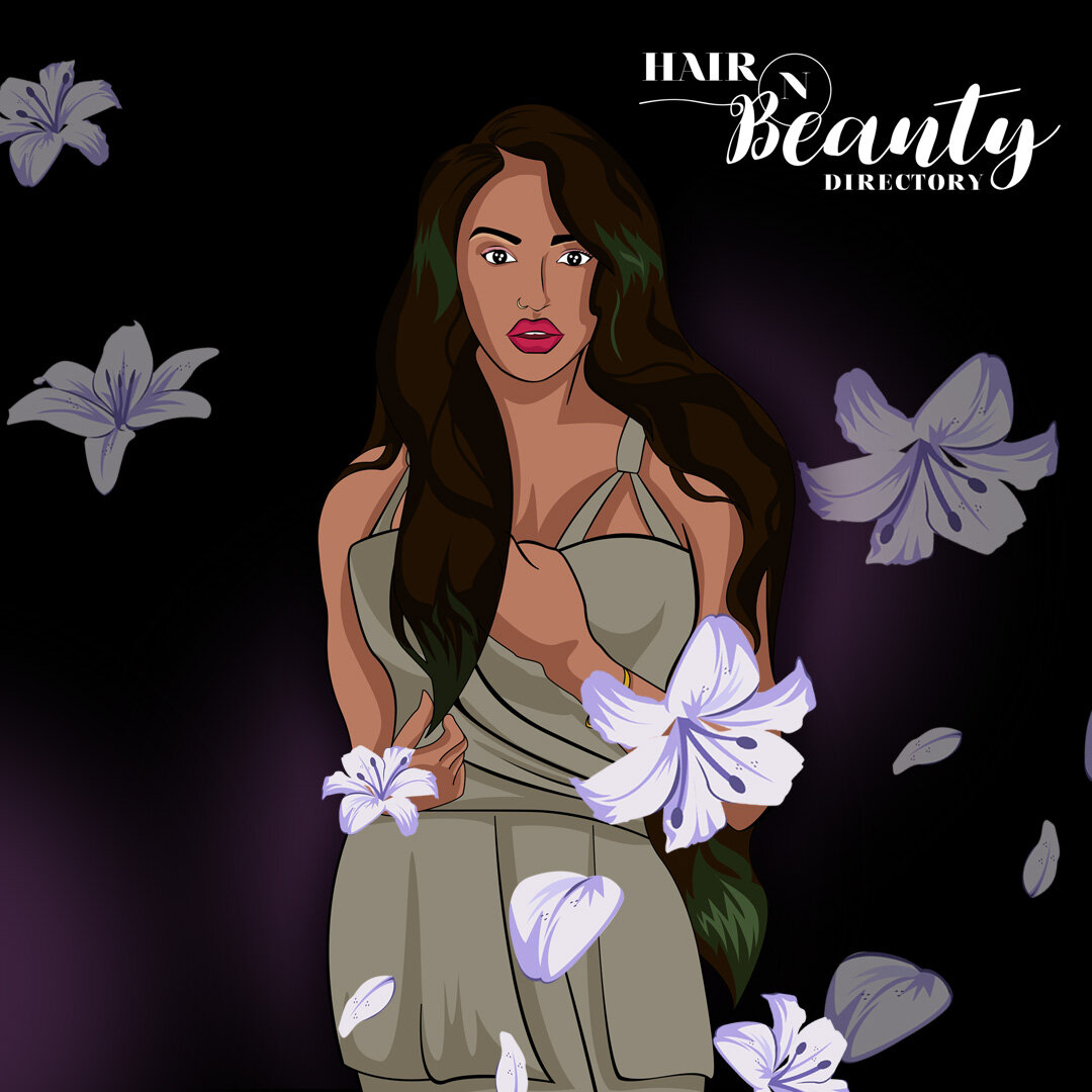
Character illustrations


Launch Party concept

Hair n Beauty Directory
Client: Hair n Beauty Directory
Project scope: Logo design, illustration design
2017

Live at Abbey Road
Launching the Ralph Lauren Spring/Summer 2014 fashion line, inspired by the UK 60’s era, Abbey Roads and the Beatles.
Execution: Develop Vinyl designs that will be passed out onto bloggers to create awareness of the new launch. I collaborated with Forward 3D to build the concept.

Vinyl covers


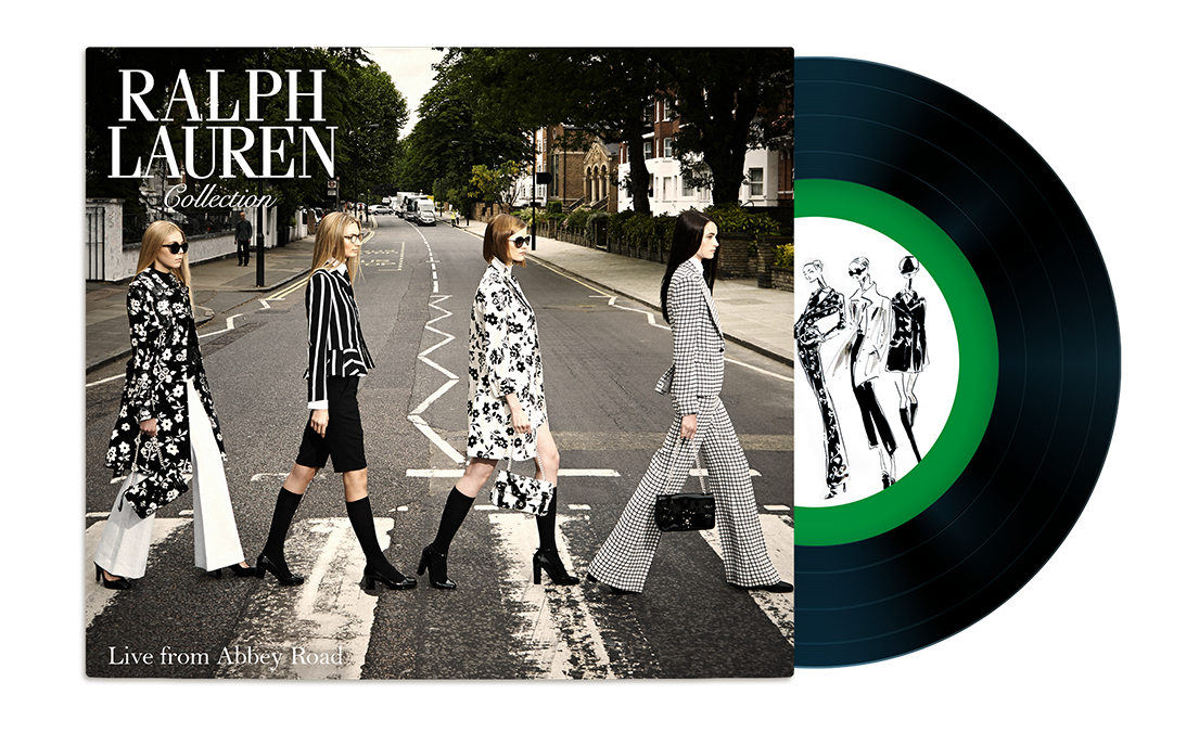


Live from Abbey Road
Client: Forward 3D/ Ralph Lauren
Project Scope: Marketing Graphics
2014

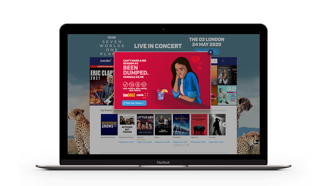
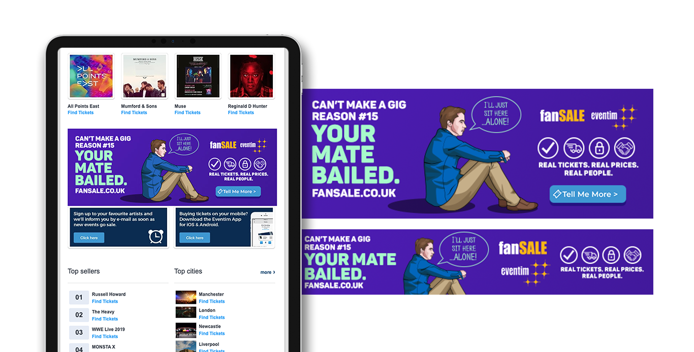
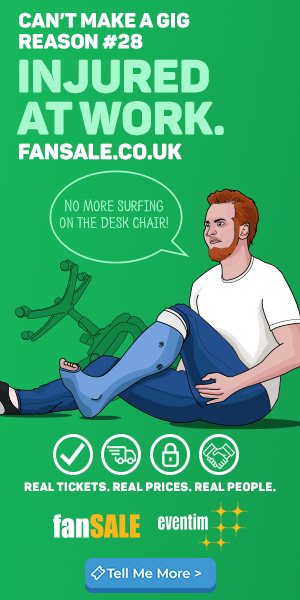
FanSale launch campaign
Unexpected things happen which means you can no longer attend your gig as planned – fanSALE allows you to buy and sell tickets with other fans. At eventim we launched fansale to the UK. With fan sale you could see the sellers original price, tickets were always verified on our system, see the exact seating location and tickets were never sold at an inflated prices.
Execution: A range of illustration for the launch Fansale, used to market around the eventim website, communications and can be used at the Eventim Apollo (Hammersmith, London).
We all have an excuse
My approach was to develop a range of colourful illustrations that could be used on different platforms. Each with a sense of humour, highlighting the many reasons as to why you have to miss an event.
Social media


Digital screens
The design was flexible and used for Digital screens and instagram stories. Design can be seen at the eventim Apollo (Hammersmith, London).

With the launch of fansale (fansale.co.uk) a separate website from the main eventim website. I created some leaderboard wraps and Website popups, to create awareness for customers.
Leaderboard Wrap & Website take over

I created banners that could be seen at the bottom of weekly newsletters and e-shots (email). We saw a boost of customer signing up to sell tickets through the fansale website.
Email Banner
We worked a few music site and created website banner to advertise fansale.
Banner Adverts


Fansale
Client: Eventim
Project Scope: Creative direction, Marketing design, illustration
2018
Next Project
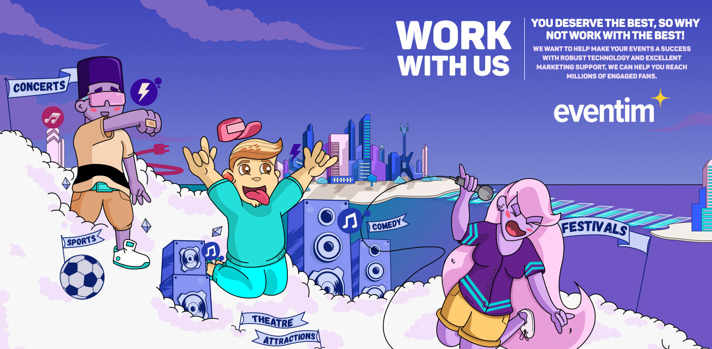
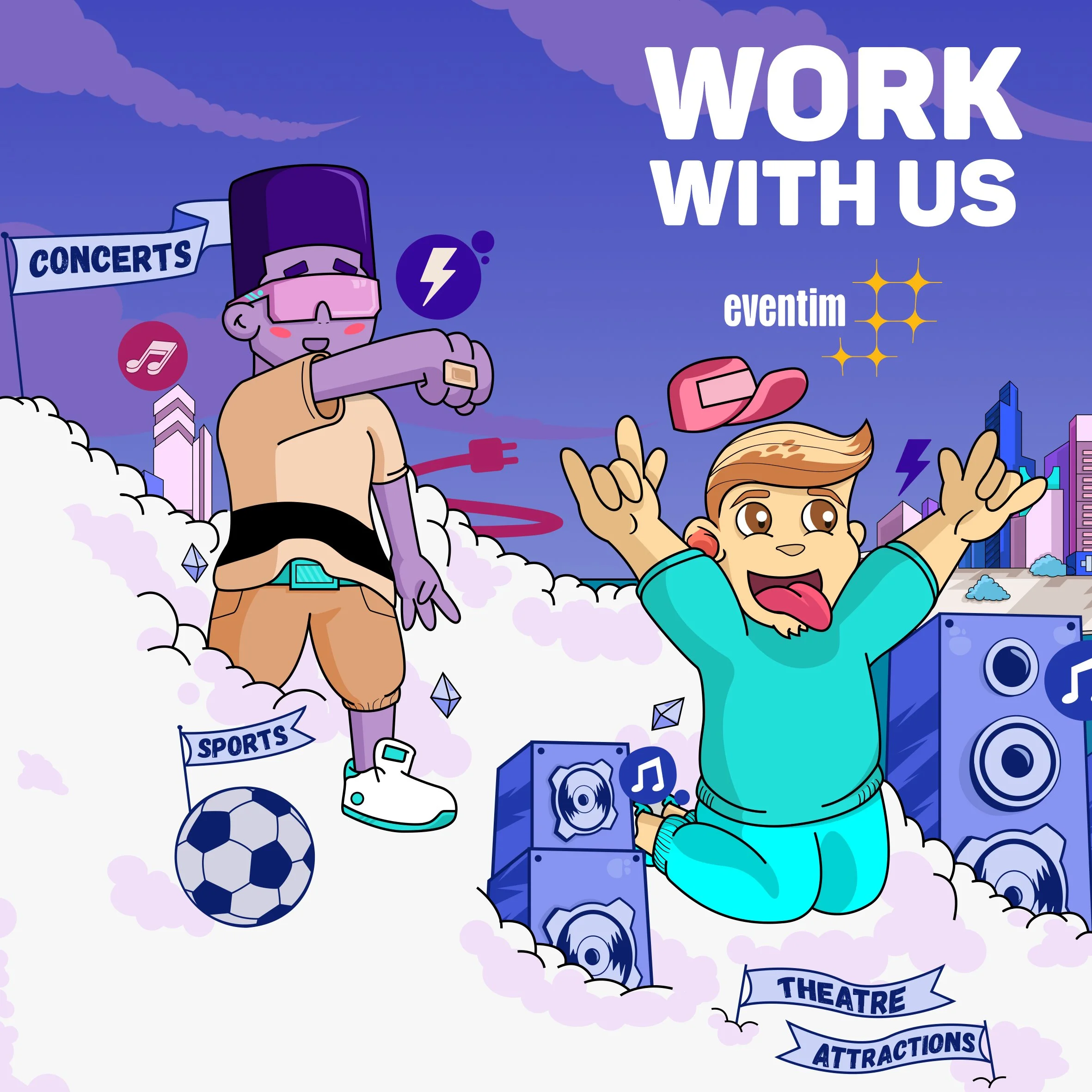
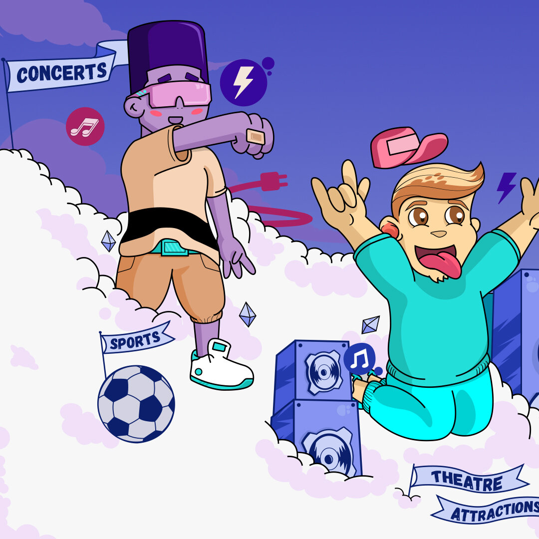
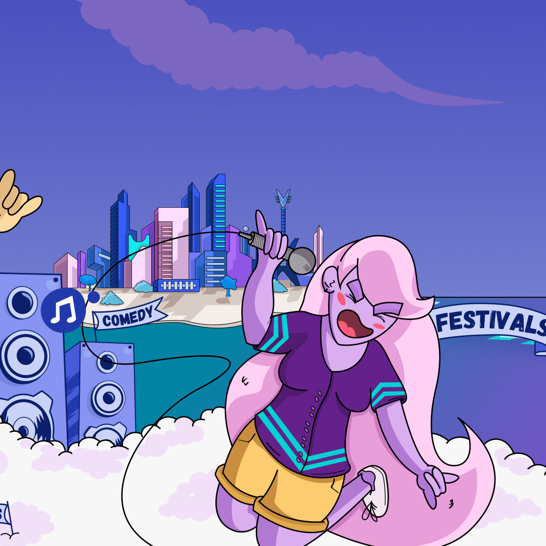
Ticketing can be fun!
Eventim is always looking for opportunities to work with venues & events. The issue was that all ticketing company had the same approach and messaging.
Execution: Develop an illustration to highlight the fun side to the ticketing industry. Events are fun and the business side can be fun too. We wanted a design that represent diversity and all kinds of events.
Print version
We used the illustration to advertise in Music week magazine, a magazine well known in the music and entertainment industry.

Website
We used the design to launch our work with us landing page, highlighting eventim as a company and a unique way to communicate between business to business.

Character design
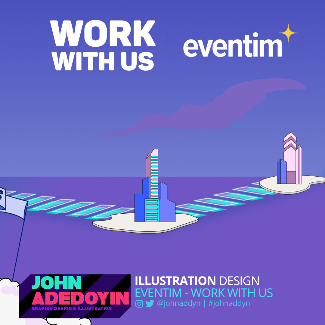
Work with us
Client: Eventim
Project Scope: Illustration design, Marketing design
2017
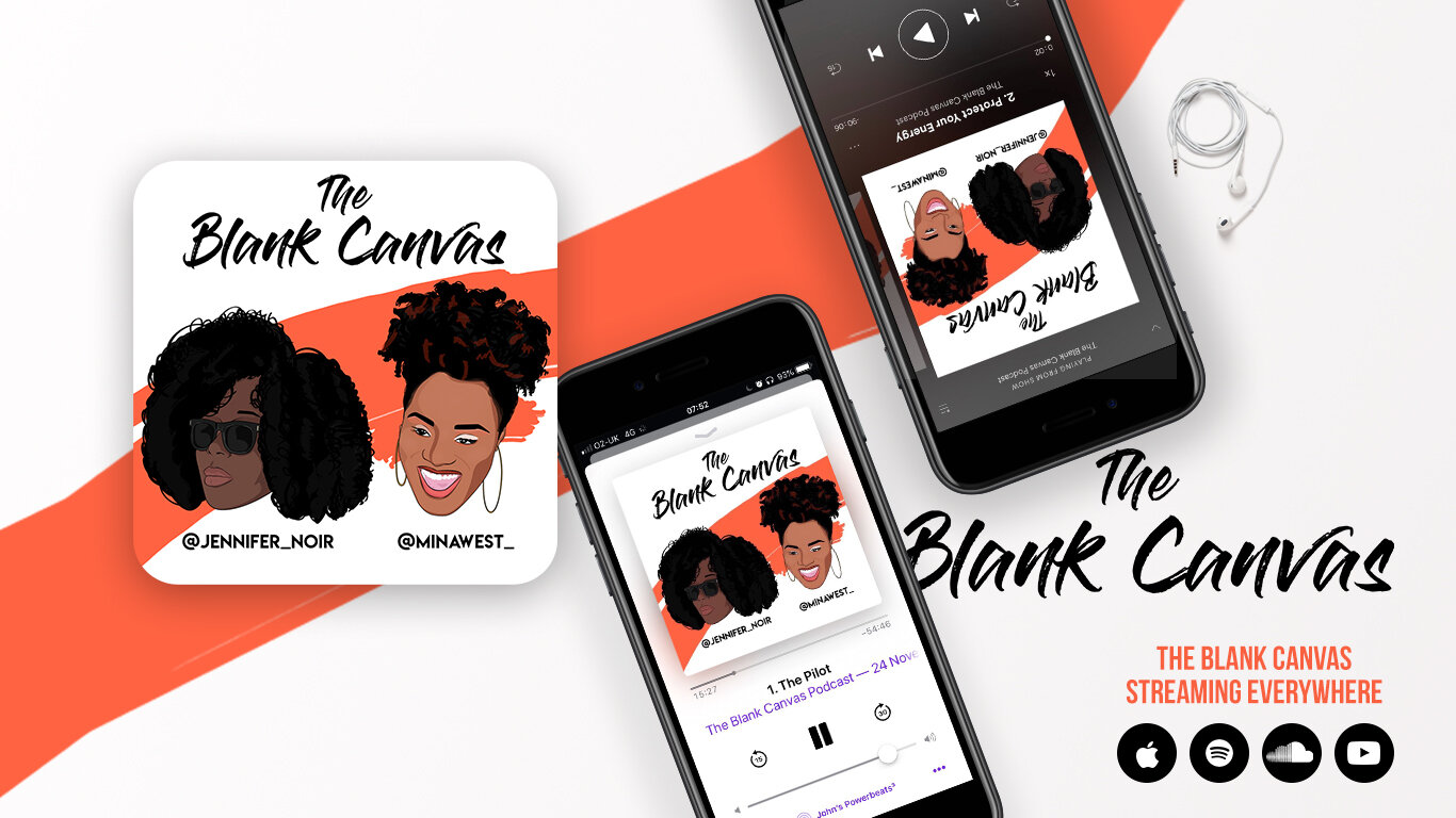
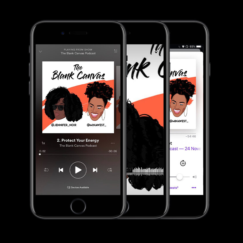
The Blank Canvas Podcast Cover
The Blank Canvas is a podcast hosted by creatives @minawest_ and @jennifer_noir who aren't afraid to be raw, honest and vulnerable. The Blank Canvas is a positive space to discuss various aspects of femininity. Execution: Develop a podcast cover that represents the host and there love for art and culture.

Host illustration


Podcast Cover


Naveyah Hair is a London based Hair & Beauty Stylist. Getting your hair done should feel good! This would my aim for this campaign.
Execution: Create a logo and illustration for the rebranding of Naveyah Hair.
Your Hair should feel good!
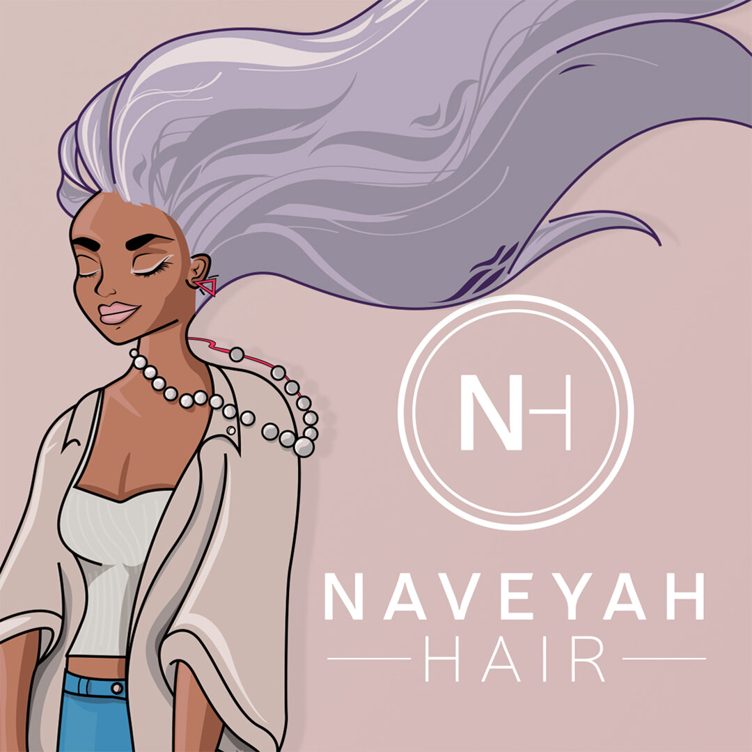
Naveyah Hair
Client: Naveyah Hair
Project Scope: illustration design
2016

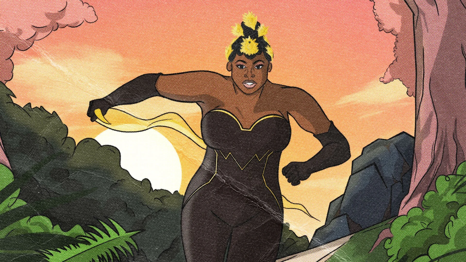
Runnin…
Zoé Collins is an independent British - Nigerian singer and songwriter from Brixton South West, London. Growing up in church, her sound is a soulful infusion of Gospel, Jazz and RnB.
The Brief
Brief: Create a single cover inside by old comic book covers from the 60s/70s era.
Execution: Working closely with Zoe, we wanted a single cover inspired by old comic books from the 60s/70s but also feel inspired current comic runs for Black Panther. The cover will be based around Zoe (the Hero/ Protagonist) Running through a jungle or forest. Costume inspired by Storm from the X-men and Wonder Woman. One fun thing we like about this concept was exploring how we could add in cultural elements into the design, with subtle hints of the Nigerian culture.

Single cover
The final outcome for the single cover, we felt inspired by comic book layouts, especially by Marvel and DC comics.
Just a touch of motion

Illustration development
Insert text here


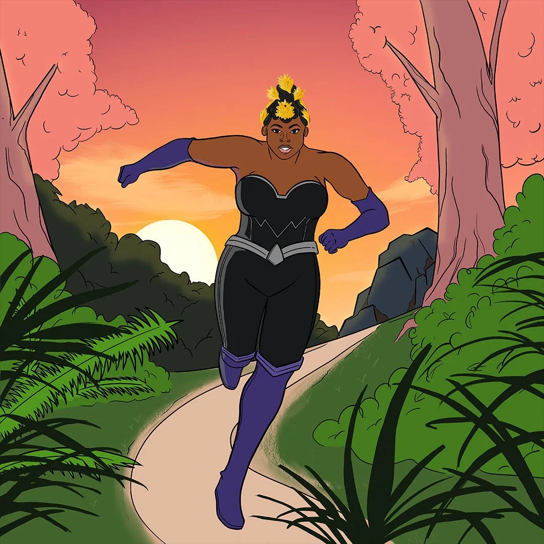
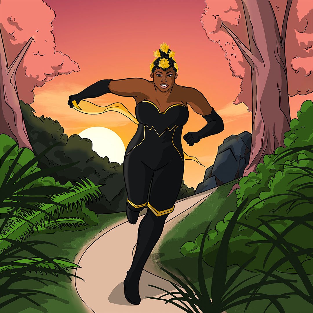

Runnin’
Client: Zoé Collins
Project Scope: Album/Single cover, Illustration design,
Feb/Mar 2022
More covers